Colour
Vivid colour photography showcasing light, detail and atmosphere to capture life’s moments with depth, energy and emotion.
-
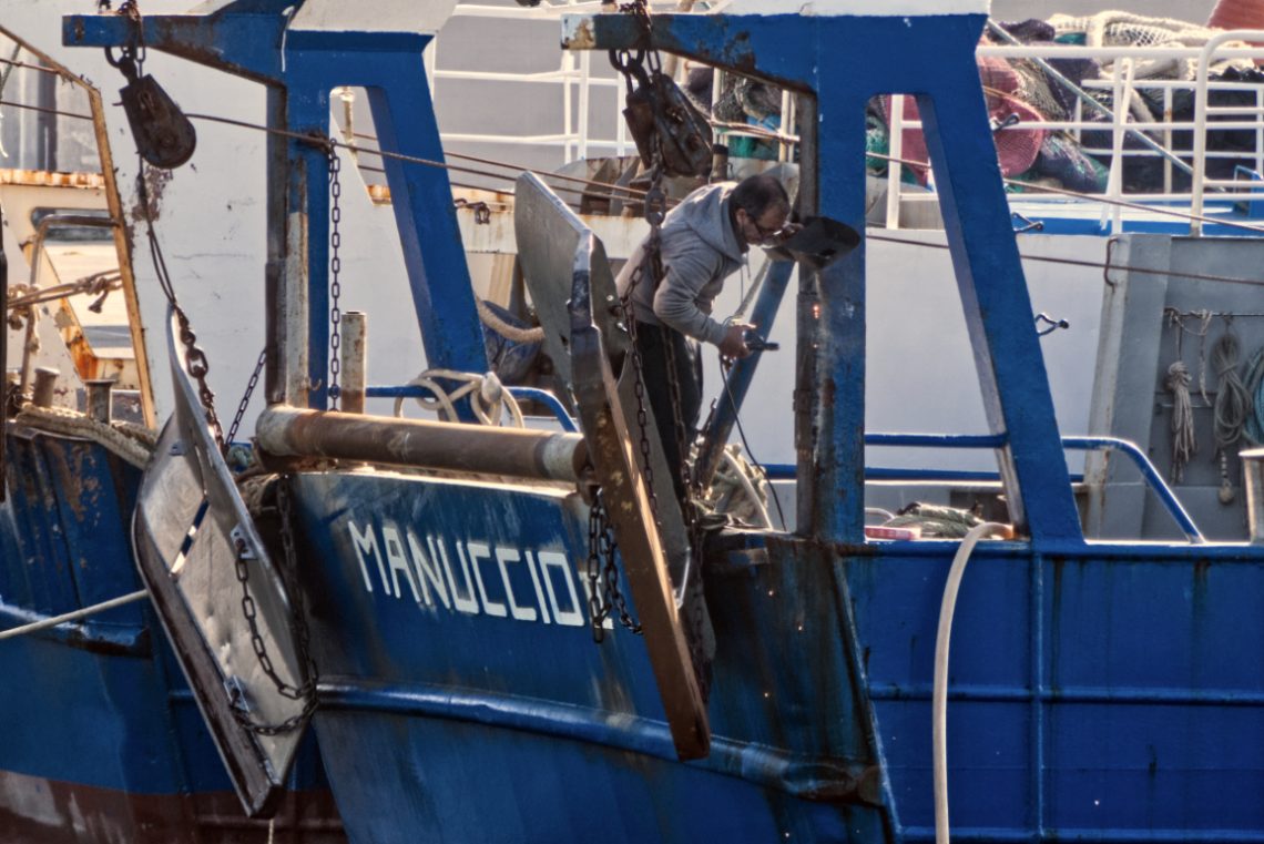
Soldering
-
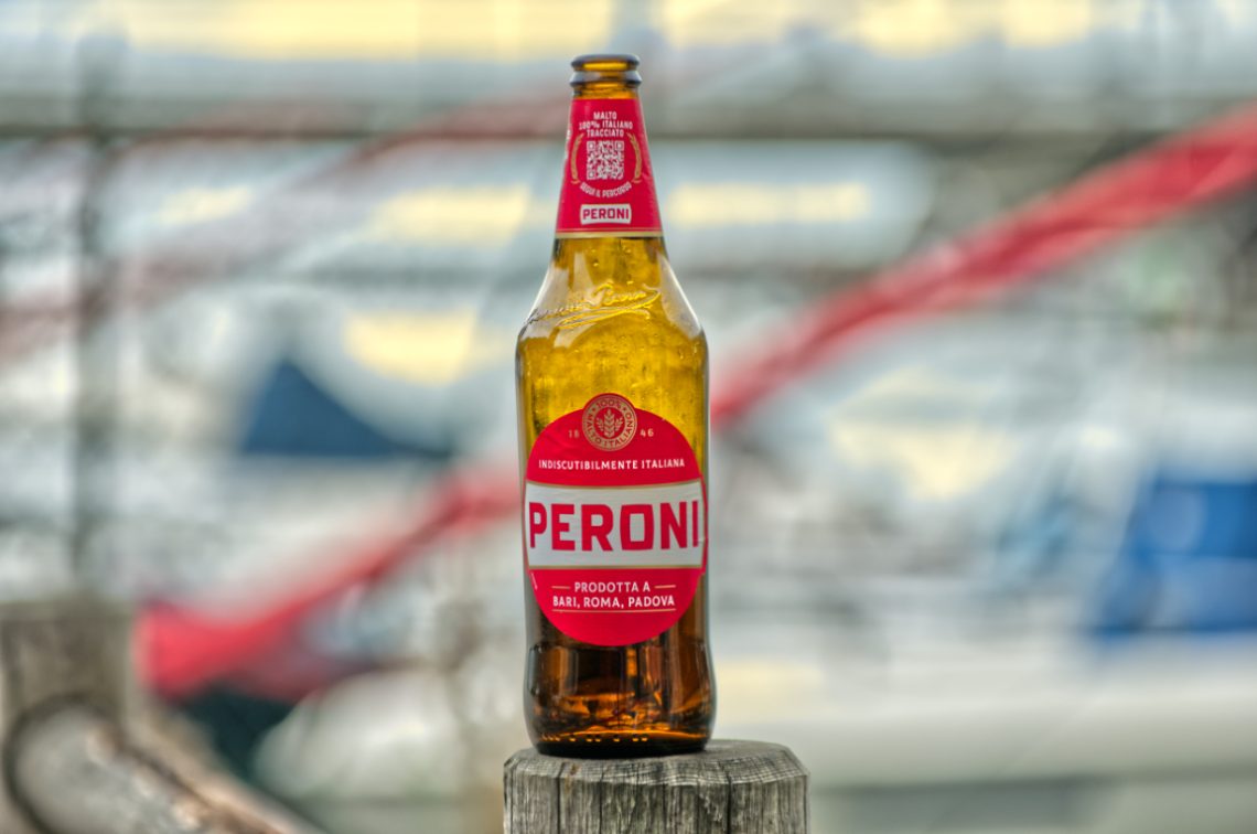
Fancy a beer?
I caught this Peroni bottle resting on a worn wooden post at the marina, the kind of accidental still life you don’t stage — you simply recognise and frame. The Pentax K-5, paired with the DA* 50-135 f/2.8, made the job effortless. That lens has a way of pulling a subject into sharp relief while letting the world behind it dissolve into painterly abstraction. Here, the background of masts, ropes, and blurred hulls becomes more a wash of colour than a setting, yet it still whispers the story of where we are. I shot wide open, wanting the bokeh to take the harsh edges off the busy scene. The glass…
-
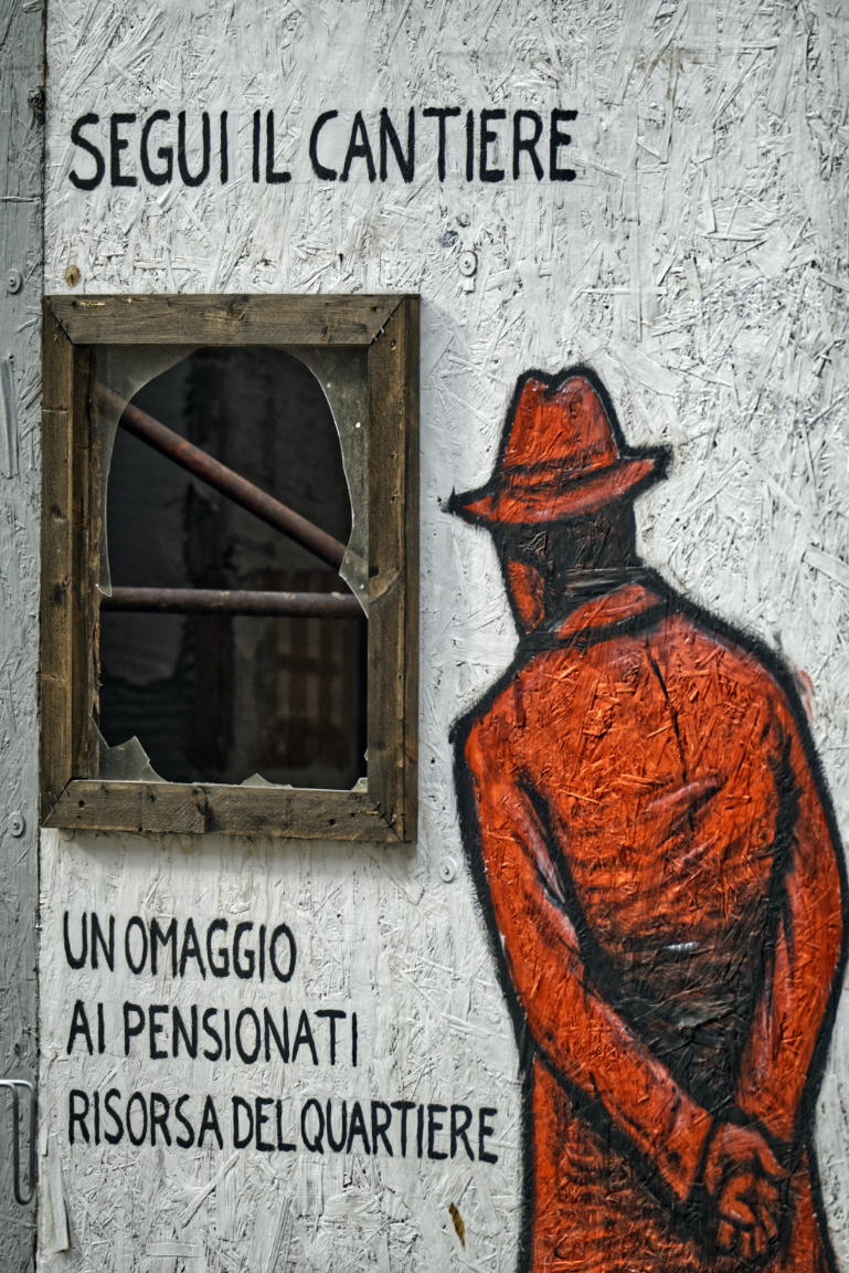
Imitation of Banksi
Some photographs happen because you spot them at the right time; others, because the right lens lets you see them from a distance before they disappear. This was the latter. Walking past a construction site, I noticed a splash of red against the pale, textured hoarding — a painted figure in a hat and long coat, back turned, hands behind him, staring through a broken window. The text alongside reads: “Segui il cantiere – Un omaggio ai pensionati, risorsa del quartiere” (“Follow the construction site – A tribute to pensioners, the neighbourhood’s resource”). It’s part humour, part homage, a knowing wink to the archetypal retiree who spends his days watching…
-
Black Cat
-
Fast Roping
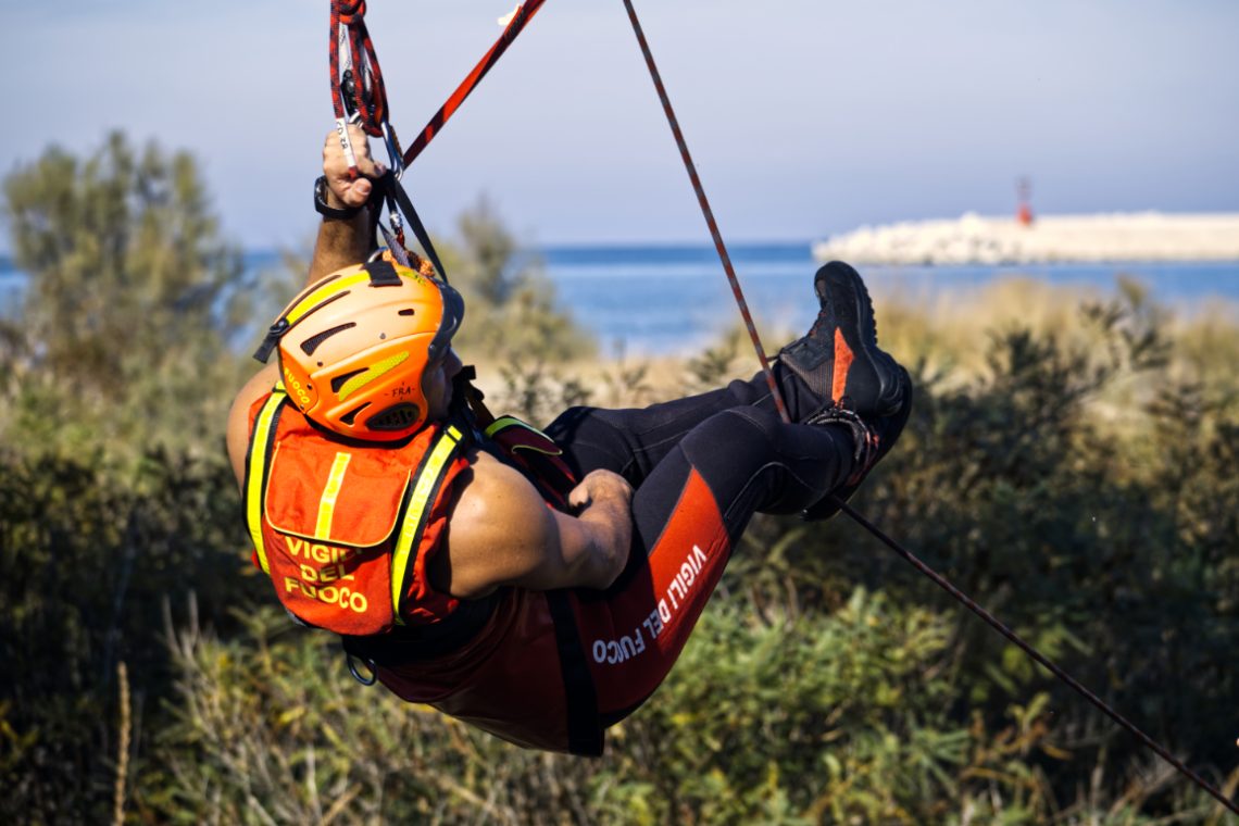
Photographing action is often about timing, but in this case it was also about proximity — or rather, the lack of it. The Fujinon 100-400mm on the Fuji X-T3 gave me the reach I needed to isolate the firefighter mid-descent, suspended against a Mediterranean backdrop. The long lens flattened the perspective just enough to bring the vegetation, the sea, and the distant breakwater into a coherent, layered background, without stealing focus from the main subject. The composition works around the strong diagonal created by the rope, which slices through the frame and guides the viewer’s eye from top left to bottom right. His bright helmet and high-vis vest aren’t just…
-
Kite Surfers
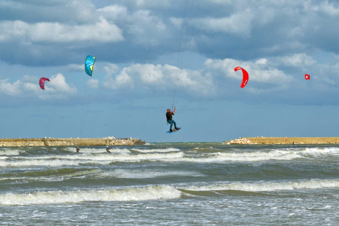
There’s a certain theatricality to kitesurfing that photography loves. The arc of the kite, the tension in the lines, the frozen posture of the rider mid-jump — all these elements play beautifully against a dramatic sky. In this frame, the scene is split into three horizontal bands: the restless sea, the solid breakwaters, and the layered clouds. The kites add the essential vertical accents, their bright reds and blues pulling the eye away from the muted tones of sea and stone. The choice of timing is decisive. The central figure is caught at the peak of his jump, the board still angled upwards, knees bent, hands taut on the bar.…
-
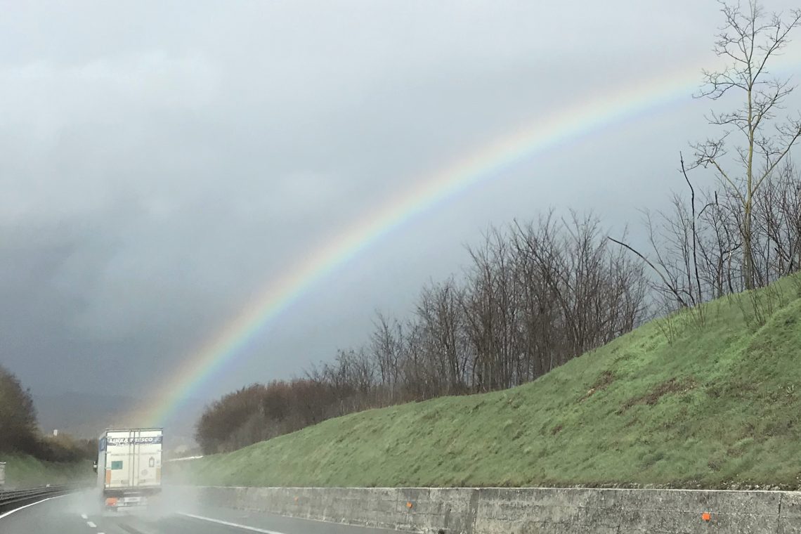
Chasing Rainbows on the Open Road
The highway stretches ahead, slick with rain, as a truck hums steadily through the mist. Then, as if drawn by some unseen hand, a rainbow arches across the sky, anchoring itself almost to the truck’s path. In that instant, the mundane transforms: the road becomes a bridge between grey clouds and fragile colour. The scene speaks of quiet journeys and unexpected rewards. The truck, anonymous and workmanlike, seems to carry the weight of routine—deliveries, schedules, miles yet to go. Yet above it, nature paints a fleeting miracle, a reminder that even on a wet and weary road, wonder can appear without warning. The trees along the embankment stand bare, witnesses…
-
Boats
-
Sky Patrol
-
Fujifilm X-T3 Video Cheat Sheet
Although the Internet (and Youtube) are full of information about using the Fujifilm X-T3’s video capabilities —kudos to Chris Lee’s Pal2Tech Youtube channel for his incredible work— having a ‘quick ‘n’ dirty’ cheat sheet works better when all you need is information and not entertainment. This cheatsheet is organised according to (my personal) logic rather than to the camera’s menu order. It starts from the outside and goes deep down the intricacies of the various features. It also highlights some techicanilities that, although written in the manual, have not so obvious implications. A final word: this is a work-in-progress. More information will be added as soon as they become available.…
-
Toxic Waste in Open Air
-
Barbarians At the Beach
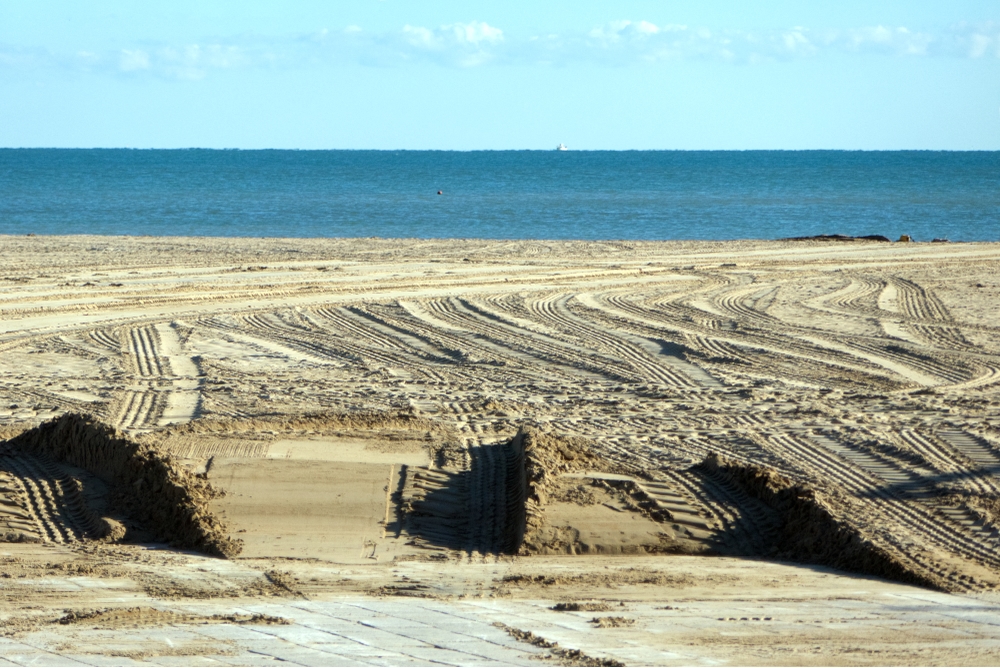
Early in the morning, before the usual hum of the seafront returned, the marks left behind during the night were still untouched. The beach, normally a place defined by wind, tide, and human leisure, had been overwritten by the heavy, mechanical tracks of off-road vehicles. What should be a natural surface shaped by the sea had become a blueprint of careless intrusion. The lines in the sand tell their own story. They are not the soft curves left by a bicycle or the faint imprints of footsteps. These are deep, forceful grooves—parallel, looping, intersecting—carved by weight and speed. They cut through the beach in patterns that have nothing to do…
-
Dark Cloud Over San Pietro
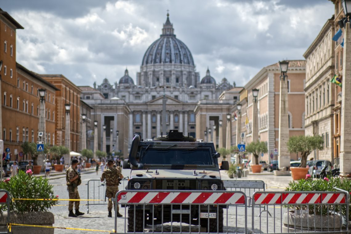
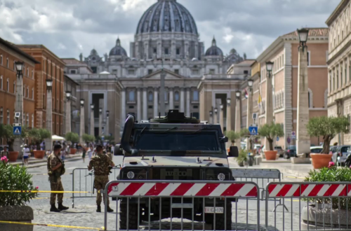
The tension wasn’t subtle. I framed this on a humid Roman afternoon, the kind where the air sticks and light flattens the facades. At the vanishing point: San Pietro, serene and untouchable, a facade that’s absorbed centuries of ceremony and conflict. But in the foreground—armoured steel, automatic rifles, and red-striped barricades—modern anxieties assert themselves. This is what occupation looks like when dressed as precaution. The symmetry of the shot exaggerates the contrast. The axis from the dome to the vehicle is mathematically clean, unnerving in its balance. You can’t not look down the middle, and once your eyes reach the Iveco Lince, you realise you’re not a tourist anymore. You’re…
-
Fixing the ship
-
Forza Italia
I took this frame in the middle of a warm evening on a busy shopping street. The crowd flowed by—quick glances, weekend chatter, the usual rhythm of a city centre. But what caught my eye was this man, sitting quietly on the kerb, Italian flags resting against a tree, another in his hands, waving lightly in the breeze. He wore a mask, a straw cap, and sandals. Behind him, mannequins lit up glossy storefronts. In front of him, passers-by moved without pause. For a second, I stood still with the camera. Then I saw it. The flag, mid-motion—green, white, red. The symbol of a nation, fluttering not from a balcony,…
-
Technological Memento
-
Wonder… Wall
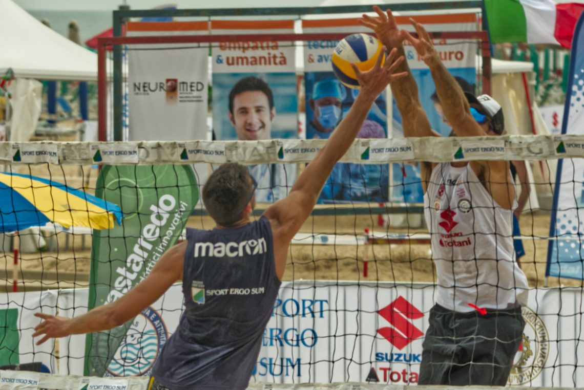
The ball hangs in that fleeting, decisive moment — neither fully blocked nor cleanly smashed — suspended in a fraction of time that speaks volumes about the tension of beach volleyball. I took this with the Nikon D750 paired with Sigma’s 150-600 Contemporary, a combination that offers both reach and flexibility for sports work, though it demands a steady hand and a keen eye to keep subjects sharp. Compositionally, I opted for a tight crop that puts the net and players right into the viewer’s space. There’s no room here for context or the comfort of distance; you’re practically part of the rally. The branding and banners in the background…
-
Portrait of a Fin Swimmer
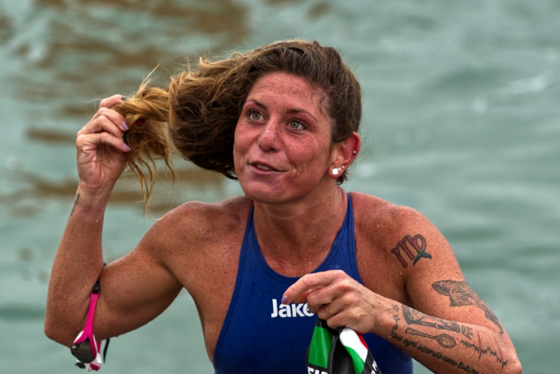
Some portraits happen in a studio, under measured light and with deliberate poses. Others — like this one — are pulled from the water, quite literally, in the midst of motion and adrenaline. I caught her just after she emerged from the sea, hair dripping and muscles tense, her expression still riding the wave of effort and triumph. The Nikon D750 paired with the Sigma 150–600 Contemporary gave me the reach to stay back and let the moment unfold naturally, while still pulling in the details — the salt-speckled skin, the flushed cheeks, the tension in her arm as she grips the swimming cap. From a technical perspective, the challenge…
-
A Seagull
Handheld.
-
A ‘Trabocco’ on the Adriatic Sea
-
Taking-Off
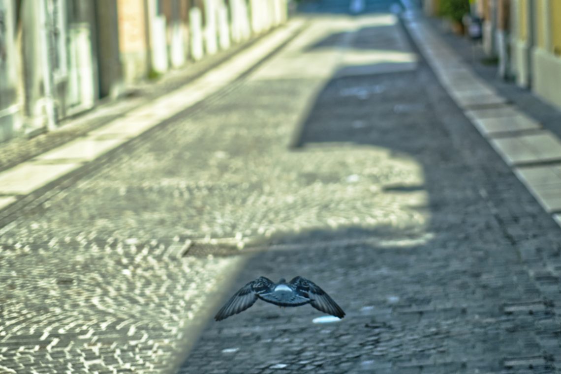
This is a test for the Viltrox AF 56/1,4 XF’s autofocus. The pidgeon took-off suddenly and I just had to point and shoot. The lens behave fairly. I didn’t plan this shot—I reacted. The pigeon launched off the cobbles just ahead of me, wings outstretched, backlit by the fragmented morning light reflecting off the street. I tracked it instinctively and pressed the shutter a fraction before it left the frame. For a moment, everything aligned: subject, motion, light, and a surprising stillness in the middle of movement. The composition isn’t textbook. The bird isn’t centred—more like hovering toward the bottom third, wings drawing a wide V across the soft texture…
-
A Fountain’s Jet
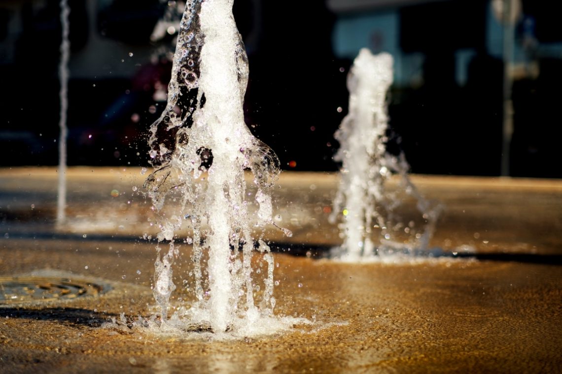
I took this shot with a Viltrox AF 56/1,4 XF at full aperture. The focus reacted swiftly, and the colours’ rendition is pretty accurate. There is minimal colour fringing. However, it is more likely caused by air bubbles rather than by the lens itself. Like its bigger sibling, the AF 85/1,8 XF, this lens is excellent. Photographing water at f/1.4 is, in many ways, an exercise in precision gambling. The Viltrox AF 56mm f/1.4 XF, mounted on the Fuji X-T3, gave me a razor-thin depth of field to work with. At this aperture, there’s no room for hesitation – you either nail the plane of focus or lose the subject…
-
Using a 1960 Leica Elmarit 90/2,8 on a Fuji X-T3
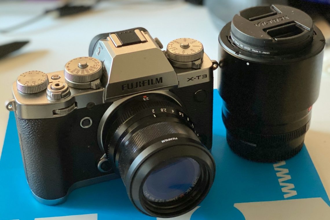
In short The Leica Elmarit 90/2,8 works flawlessly on a Fujifilm X-T3, also with third-party adapters having no electronic connection with the camera. It provides excellent results, notwithstanding its age. Using this lens for street photography requires using focus-peaking or zone focus. In this latter case, proper training is necessary to correctly assess the distance from the subject. Image quality On the X-T3 the lens preserves its unique identity. Its colour rendering gives pictures a distinctive ‘retro’ character. The Elmarit shows an excellent resolving power: thin lines are visible and well defined. Chromatic aberration is visible at F2,8. It disappears from F4 and ahead. Anyway, the lens profile is well…
-
In praise of ‘cheap’ lenses for ‘pro’ works
Full disclosure: I have no relationship with Viltrox. I purchased the lenses with my own money and did not receive any request to write this post. I have recently discovered Viltrox, a Chinese manufacturer of lenses for the Fujifilm X-system. I am using the AF 85/1,8 II XF and the AF 56/1,4 XF and I am very satisfied by their performance. They are very good for ‘professional’ sessions, however, there are many online reviews that snobbishly rate these lenses as ‘amateur’, ‘non-professional’ or ‘first time portrait photography enthusiasts’ grade. I think that these reviews are unfair and here is why: What does ‘better’ mean? It is a known fact that…
