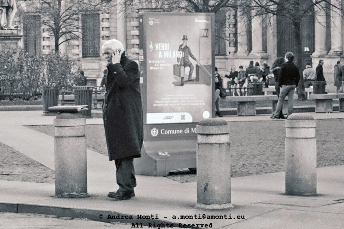
W Verdi
Milan rewards you when you walk slowly. I turned a corner and found a living quotation mark to a poster: an elderly man paused beneath a billboard of a stern, bearded face—Giuseppe Verdi by way of contemporary graphic design. The likeness was uncanny enough to make the old slogan in my head—Viva Verdi—mutate into “W Verdi,” a wink at how public imagery and real life can rhyme.
I built the frame around that rhyme. The poster anchors the top-right quadrant while the man occupies the lower-left, a diagonal conversation that keeps the eye ping-ponging across the picture. I left generous negative space to let the pairing breathe; too tight and it would feel like a sight gag, too loose and the joke would evaporate. The street lines and façade edges act as quiet guides toward the hinge where the two faces meet.
Technically, it’s a candid balancing act. Light was mixed—cool shade on the pavement, warmer spill on the billboard—so I exposed for the highlights in the print to hold typography and skin texture, letting the street fall a half-stop down. That choice protects detail in the poster without crushing the shadows around the man’s coat. A moderate focal length keeps perspective natural yet compresses just enough to flatten the poster and the passer-by into a single plane, which is essential to making the resemblance land. Depth of field is deliberate: sharp on the two “portraits,” with a gentle falloff to keep passing clutter from hijacking the scene.
If I’m critical, the background carries a few fussy elements I’d rather have excluded—a stray sign and a sliver of bright storefront on the edge—but the timing of the man’s profile, chin lifted to mirror the maestro’s, earns their keep. The picture isn’t about worshipping the great composer; it’s about the small coincidences that make a city sing. On this corner, for a heartbeat, Milan staged its own duet.