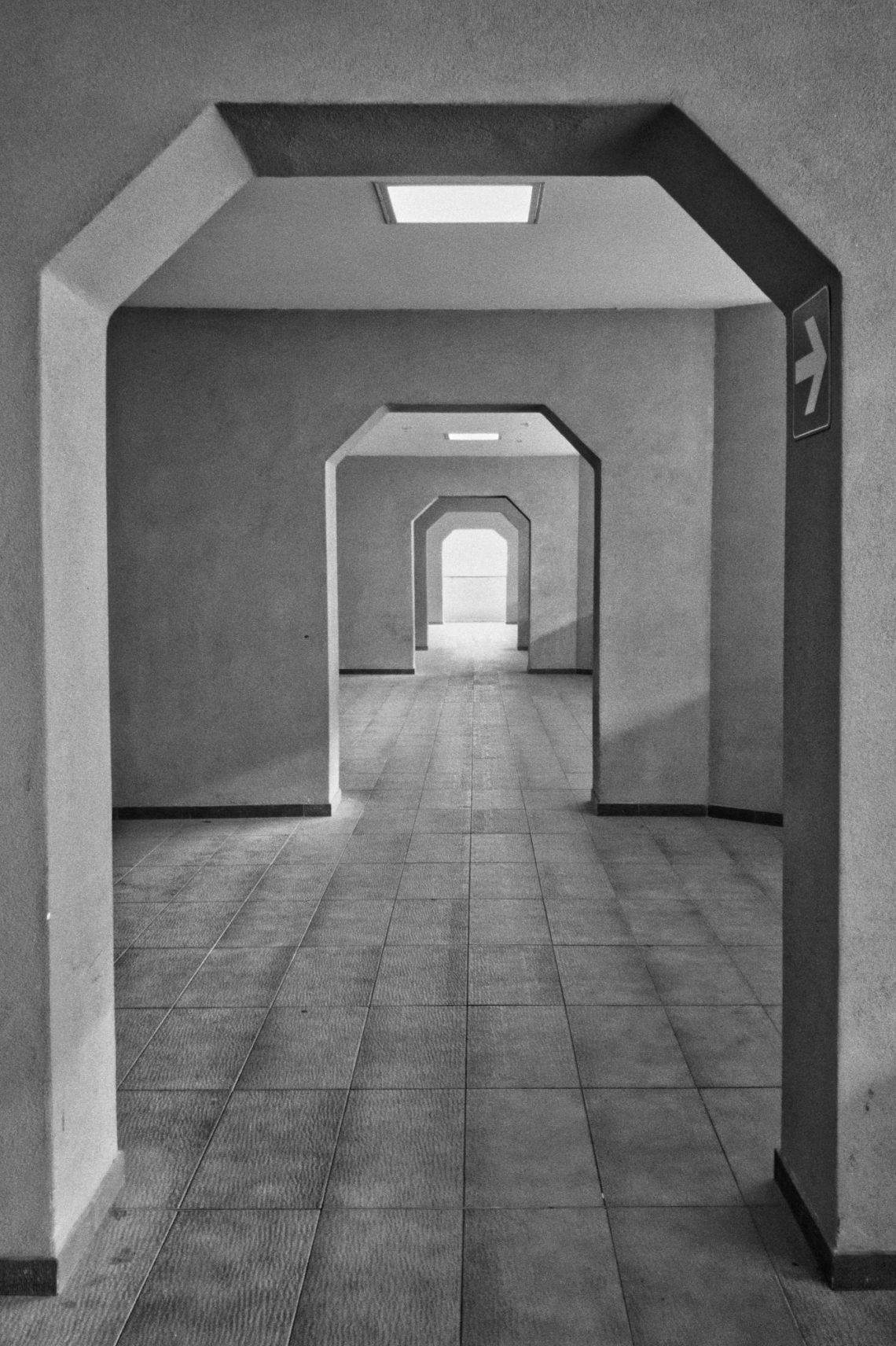
The Gate to the Appeal
Inside the Court of Appeals, a lobby serves more as a transition than a destination. The architecture is stripped of ornament—pure function, no decorative intent—yet the repeated octagonal frames create an unintended visual rhythm. Each opening leads to another, and then another, until the corridor seems to extend beyond its physical limits.
What drew me to the scene was the quiet precision of these shapes. They’re not dramatic, but they impose order. The light at the far end, brighter and slightly softer than the interior illumination, acts as a vanishing point that pulls the viewer forward. It lends the space a faint sense of expectation, as though something awaits at the end even if the destination is just another hallway.
Technically, the image benefits from its simplicity. The monochrome treatment emphasises structure rather than colour, which suits the subject. The tones are kept within a narrow range—light greys, mid-tones, and soft shadows—avoiding heavy contrast that would distort the calmness of the space. The exposure preserves texture in the tiled floor and the matte walls, giving the surfaces enough clarity to feel tactile without overwhelming the composition.
The geometry does most of the work. The arches recede in perfect alignment, creating a forced perspective that suggests depth and stillness simultaneously. The small exit sign on the right breaks the symmetry just enough to remind us this is a functional public space, not an abstract composition. Without that detail, the corridor might feel too detached from its purpose.