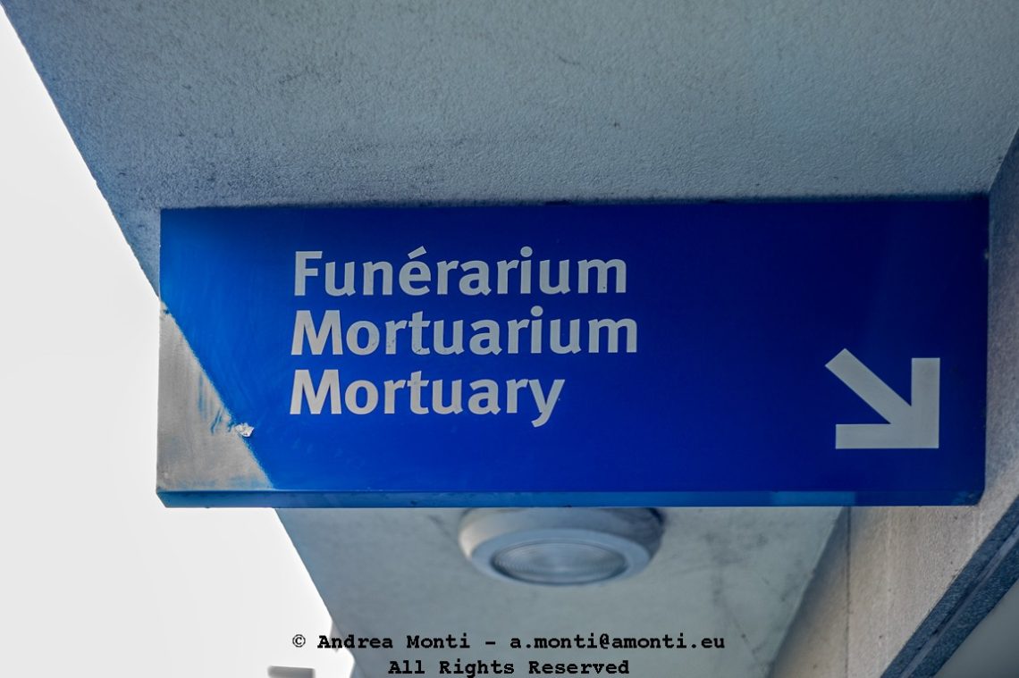
Just In Case
Should you have some doubt, by reading the banner you can’t be mistaken.
Clarity can be a virtue, even when it delivers its message with the blunt weight of inevitability. Here, a simple blue sign announces the location of the mortuary—not just once, but three times, in three languages. French, Latin, English. No ambiguity, no chance of misunderstanding. Just in case.
The composition frames the sign against the muted greys of the surrounding architecture, a deliberate choice to strip away distractions. The words stand out, rendered in stark, functional typography, their neutrality belying the emotional weight of the place they indicate.
Photography thrives on layers of meaning, and here the pun embedded in the title meets the matter-of-factness of the image. It’s a reminder of how language, repetition, and translation can both inform and unsettle. Whether you approach it as a practical guide or as a quiet memento mori, the destination is unmissable—linguistically, geographically, and philosophically.