-
Cognitive Dissonance
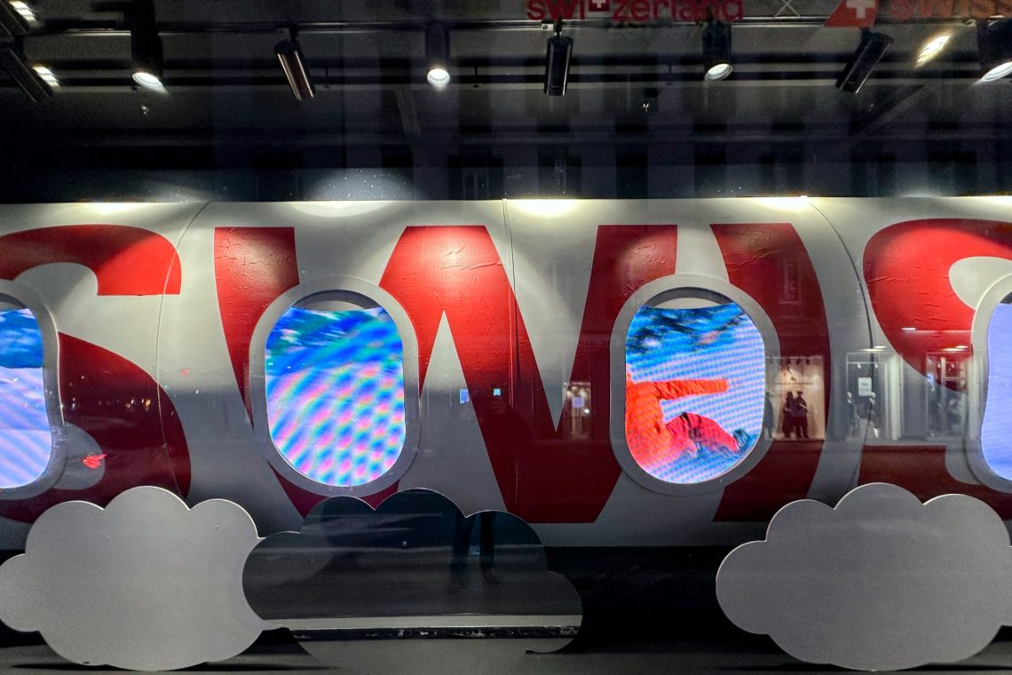
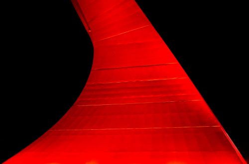
In advertising, sometimes, disregard for reality is a deliberate choice because the aim is to pique the viewer’s curiosity no matter what. At other times, though, it is the result of cognitive dissonance leading to mismatched reality’s depiction, as in the case of the prop in this photo, which I took at La Rinascente in Rome, meant to work as an ad for Swiss International Air Lines and Switzerland as a winter touristic location. At first, I didn’t understand what was wrong with it. The idea looked fairly average —ordinary, I would say: a plane’s fuselage with windows, and videos were shown as if they were the outside view that…
-
On Prizes and Awards (a Long and Tiring Musing)
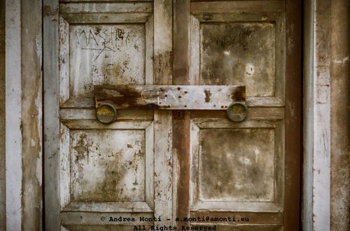
Prizes and awards are ubiquitous also in the photography world. There is an award for everything, and I wouldn’t be suprised to discover an award for the best photo award as well. When we’re just starting out on our photographic journey, it’s natural to think about entering a competition. I am not an exception, in fact I tried a few myself and I also got one honorable mention for the photo featuring this post in a competition organised by a local chapter of the Italian Photoamateur Association (FIAF).
-
Autumn, Colour, Daily photo, PhotoCritics, Photography, Spring, Street Photography, Summer, Technique, Winter
Make Sense (or: Meaning is in the Eye of the Beholder)
I am a big fan of Jim Hall. A god of the Jazz Olympus, he was an amazing guitar player and played (i.e. lived) according to a simple but effective maxim: make musical sense. He jotted it on a scrap of paper and stashed it in his guitar case, so, whenever he took the instrument out, he was reminded to follow the advice. And he did it. This is an excellent advice also in photography and I do my best to follow it, also if I don’t always get it right for a number of reasons, the main one being that meaning is in the eye of the beholder as…
-
Some odd outcomes from a photo recovering attempt using an AI
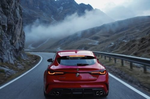
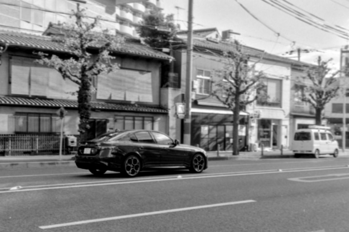
I was curious to see how an AI would handle a bad photo, so I uploaded this black-and-white shot taken in the area around Kyoto Station with my Nikon 35TI. Initially published on 35mmc.com. The photo itself —the one published as featured image— it’s part of a long term project to show the presence of Alfa Romeo (a brand I’m a big fan of) in the Japanese streets. It isn’t anything special, but I needed a starting point (the worse, the better) so, after having uploaded this poor shot, I prompted the software like this: As a professional in photo restoration and post production restore this photograph of an Alfa…
-
On Tips’n Tricks to ‘take you photos to the next level’
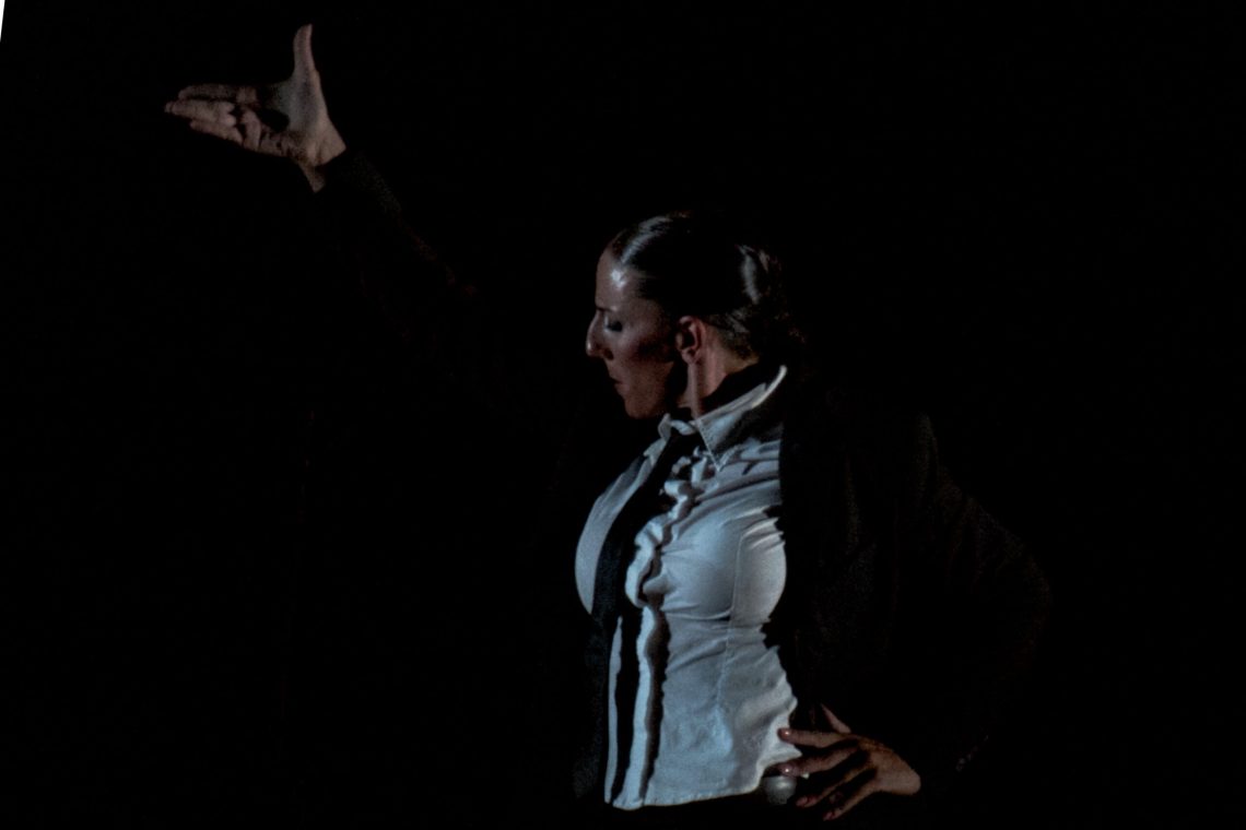
I recently asked a friend, who works on the editorial side of the music industry, to share his thoughts on one of my photographs taken during a flamenco concert. His response was a deep and thorough analysis, which I will spare the readers in full. In brief, however, he praised the lighting as particularly effective for flamenco photography, noting how the chiaroscuro effect recalls the classical paintings of Caravaggio. Regarding the composition, he observed that the bailaora’s body fills the frame dynamically, without ever feeling cramped. In his conclusion, he remarked that the image captures the very soul of flamenco. As flattering as this commentary was, I must admit that none…
-
Creativity vs Originality
Is the photo above creative? Is it original? Well… yes and no. It is certainly original because I ‘in person’ took it, and it is creative because – regardless of the aesthetic result – I took the time to arrange all the elements (composition, light, etc.) in a coherent moment —and I have the film negative to prove it. On the other hand, it is neither original —as in ‘unique’— nor creative because the same photo can be found here and maybe elsewhere on the Internet. Obviously, the linked photo it is not ‘the’ same as mine, because it is clear that they were taken at different times and places (mine was…
-
Easy To Shoot?
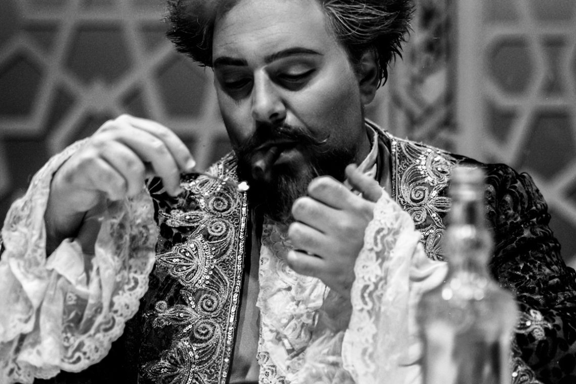
This picture might look “ordinary” but for the fact that I shot it with a rangefinder film camera (guess which?) during the scene change between to acts of a theatre play. Scene assistants were placing the furnitures, actors were trying to focus on their parts, there was no time (and place) to design a proper composition and set the camera. No autofocus, no real-time exposure and white-balance setting. Maybe I have been lucky capturing the match flame close to the cigar, maybe it was because of “muscle memory”, but I did it nonetheless. Problem is that I could not be sure if I succeeded until, one week later, I saw…
-
Meaning in Photography
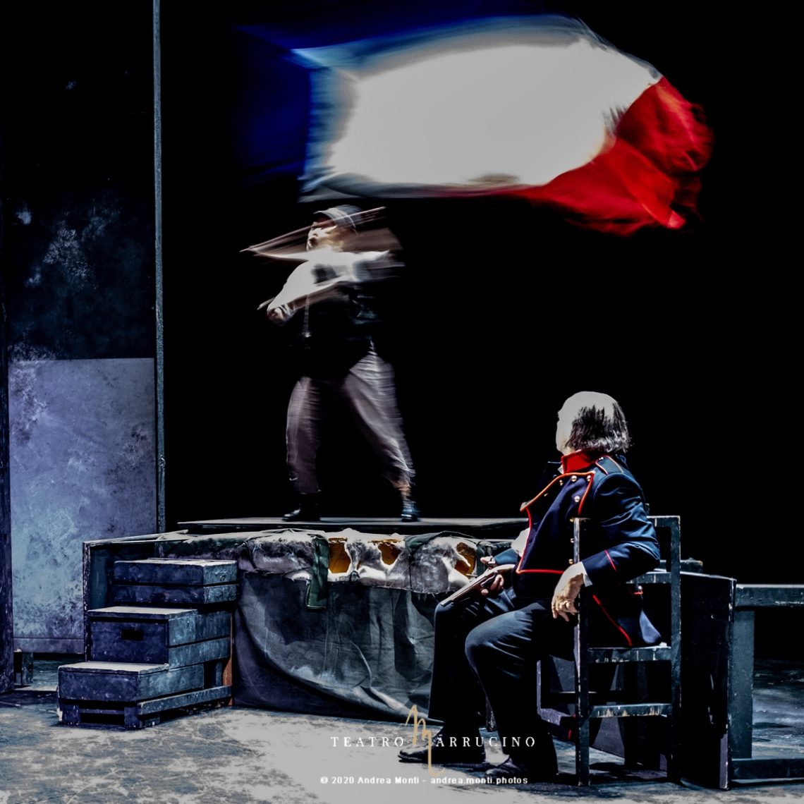
In this picture, taken during the reportage I did for the Teatro Marrucino’s I Miserabili, an old and exhausted fighter rests while a young citoyen waves the French flag defying the fire of the royalists. The strength of the picture is in the dialectics created by the two protagonists, hinting at a “relay” between an old man that “gave all”, resting while a young man steps in.
-
Denegata Justitia
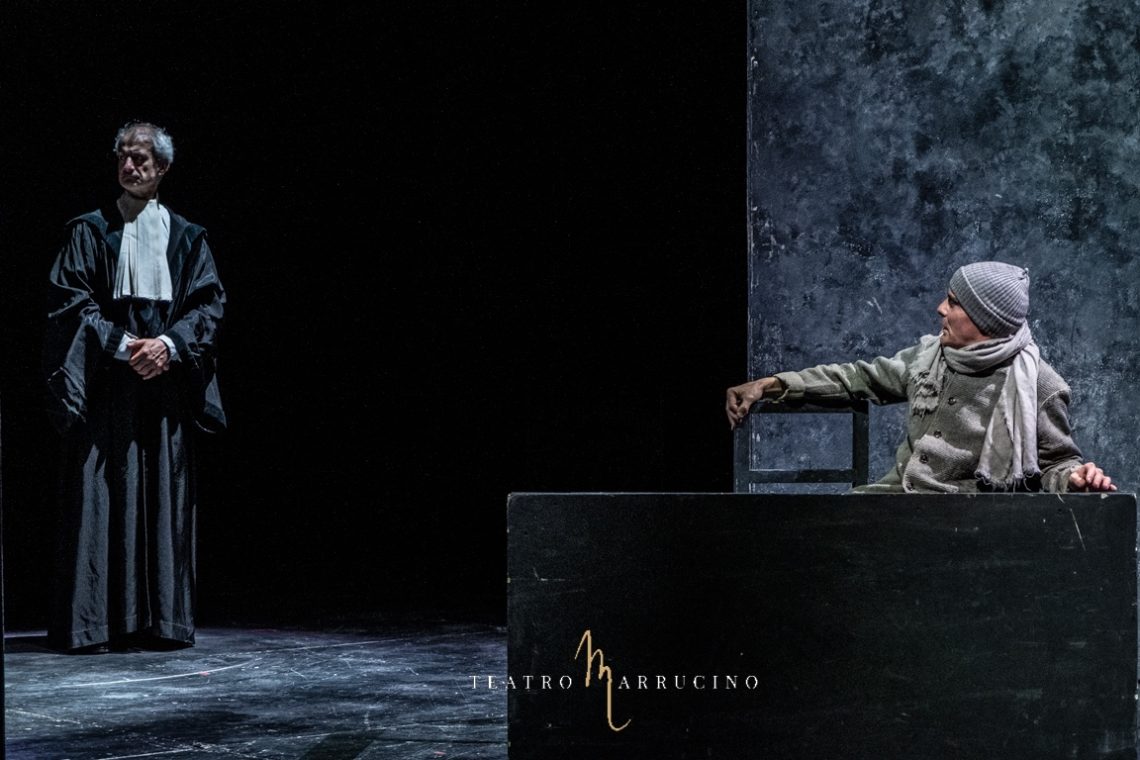
Sometimes a picture acquires a meaning that goes beyond the original intent of the photographer. In this case, taken from a reportage I did for Victor Hugo’s Les Miserables featured at Teatro Marrrucino, in Chieti, the photography becomes the archetype of the denegata Justitia. The defendant asks to speak, the justice stares elsewhere.
-
Breaking the Fourth Wall
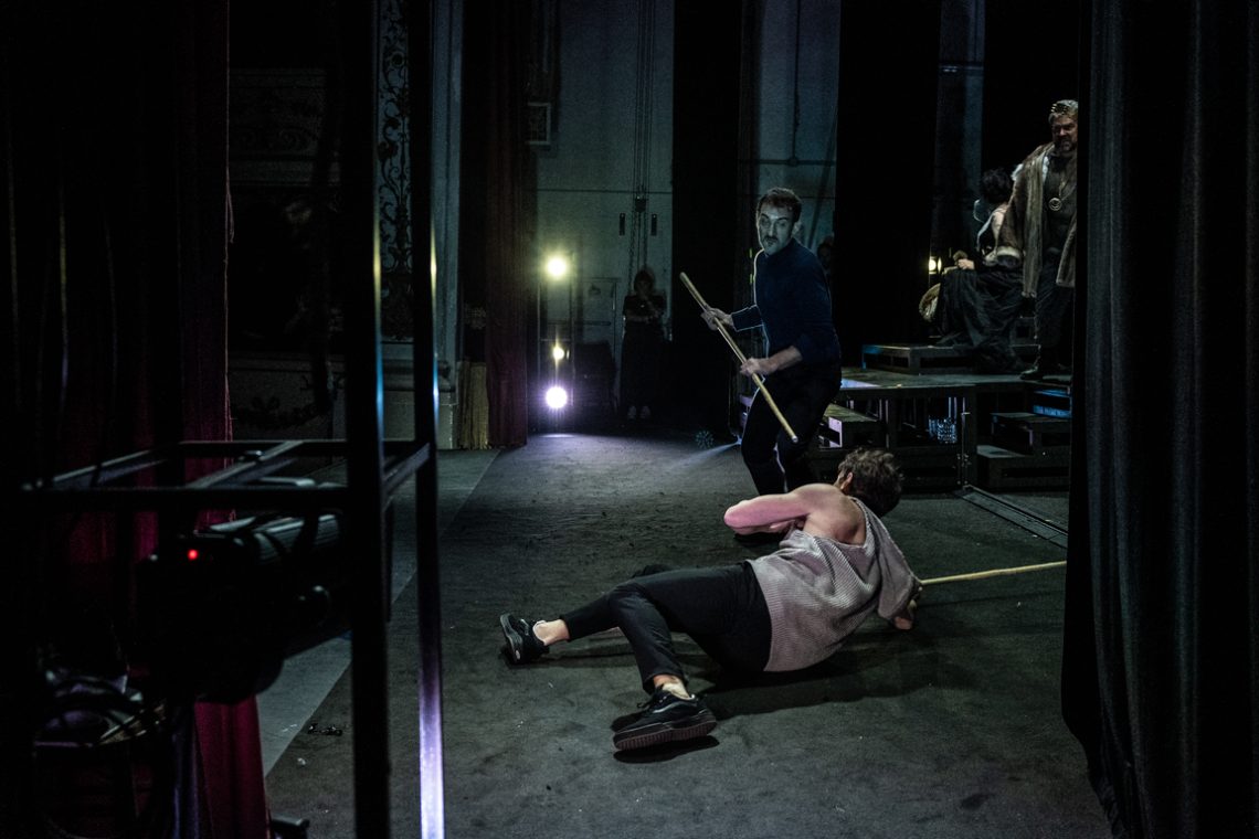
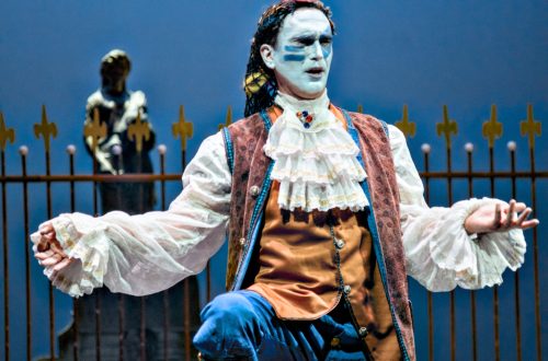
Shooting a play is challenging because you must be ready to seize ‘the moment’ and, at the very same time, think of unusual compositions to avoid the boring ‘frontal’ perspective. Shooting part of the reportage from the backstage of Hamlet, with Giorgio Pasotti and Mariangela D’Abbraccio directed by Francesco Tavassi I had the possibility to experiment the breaking of the fourth wall. This picture is one of the results.
-
Counter-intuitive Focus
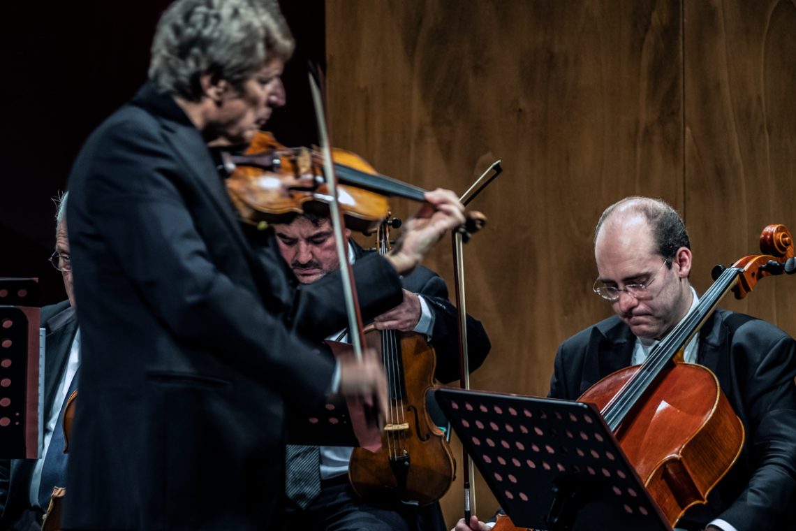
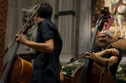
This photo I took during a reportage for a theatre hosting a concert of Uto Ughi shows a counter-intuitive use of focusing. Rather than go for the obvious option, the attention is shifted on the two musicians in the background capturing their concentration, with the leading violin blurred and conceptually, thus, ‘left behind’. The global effect is reinforced by a neat separation between the dark and light parts of the frame.
-
When Colour Helps Composition
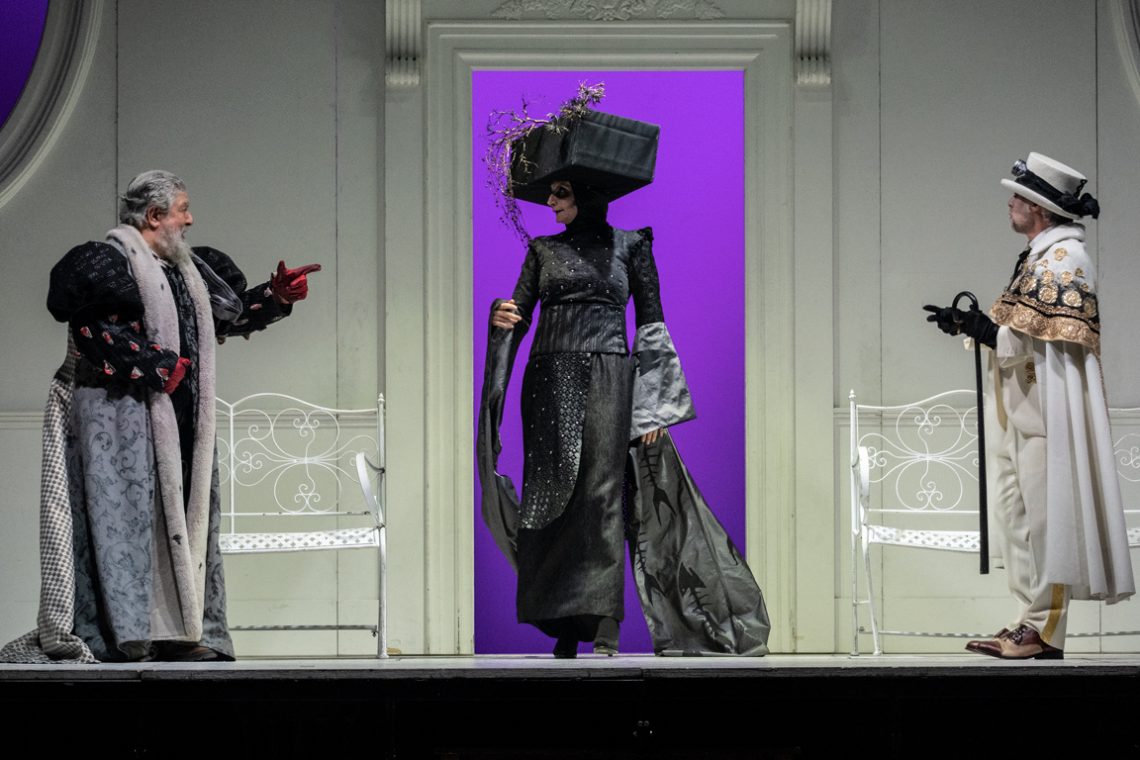
This photo I took during a reportage of Miseria e nobiltà – a classic of the Neapolitan comedy by Eduardo Scarpetta – in the mise en scene of Lello Arena e Luciano Melchionna gives a lot of insights on how composition works. The triangle designed by the two actors on the sides and the taller actress in the centre is reinforced by the colours of the costumes: black in the centre, white in the sides. Finally, the purple background behind the black figure enhances the eye-driving effect toward the centre.
-
Deadly Bored
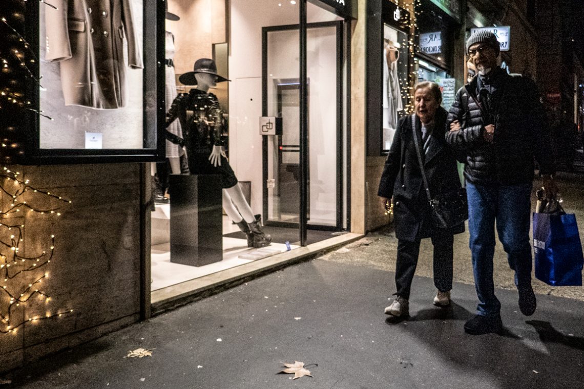
Once again, the meaning of this picture is counter intuitive and “made up” by the composition. The scene is seen from the perspective of the mannequin: at the end of a hard day spent sitting on the street-front, it (or he?) looks deadly bored and tries to kill the time before the shop closes by casually looking at the next passerby. The directional effect (from the mannequin to the passerby) is achieved by the diagonal connecting the tip of the hat, the feet of the mannequin and the cast of the shadow. Taken as a whole, these elements drive the eye from the mannequin to the persons and not vice-versa.
-
A Virtual Glance Dance
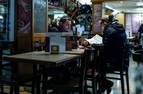
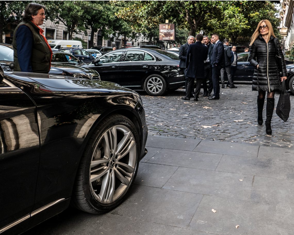
The essence of this photo is all in the glances of the protagonists. The man looks at the woman, the woman looks at the luxury car. The essence of this photo is all in the glances of the protagonists. The man looks at the woman, and the woman looks at the luxury car. It is this subtle game of glances that tells a story and turns the photography from a casual picture into something worth seeing. Once again, it is not relevant whether the people portrayed are actually involved in the “glance dance”, as what matters is the image to convey the meaning created by the overall result. This confirms…
-
The Power of Underexposing
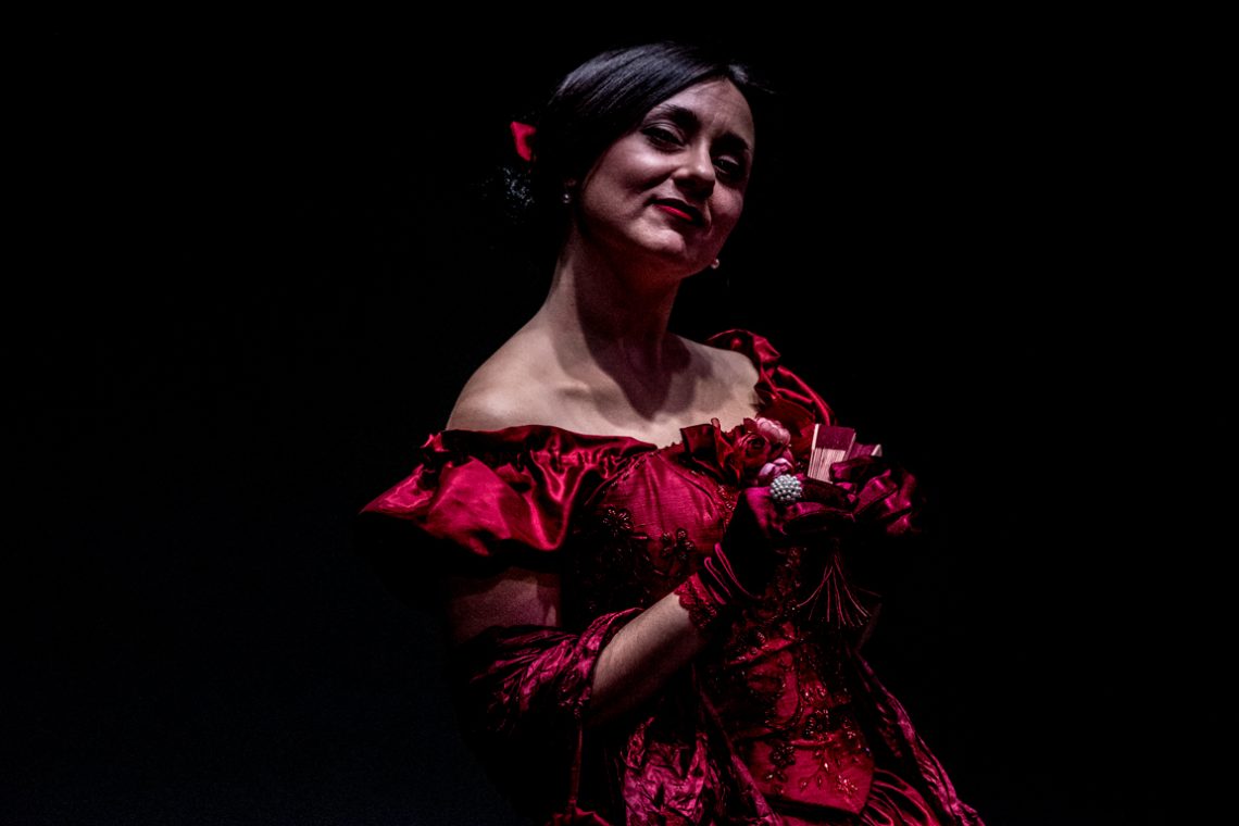
This portrait was built in the shadows. Underexposing by design meant letting darkness dominate the frame, allowing only the essentials — the face, the glint of an earring, the folds of the dress — to emerge. The result is a scene stripped of distraction, where every visible element has earned its place. The composition is weighted to the left, pulling the viewer into the subject’s gaze and leaving negative space to amplify the drama. The rich crimson of the gown benefits from the controlled exposure: under normal lighting, its details might have flattened into uniform red; here, the fabric’s texture and the embroidery’s sparkle gain depth from the way light…
-
When Tilted Photos Work
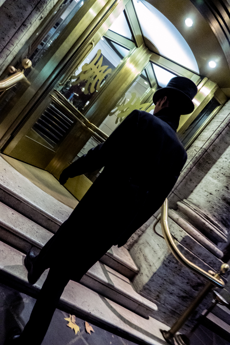
Tilted photos are very challenging to take. It is easy to break the composition, lose an essential part of the scene, or take a bad picture. Furthermore, making sense out of a diagonal orientation with a ratio that is not square (Hasselblad people, I can hear you loud and clear!) adds layers of difficulties. As counterintuitive as it might look, this photo taken in a “normal” orientation would have lost all its visual impact.
-
Good Plan, Poor Execution
The idea behind the composition is entirely correct. The mannequins and the girl form a triangle, as does the direction of the stares, conveying both a sense of symmetry and counterposing the liveness of a human being to the puppets’ lack of. A poor execution, though, led to the mannequins’ head cut, turning a visually appealing photography into a meaningless shot.
-
Light as Meaning Shifter
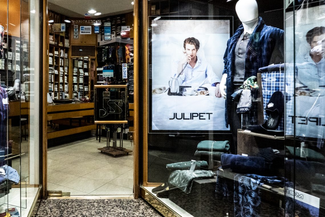
The original idea behind this picture was to match the emptiness of the shop with the facelessness of the mannequin posing as a store clerk, to convey a general feeling of depersonalization. Unfortunately, the big lightblot represented by the poster close to the mannequin catches the observer’s attention and reduce the effectiveness of the composition. Instead of connecting the mannequin with the internal part of the store thus making sense of the whole picture, the eye just “sees” an ad poster.
-
Photopanning in Rome
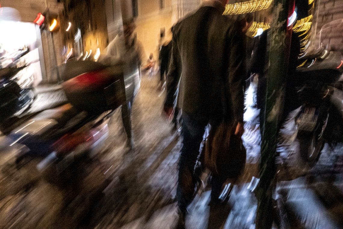
Photo panning is an art in itself and – when adequately practised – is able to deliver a stunning visual experience. In this picture (that has not been altered but for contrast and clarity) the overall experience reminds the Impressionism aesthetics.
-
Keep Out!
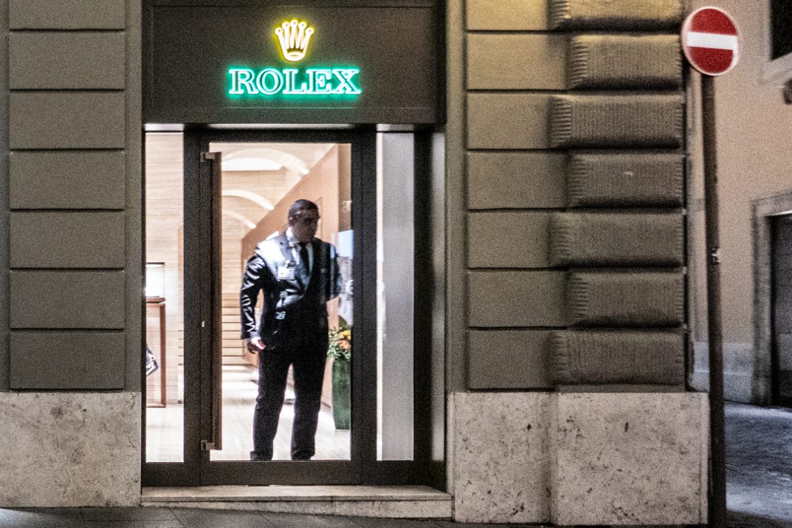
This photo conveys a message of “rejection”: first, a security guard who blocks access to the jewellery and then a signal of a prohibition of access reinforces the concept, thanks to a composition that guides the eye to a diagonal that goes from the bottom to the top, from left to right. Obviously, there is nothing “true” about all this because the overall result is the result of the organization of the spaces and the management of the perspective that allow connecting semantically elements that, in reality, have no relationship between them. It would have been enough to shoot from a different angle – or not juxtapose the security guard…
-
Evolution in Red
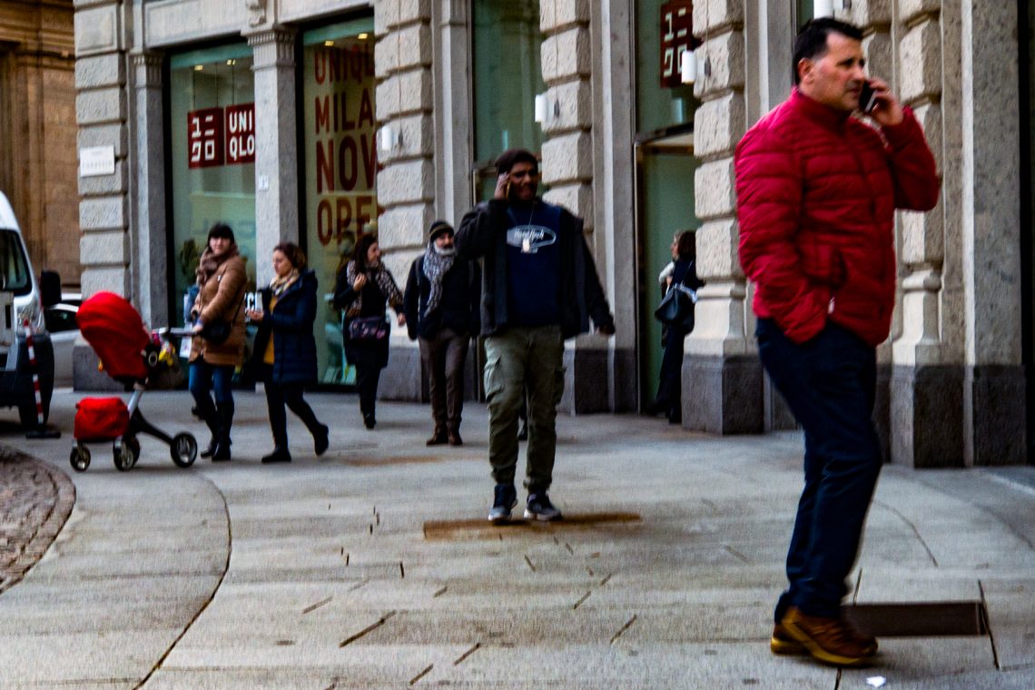
The frame unfolds on a Milanese street, a busy scene of people moving in different directions, yet bound by an unplanned visual thread — the colour red. On the far left, a stroller stands out, its fabric vivid against the muted tones of the pavement and stone façades. On the far right, a man in a red jacket, phone pressed to his ear, anchors the other end of the composition. Between them lies the space in which meaning is manufactured by the viewer: a perceived transition from childhood to adulthood, implied but never intended by reality itself. The technical construction supports this interplay. The image uses depth rather than focus…
