-
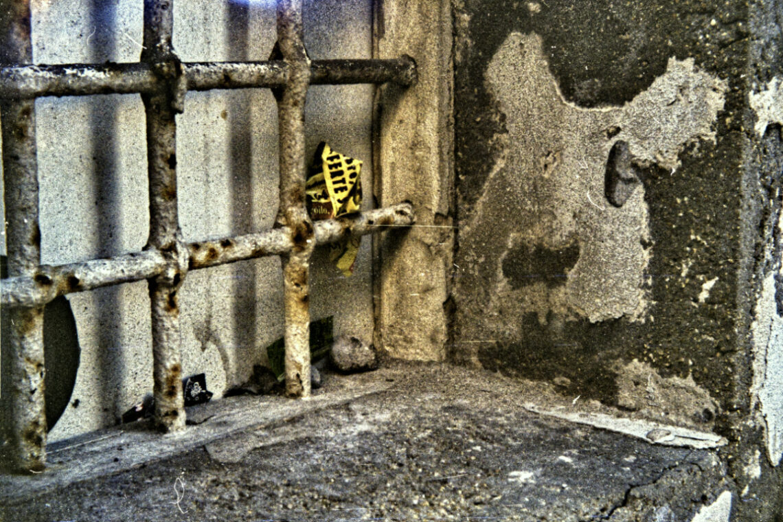
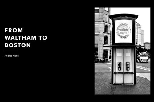
The Mystique of Film
I have resisted for a long time before giving out my two cents about the neverending debate ‘film vs digital’. I gave up after the next self-delusion I read in a well-known ‘semi-pro’ (purposely not linked) online photography magazine. It featured the umpteenth column explaining how shooting film ‘gets the experience back’, going full-manual ‘forces you thinking’, having limited exposures ‘pushes you to become more selective’, and all the usual motives connected with the choice of travelling on a horse-powered chariot instead of using a regular car. There is no need to shoot film to experience all that. Set the camera on full manual, disable OIS and IBIS, use a…
-
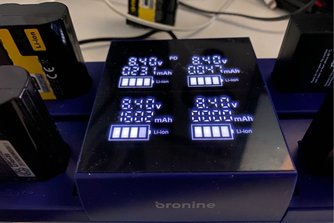
Bronine Volkit Camera Hub. Mixed feelings
The picture is self-eplaining. Patona batteries show odd parameters, while a Nikon original battery is more in line with the declared specs. This is by no way a reliable experiment, as the batteries’ state is not comparable. I will continue experimenting with different models because these results are pretty odd. However I can not blame Patona for the outcomes, for the bromine volkit itself might be defective and a fair comparison should be based upon batteries handled similarly.
-
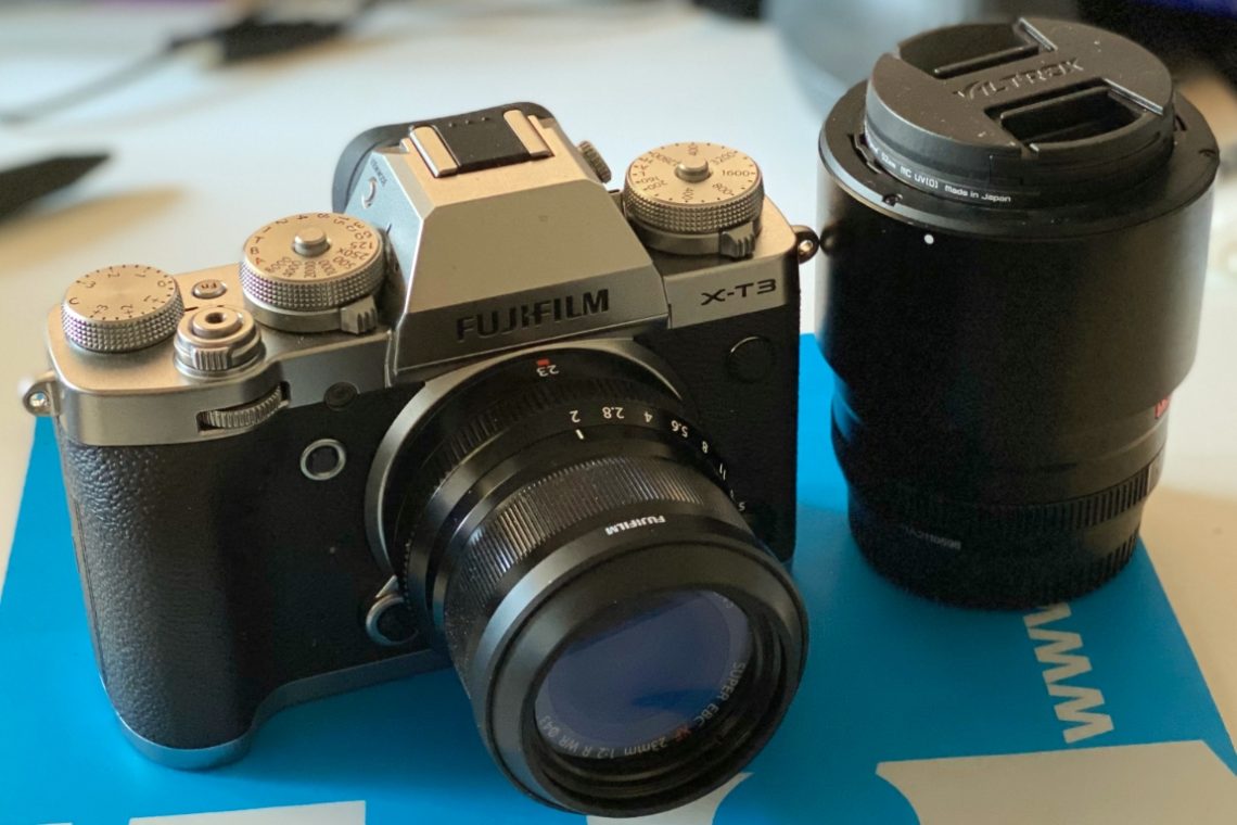
Fujifilm X-T3 Video Cheat Sheet
Although the Internet (and Youtube) are full of information about using the Fujifilm X-T3’s video capabilities —kudos to Chris Lee’s Pal2Tech Youtube channel for his incredible work— having a ‘quick ‘n’ dirty’ cheat sheet works better when all you need is information and not entertainment. This cheatsheet is organised according to (my personal) logic rather than to the camera’s menu order. It starts from the outside and goes deep down the intricacies of the various features. It also highlights some techicanilities that, although written in the manual, have not so obvious implications. A final word: this is a work-in-progress. More information will be added as soon as they become available.…
-
A Fountain’s Jet
I took this shot with a Viltrox AF 56/1,4 XF at full aperture. The focus reacted swiftly, and the colours’ rendition is pretty accurate. There is minimal colour fringing. However, it is more likely caused by air bubbles rather than by the lens itself. Like its bigger sibling, the AF 85/1,8 XF, this lens is excellent. Photographing water at f/1.4 is, in many ways, an exercise in precision gambling. The Viltrox AF 56mm f/1.4 XF, mounted on the Fuji X-T3, gave me a razor-thin depth of field to work with. At this aperture, there’s no room for hesitation – you either nail the plane of focus or lose the subject…
-
Using a 1960 Leica Elmarit 90/2,8 on a Fuji X-T3
In short The Leica Elmarit 90/2,8 works flawlessly on a Fujifilm X-T3, also with third-party adapters having no electronic connection with the camera. It provides excellent results, notwithstanding its age. Using this lens for street photography requires using focus-peaking or zone focus. In this latter case, proper training is necessary to correctly assess the distance from the subject. Image quality On the X-T3 the lens preserves its unique identity. Its colour rendering gives pictures a distinctive ‘retro’ character. The Elmarit shows an excellent resolving power: thin lines are visible and well defined. Chromatic aberration is visible at F2,8. It disappears from F4 and ahead. Anyway, the lens profile is well…
-
In praise of ‘cheap’ lenses for ‘pro’ works
Full disclosure: I have no relationship with Viltrox. I purchased the lenses with my own money and did not receive any request to write this post. I have recently discovered Viltrox, a Chinese manufacturer of lenses for the Fujifilm X-system. I am using the AF 85/1,8 II XF and the AF 56/1,4 XF and I am very satisfied by their performance. They are very good for ‘professional’ sessions, however, there are many online reviews that snobbishly rate these lenses as ‘amateur’, ‘non-professional’ or ‘first time portrait photography enthusiasts’ grade. I think that these reviews are unfair and here is why: What does ‘better’ mean? It is a known fact that…
-
Viltrox AF85/1,8 II XF. Reflexless?
I wanted to see how the Viltrox AF85/1,8 II XF handled flare, contrast, and chromatic control in the most demanding conditions: shooting straight into the sun. The result was surprising. No ghosts, no halos, no rainbow arcs. The field stayed clean, with the light falloff natural and evenly graduated. For a lens at this price, that’s more than acceptable — it’s exceptional. This is an Out-of-Camera Jpeg, shot at F8 and ISO 160, unprocessed but for the size. The results are Incredible for a lens that costs so little…
-
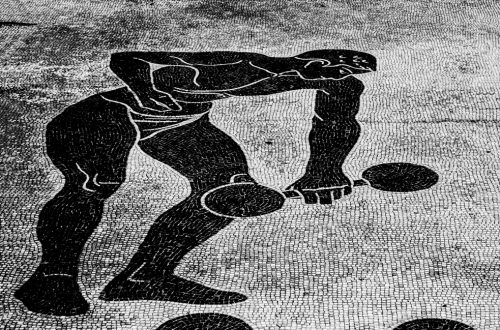
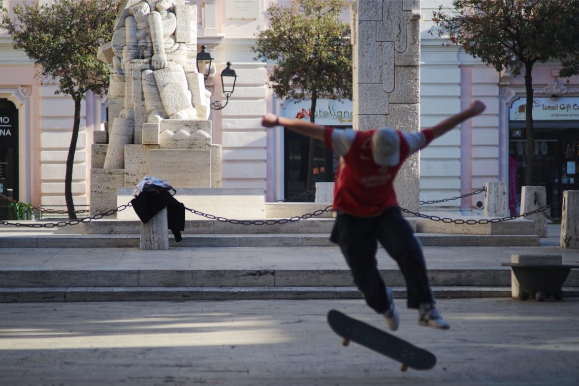
A Skater
Framing the whole statue would have made this photo better. The mistake was caused by the necessity to shoot fast, the lens’ field of view and the distance between the subject and the focal plane.
-
A Rudder
Pentax K-1/smc Pentax-A 135/2,8
-
Pentax SMC-A 50/1,7 – Nikkor 50/1,4 – Summicron 50/2
The left slice is taken with a Pentax K-1 and SMC-A 50/1,7, the centre with a Nikon D750 and a Nikkor 50/1,4, the right with a Fujifilm X-T3 and a Summicron 50/2. All the cameras were at their base ISO (100 for the Pentax and Nikon, 160 with the Fujifilm), at F2 and aperture priority. The K-1 and the X-T3 photos were shot in manual focus. Only the K-1 has IBIS stabilization. The jpg is taken in Affinity by slicing each OOC RAW file without post-processing.
-
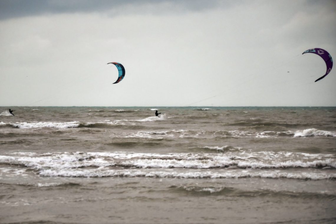
Kite Surfer Under Duress
The wind was already rising when I reached the beach. Grey sky, hard light, the kind of day most people read from behind a window. But the kitesurfers were already out—lines taut, boards skipping through the chop. What always strikes me about this scene isn’t just the colour of the kites against a flat sky, or the sharp angles they carve into the wind—it’s the resolve. They know what they’re getting into. The cold. The salt in their eyes. The bruises. And they do it anyway. Because this is when it’s real. That’s what drew me to raise the camera. The same drive, maybe. You don’t wait for golden hour.…
-
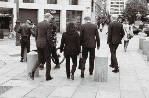
Galaxy S21 Ultra 5g. The difference between Marketing and Reality in Image Quality
To put it short, this is what you get by purchasing a Galaxy S21 Ultra 5g using the standard camera app: access to all four lenses is limited to jpg, 108megapixel resolution is limited to one lens (the one Samsung calls ‘wide’ or ‘1x’), RAW format is only availble in ‘PRO’ mode, limited to ‘ultrawide’ (0,6x) and ‘wide’ (1x), with no access to 108megpixel resolution. Samsung advertises the Galaxy S21 Ultra 5g by spinning its 108 megapixel camera. However, it does not make clear that the 108 megapixel resolution is not available in “PRO” mode, the only that records in raw. By contrast, this super resolution is available in normal…
-
A Fix for the Wikipedia Photos’ Copyright Scams?
As reported by Petapixel, a new form of copyright (better, ‘moral rights of author) scam hits photographer: the credit stealing on Wikipedia. In a nutshell, as everything on Wikipedia is editable, somebody started changing the photos’ ownership information from the original author to somebody else who, as Petapixel writes, get a series of ‘benefit’. As bad as it sounds, copyright protection on the Internet is a lost battle for an individual. Some services like Unsplash “turned the problem into an opportunity”. However it did not solve the issue in general terms. I’m seriously considering if just going back to a print-only sharing is a better way to handle pictures’ copyright,…
-
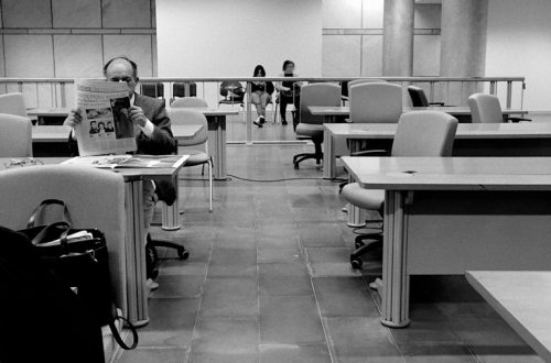
Easy To Shoot?
This picture might look “ordinary” but for the fact that I shot it with a rangefinder film camera (guess which?) during the scene change between to acts of a theatre play. Scene assistants were placing the furnitures, actors were trying to focus on their parts, there was no time (and place) to design a proper composition and set the camera. No autofocus, no real-time exposure and white-balance setting. Maybe I have been lucky capturing the match flame close to the cigar, maybe it was because of “muscle memory”, but I did it nonetheless. Problem is that I could not be sure if I succeeded until, one week later, I saw…
-
Fuji X-T2 records audio at 16bit/48Khz
Neither the user manual, nor the Youtube ‘experts’ tell this open secret: the X-T2 samples audio at 16bit. Although the sample rate is 48khz (a standard in video production) 16bit may not be enough to record (a minimum) professional grade audio. This is not a big deal for the rest of the humans, but If you want to ‘go pro’ or need to unleash your Gear Addiction Syndrome be advised that to have 24bit/48Khz audio you must switch to the X-T3.
-
Meaning in Photography
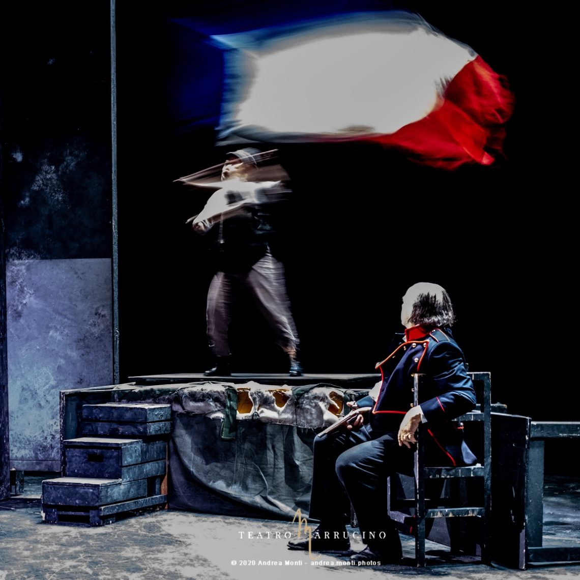
In this picture, taken during the reportage I did for the Teatro Marrucino’s I Miserabili, an old and exhausted fighter rests while a young citoyen waves the French flag defying the fire of the royalists. The strength of the picture is in the dialectics created by the two protagonists, hinting at a “relay” between an old man that “gave all”, resting while a young man steps in.
-
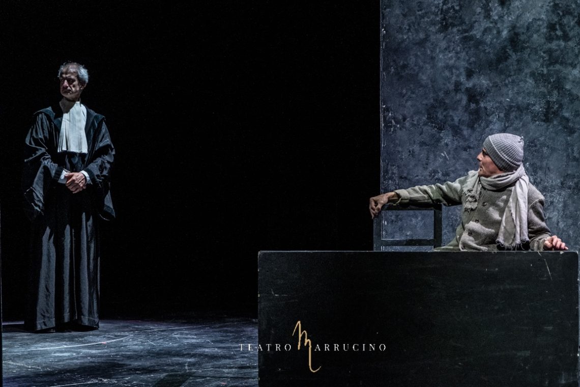
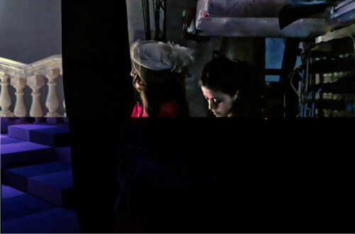
Denegata Justitia
Sometimes a picture acquires a meaning that goes beyond the original intent of the photographer. In this case, taken from a reportage I did for Victor Hugo’s Les Miserables featured at Teatro Marrrucino, in Chieti, the photography becomes the archetype of the denegata Justitia. The defendant asks to speak, the justice stares elsewhere.
-
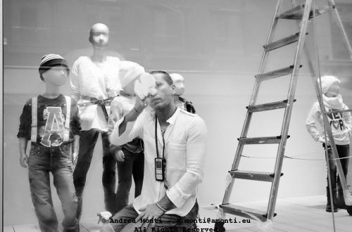
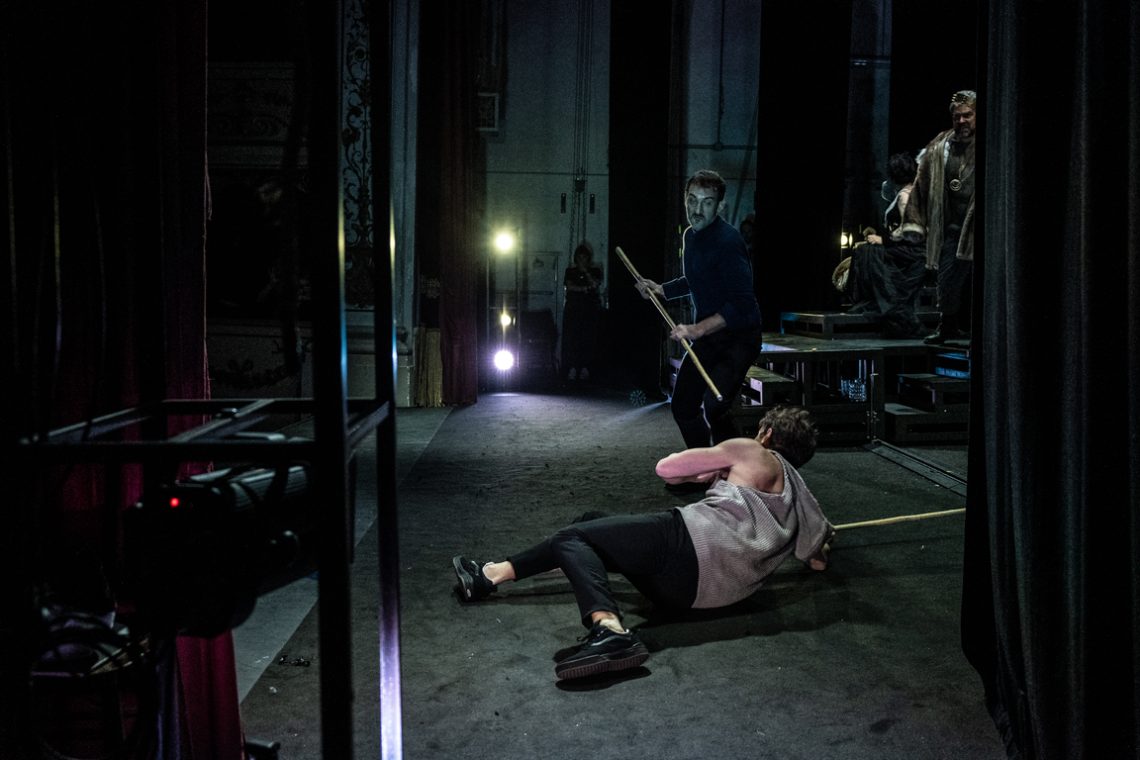
Breaking the Fourth Wall
Shooting a play is challenging because you must be ready to seize ‘the moment’ and, at the very same time, think of unusual compositions to avoid the boring ‘frontal’ perspective. Shooting part of the reportage from the backstage of Hamlet, with Giorgio Pasotti and Mariangela D’Abbraccio directed by Francesco Tavassi I had the possibility to experiment the breaking of the fourth wall. This picture is one of the results.
-
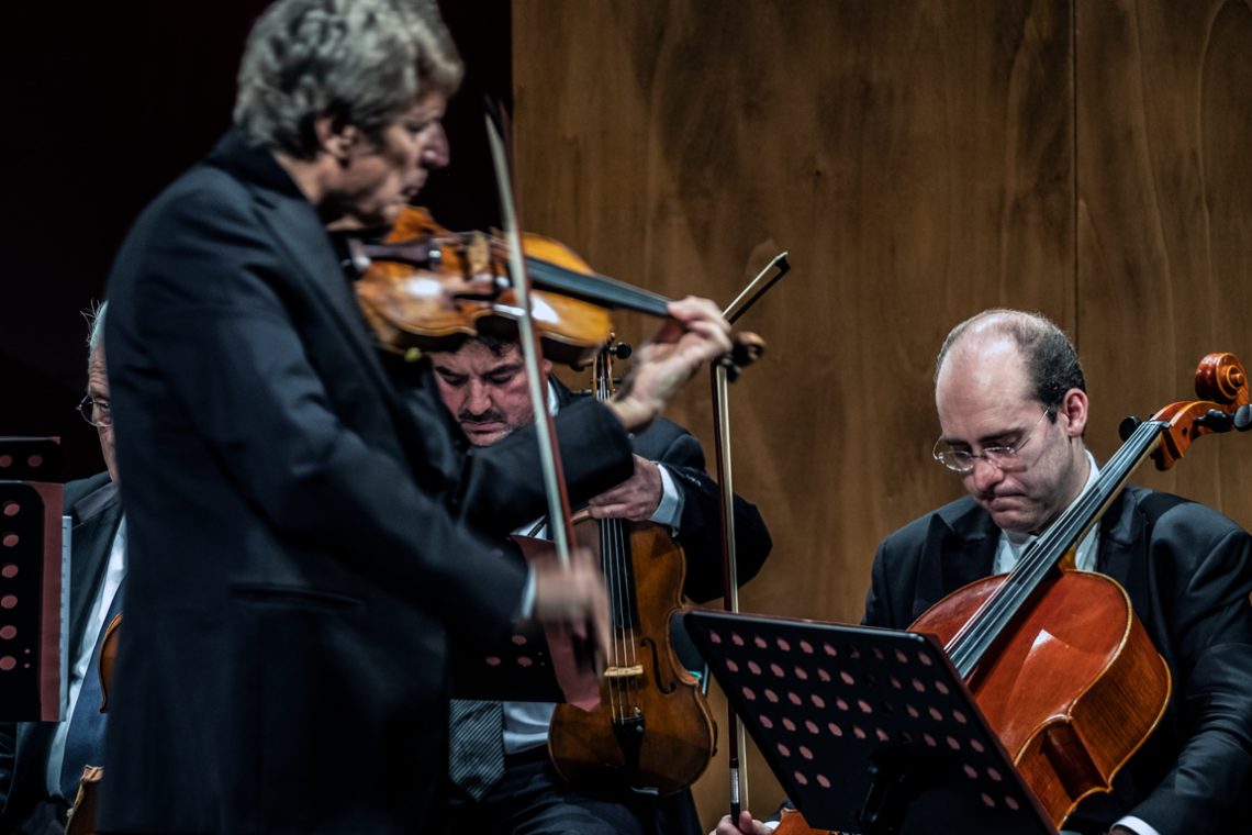
Counter-intuitive Focus
This photo I took during a reportage for a theatre hosting a concert of Uto Ughi shows a counter-intuitive use of focusing. Rather than go for the obvious option, the attention is shifted on the two musicians in the background capturing their concentration, with the leading violin blurred and conceptually, thus, ‘left behind’. The global effect is reinforced by a neat separation between the dark and light parts of the frame.
-
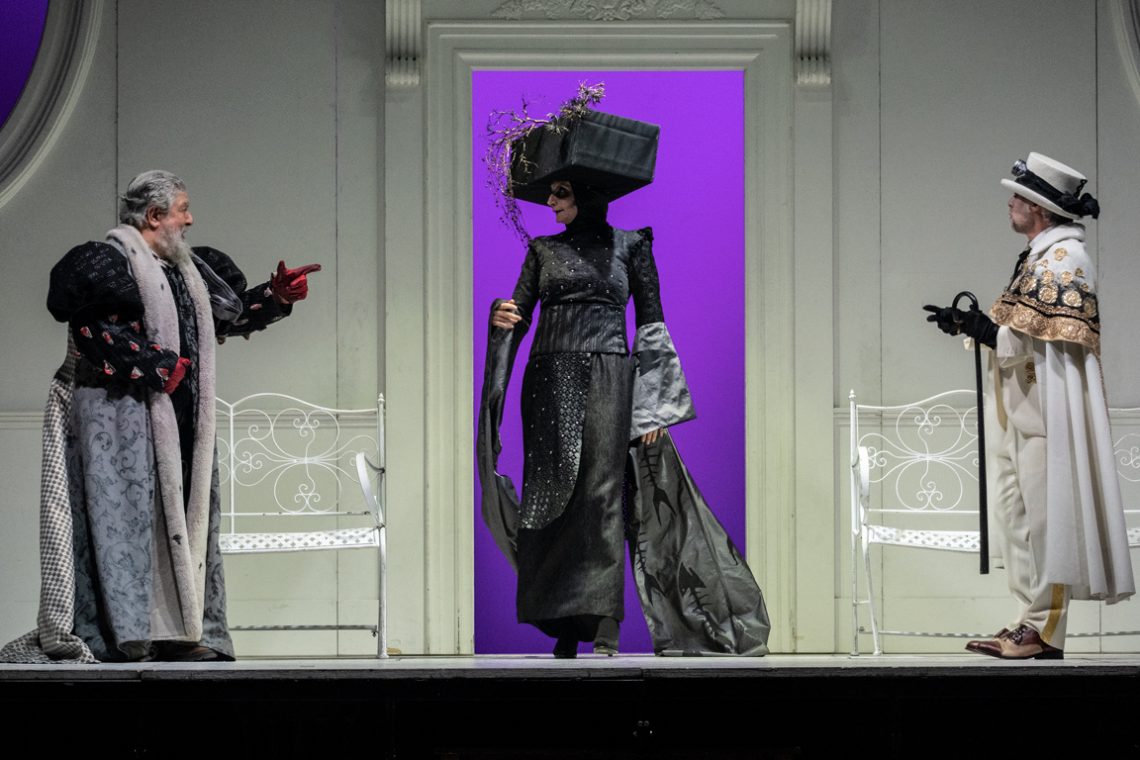
When Colour Helps Composition
This photo I took during a reportage of Miseria e nobiltà – a classic of the Neapolitan comedy by Eduardo Scarpetta – in the mise en scene of Lello Arena e Luciano Melchionna gives a lot of insights on how composition works. The triangle designed by the two actors on the sides and the taller actress in the centre is reinforced by the colours of the costumes: black in the centre, white in the sides. Finally, the purple background behind the black figure enhances the eye-driving effect toward the centre.
-
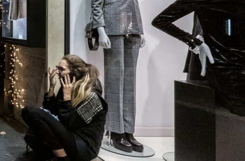
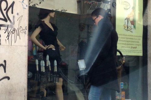
Deadly Bored
Once again, the meaning of this picture is counter intuitive and “made up” by the composition. The scene is seen from the perspective of the mannequin: at the end of a hard day spent sitting on the street-front, it (or he?) looks deadly bored and tries to kill the time before the shop closes by casually looking at the next passerby. The directional effect (from the mannequin to the passerby) is achieved by the diagonal connecting the tip of the hat, the feet of the mannequin and the cast of the shadow. Taken as a whole, these elements drive the eye from the mannequin to the persons and not vice-versa.
-
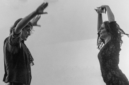
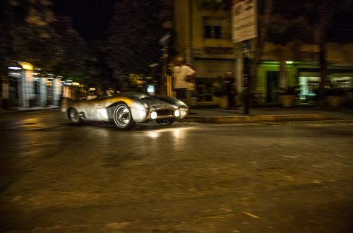
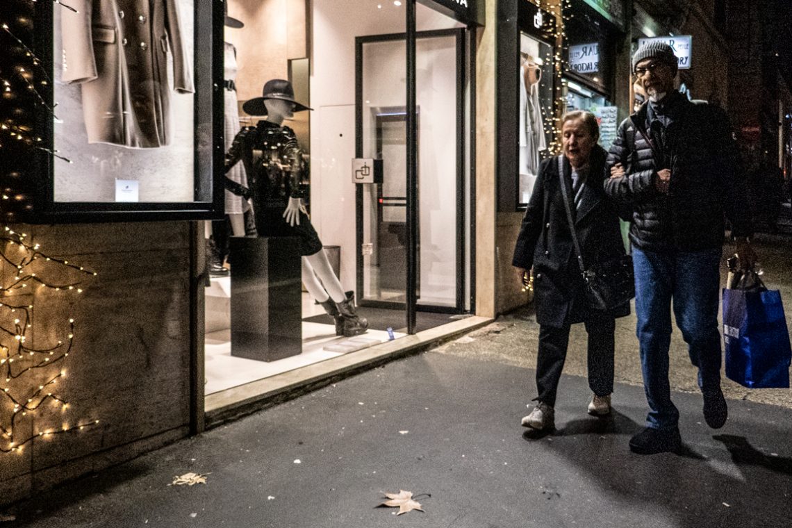
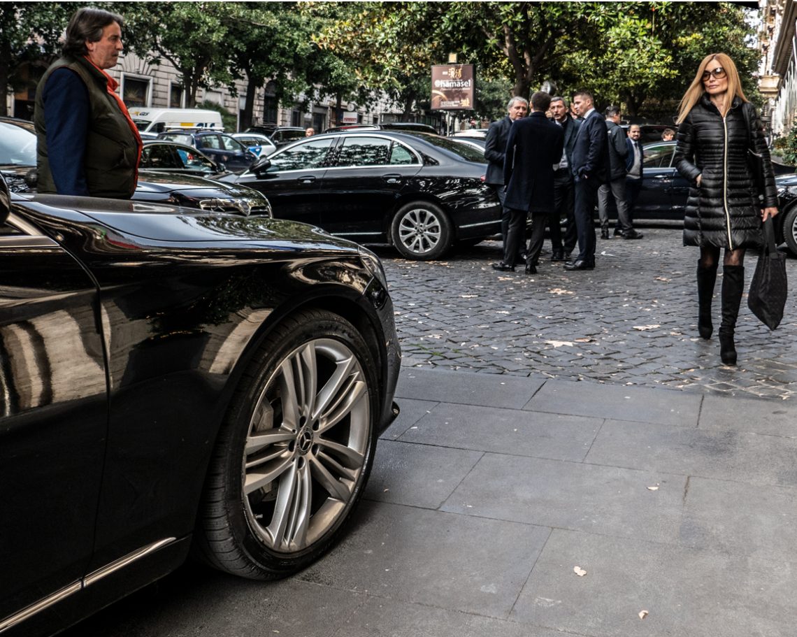
A Virtual Glance Dance
The essence of this photo is all in the glances of the protagonists. The man looks at the woman, the woman looks at the luxury car. The essence of this photo is all in the glances of the protagonists. The man looks at the woman, and the woman looks at the luxury car. It is this subtle game of glances that tells a story and turns the photography from a casual picture into something worth seeing. Once again, it is not relevant whether the people portrayed are actually involved in the “glance dance”, as what matters is the image to convey the meaning created by the overall result. This confirms…
-
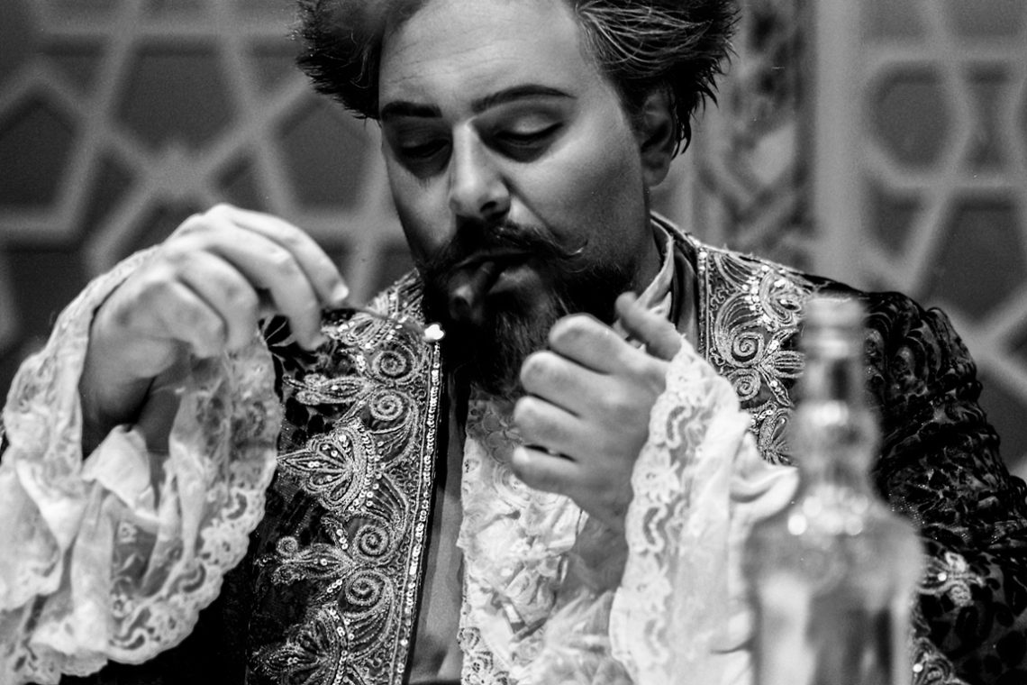
The Power of Underexposing
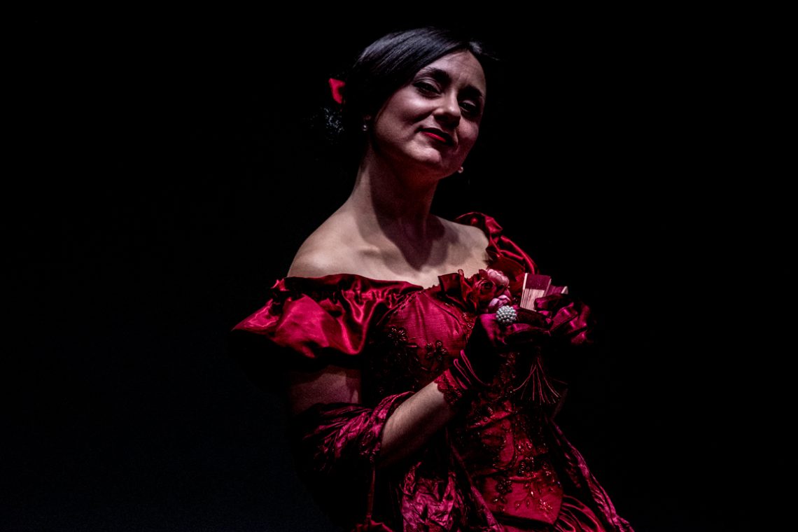
This portrait was built in the shadows. Underexposing by design meant letting darkness dominate the frame, allowing only the essentials — the face, the glint of an earring, the folds of the dress — to emerge. The result is a scene stripped of distraction, where every visible element has earned its place. The composition is weighted to the left, pulling the viewer into the subject’s gaze and leaving negative space to amplify the drama. The rich crimson of the gown benefits from the controlled exposure: under normal lighting, its details might have flattened into uniform red; here, the fabric’s texture and the embroidery’s sparkle gain depth from the way light…
-
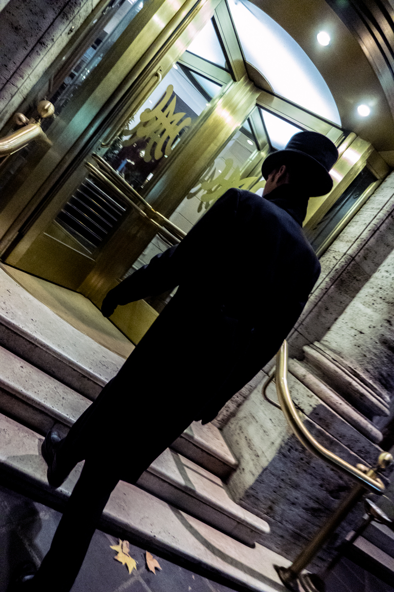
When Tilted Photos Work
Tilted photos are very challenging to take. It is easy to break the composition, lose an essential part of the scene, or take a bad picture. Furthermore, making sense out of a diagonal orientation with a ratio that is not square (Hasselblad people, I can hear you loud and clear!) adds layers of difficulties. As counterintuitive as it might look, this photo taken in a “normal” orientation would have lost all its visual impact.