-
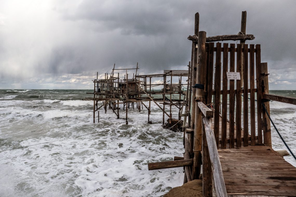
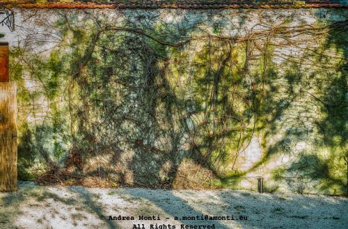
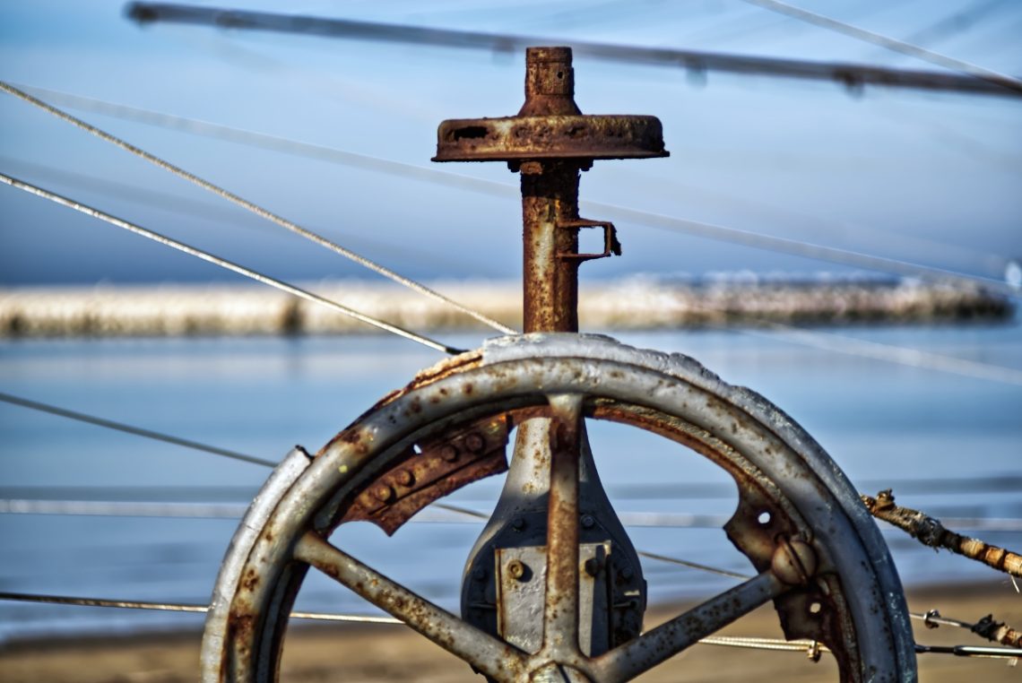
A ‘Trabocco’ on the Adriatic Sea
-
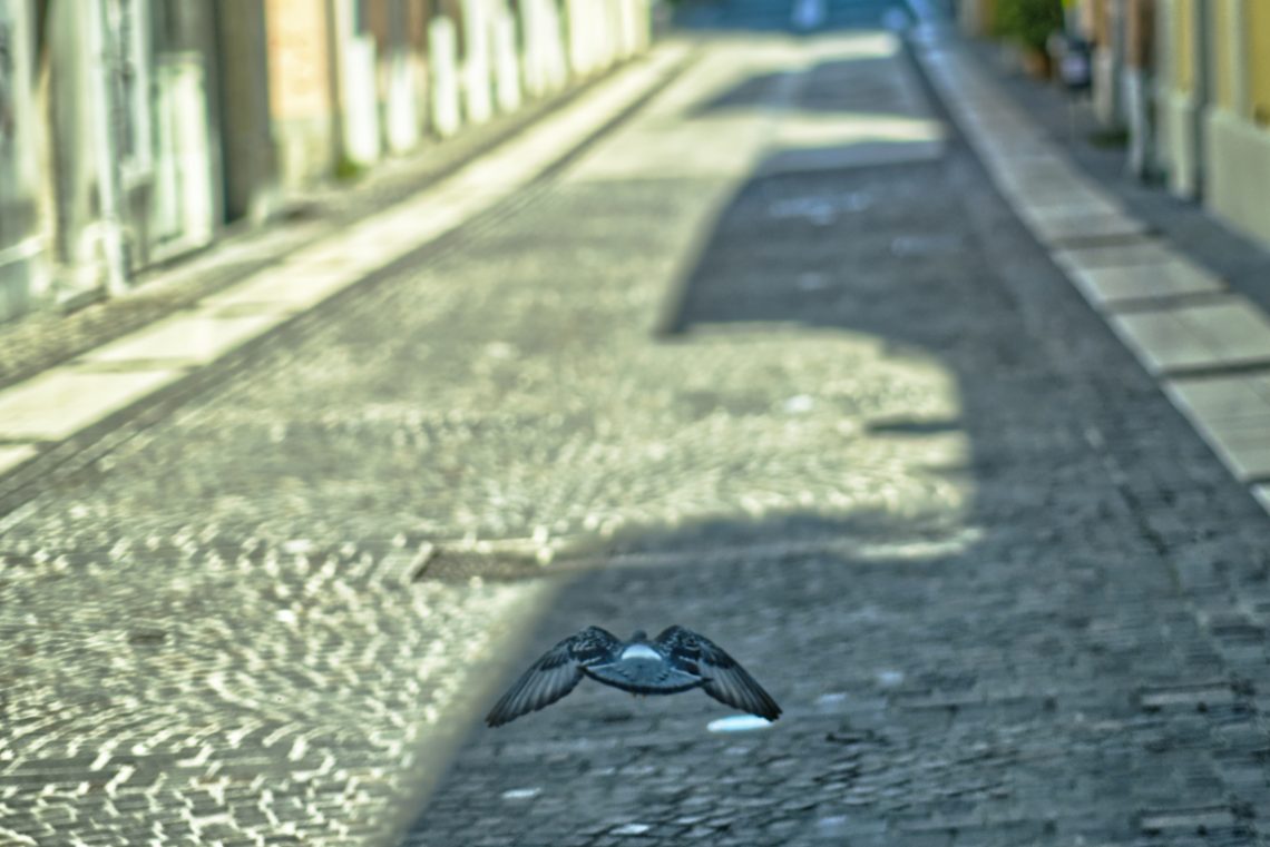
Taking-Off
This is a test for the Viltrox AF 56/1,4 XF’s autofocus. The pidgeon took-off suddenly and I just had to point and shoot. The lens behave fairly. I didn’t plan this shot—I reacted. The pigeon launched off the cobbles just ahead of me, wings outstretched, backlit by the fragmented morning light reflecting off the street. I tracked it instinctively and pressed the shutter a fraction before it left the frame. For a moment, everything aligned: subject, motion, light, and a surprising stillness in the middle of movement. The composition isn’t textbook. The bird isn’t centred—more like hovering toward the bottom third, wings drawing a wide V across the soft texture…
-
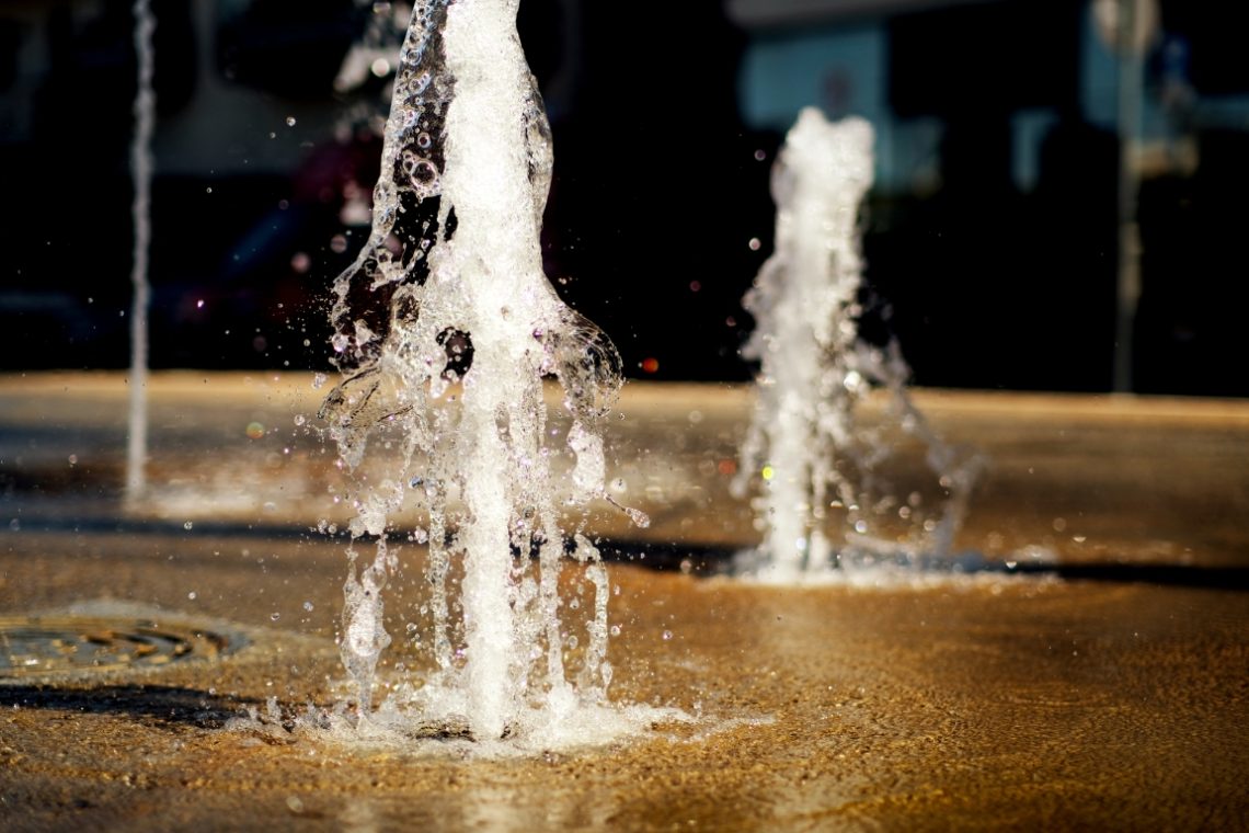
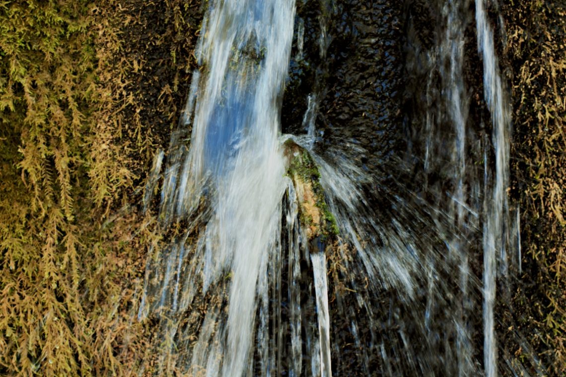
A Fountain’s Jet
I took this shot with a Viltrox AF 56/1,4 XF at full aperture. The focus reacted swiftly, and the colours’ rendition is pretty accurate. There is minimal colour fringing. However, it is more likely caused by air bubbles rather than by the lens itself. Like its bigger sibling, the AF 85/1,8 XF, this lens is excellent. Photographing water at f/1.4 is, in many ways, an exercise in precision gambling. The Viltrox AF 56mm f/1.4 XF, mounted on the Fuji X-T3, gave me a razor-thin depth of field to work with. At this aperture, there’s no room for hesitation – you either nail the plane of focus or lose the subject…
-
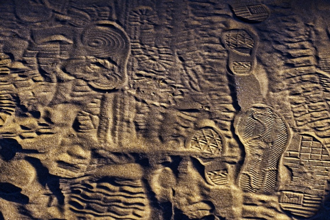
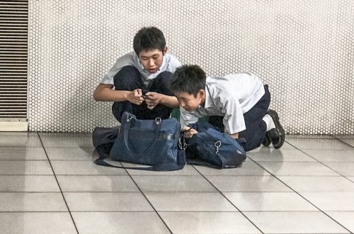
Footprints
-
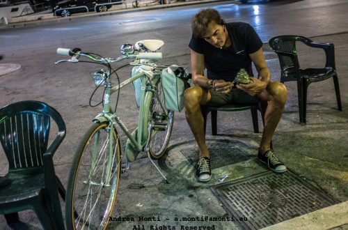
Deserved Rest
-
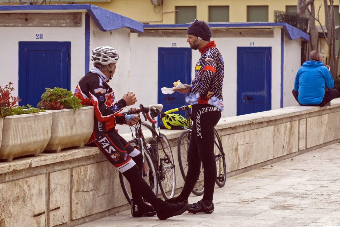
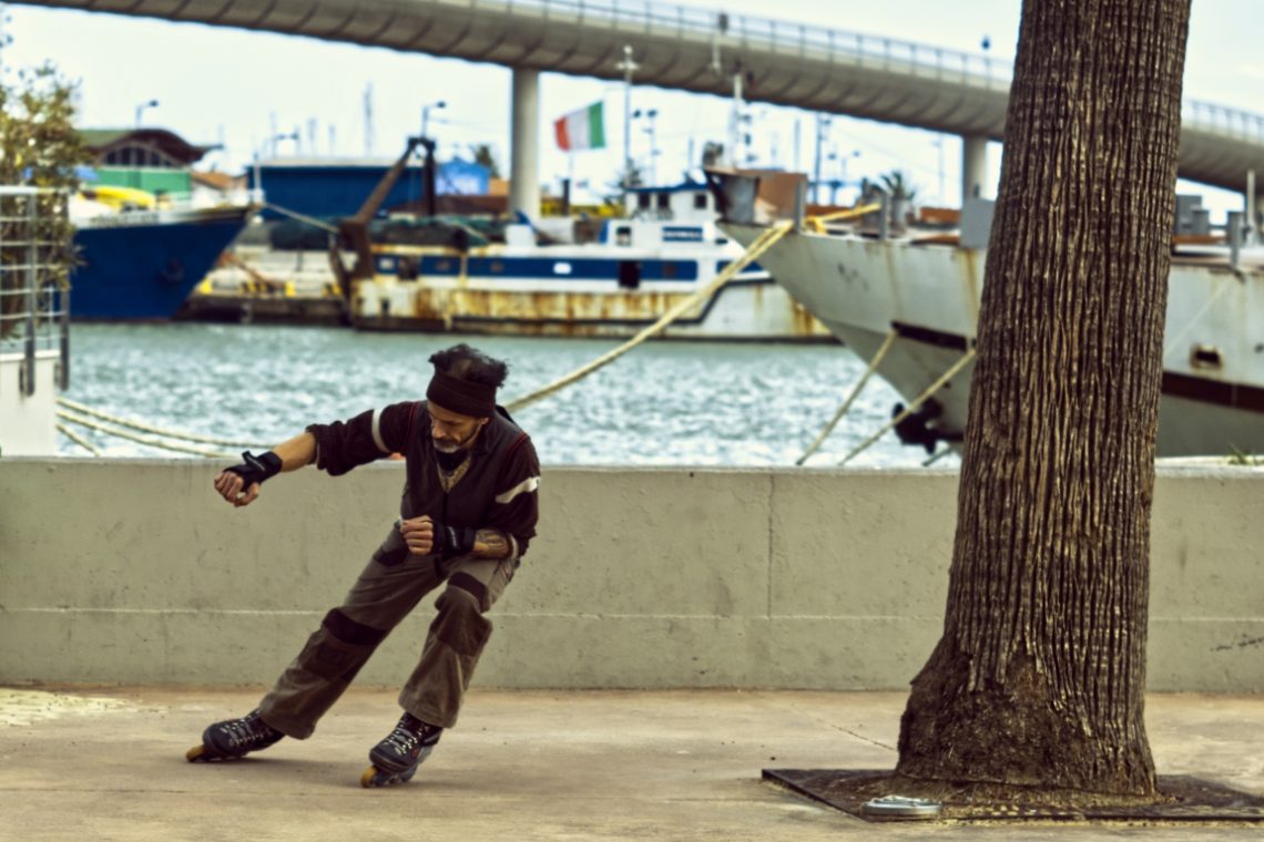
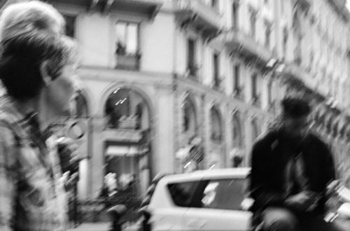
A Street-Skater on the Waterfront
I came across him by the harbour on a day when the wind carried the smell of salt and diesel from the moored fishing boats. He wasn’t performing for an audience—just skating alone, immersed in his own rhythm. His movements were sharp but fluid, somewhere between dance and martial art. I wanted to capture that moment when the body leans into balance, teetering on the edge of a fall but never crossing it. The setting presented an immediate visual contrast: the fluidity of his posture against the static, almost heavy backdrop of the docked ships. I framed him to the left, letting the background breathe, so that the masts, ropes,…
-
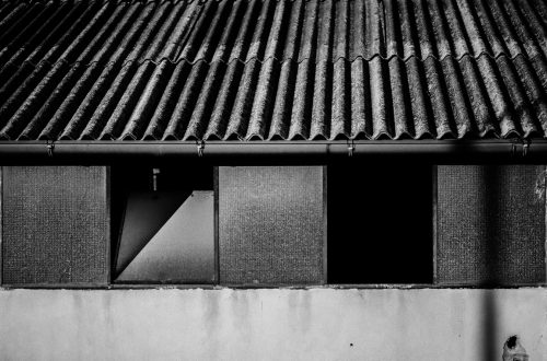
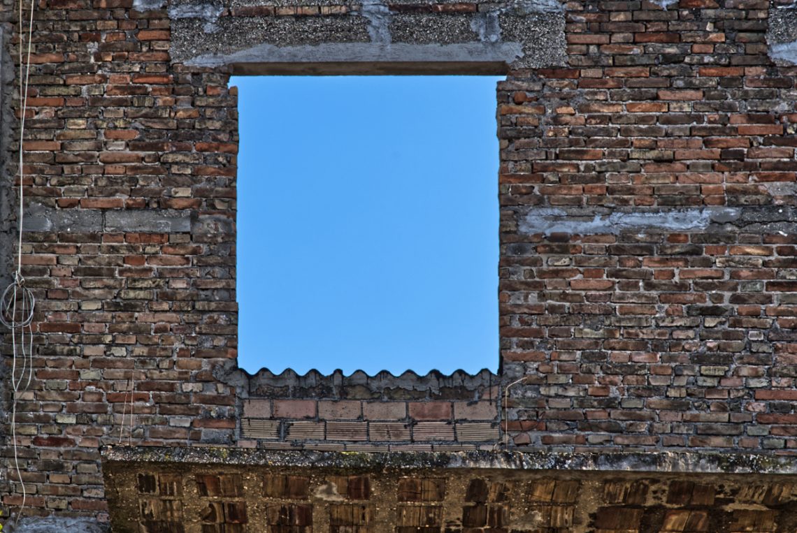
Open Interior
-
Splinter
-
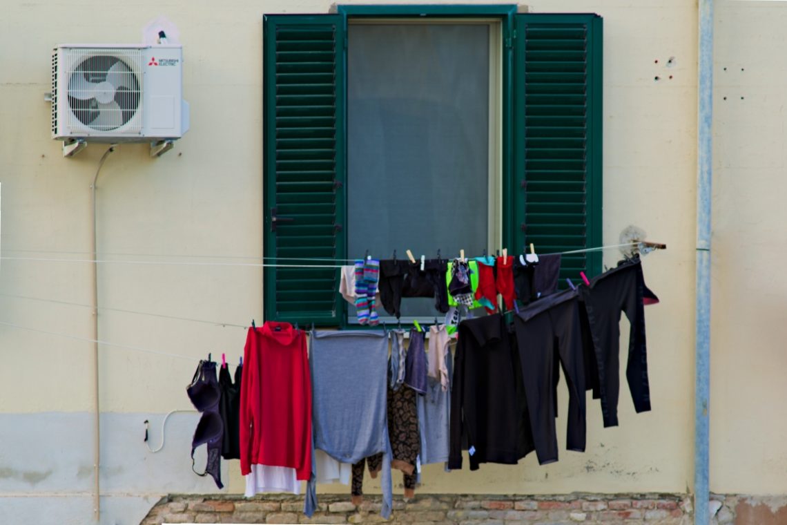
Drying Clothes
-
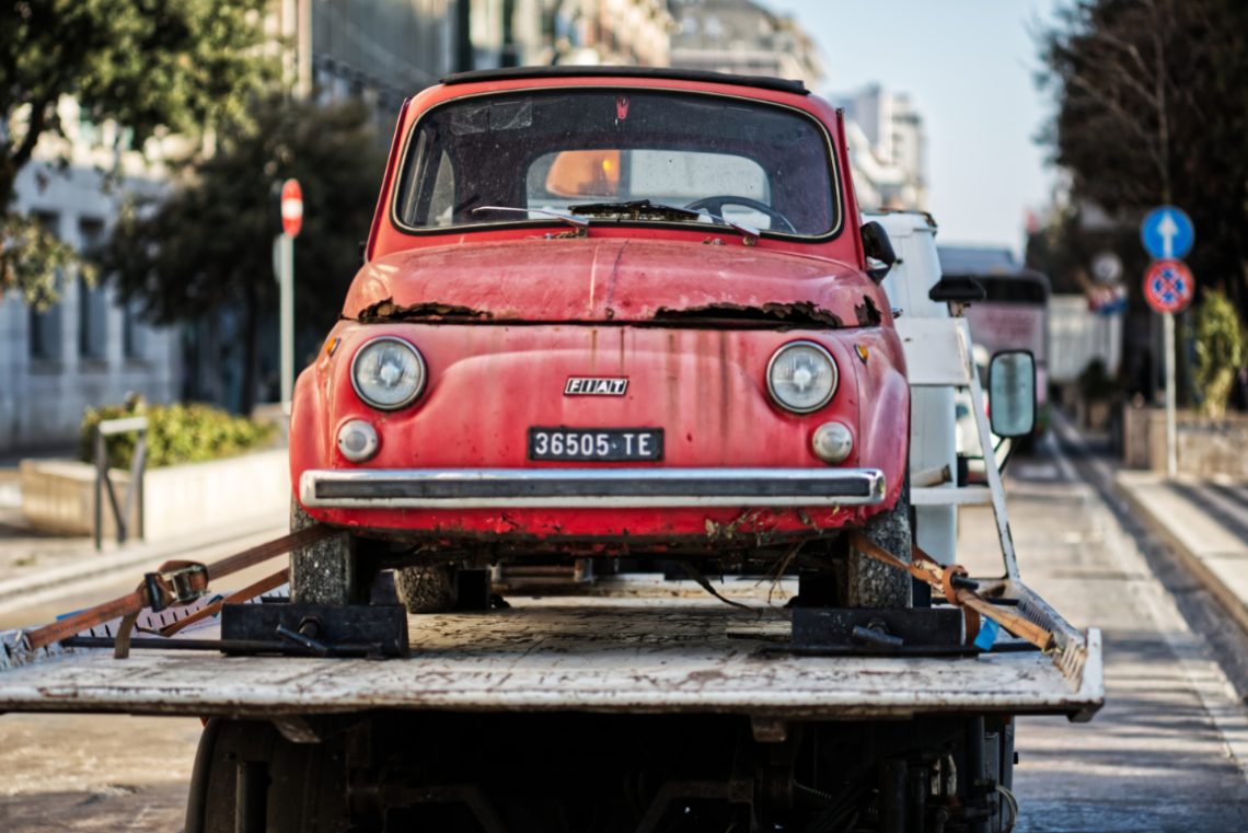
The Last Journey Of An Hero of Italian Motoring
Behold, the Fiat 500. Not the modern one that’s all airbags and Bluetooth and makes you feel like a fashion blogger. No, this is the real thing. The original. The glorious, underpowered, unapologetically tinny Italian shoebox. And look at it now—strapped to the back of a truck like a pensioner wheeled out of the bingo hall for the last time. Rusted. Flat-tyred. Beaten. Magnificent. I spotted it being hauled away through a southern Italian town, and frankly, I nearly wept. This was once the car that got a nation moving. The people’s Ferrari. The automotive embodiment of an espresso shot. And now? A hunk of oxidised metal destined for the…
-
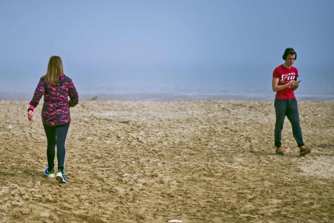
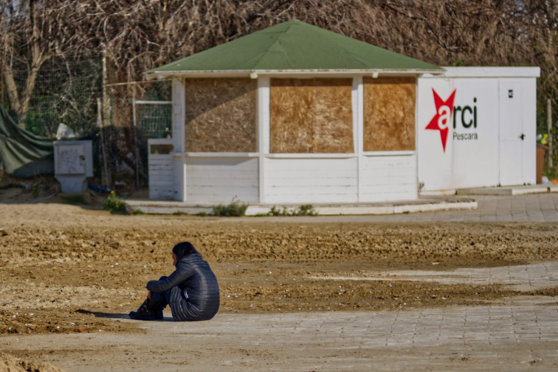
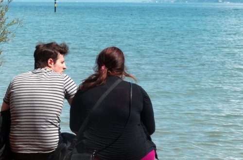
Uninterested
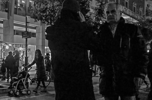
No glance. No nod. Just two people moving through the same space, as if the other didn’t exist. This was taken on a beach that should have felt wide open, maybe even freeing—but something about the moment made it feel small, enclosed. The boy looks down at his phone. The girl walks past him, eyes fixed forward. Neither slows. Neither turns. They’re metres apart, yet orbiting separate worlds. I didn’t ask for this scene. It unfolded on its own. A brief choreography of disconnection. Their postures say enough: one drawn into a screen, the other into her own stride. There’s no hostility here—just absence. A quiet kind of loneliness, the…
-
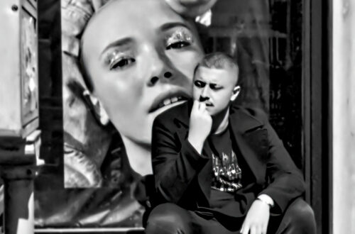
Pensive
Manual focus needs practice. This photo would have been better if I framed also the top of the cabin and focused better the person.
-
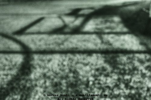
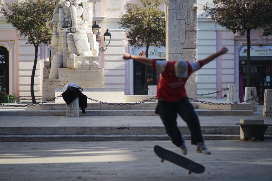
A Skater
Framing the whole statue would have made this photo better. The mistake was caused by the necessity to shoot fast, the lens’ field of view and the distance between the subject and the focal plane.
-
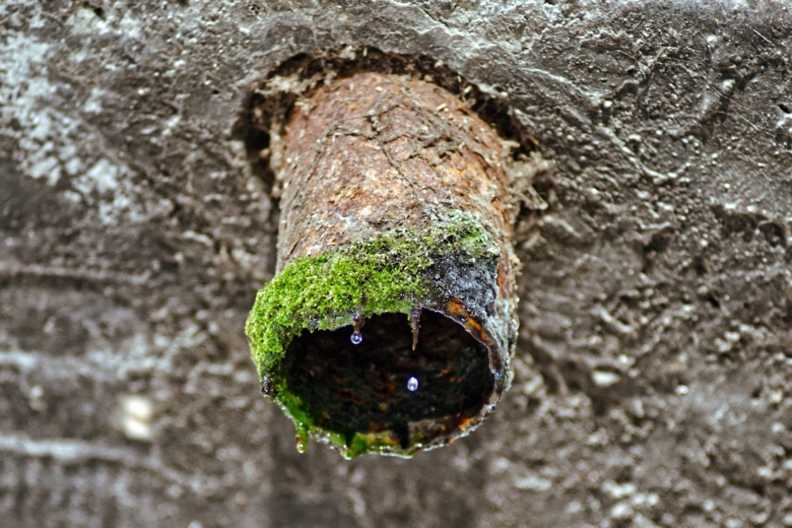
A Droplet
Sometimes the most unassuming subjects hold the greatest visual intrigue. A Droplet invites us to pause before a corroded pipe, its mouth fringed with moss and decay, and notice the minute beads of water suspended in time. The scene is humble, even neglected, yet it carries a quiet dignity — a testament to the slow, unrelenting processes of nature reclaiming the man-made. From a compositional standpoint, the photographer has made the astute decision to centre the pipe, drawing the eye directly to the mossy rim and the droplets. The shallow depth of field isolates the subject from the textured wall behind it, giving the image a pleasing three-dimensionality. The fine…
-
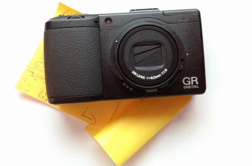
A Rudder
Pentax K-1/smc Pentax-A 135/2,8
-
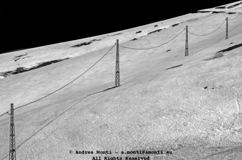
A Mesh
-
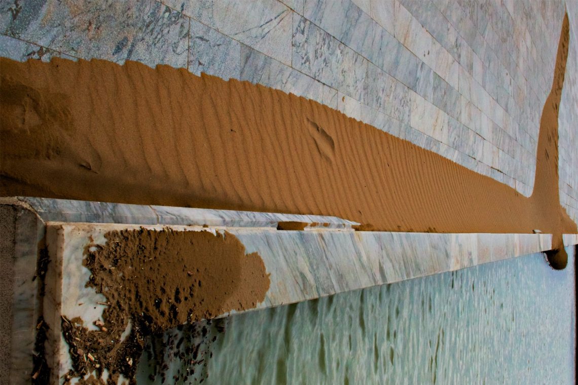
An Essay on Composition
This photograph began with geometry, but it ended up being about contradiction. Sand, marble, sea—each a distinct texture, each performing under different rules. It’s not a landscape and it’s not abstract, but it borrows from both. The diagonal lines, the flattened depth, the conflict between order and erosion—all deliberate, but not staged. I rotated the frame on purpose. The eye expects a horizon, some gravitational anchor, but here that’s denied. The marble slabs—cold, precise, quarried and arranged—seem to float or fall, depending on how you orient yourself. The band of sand running diagonally across the frame interrupts their perfection with a tactile, natural disorder: dunes formed by wind, not by…
-
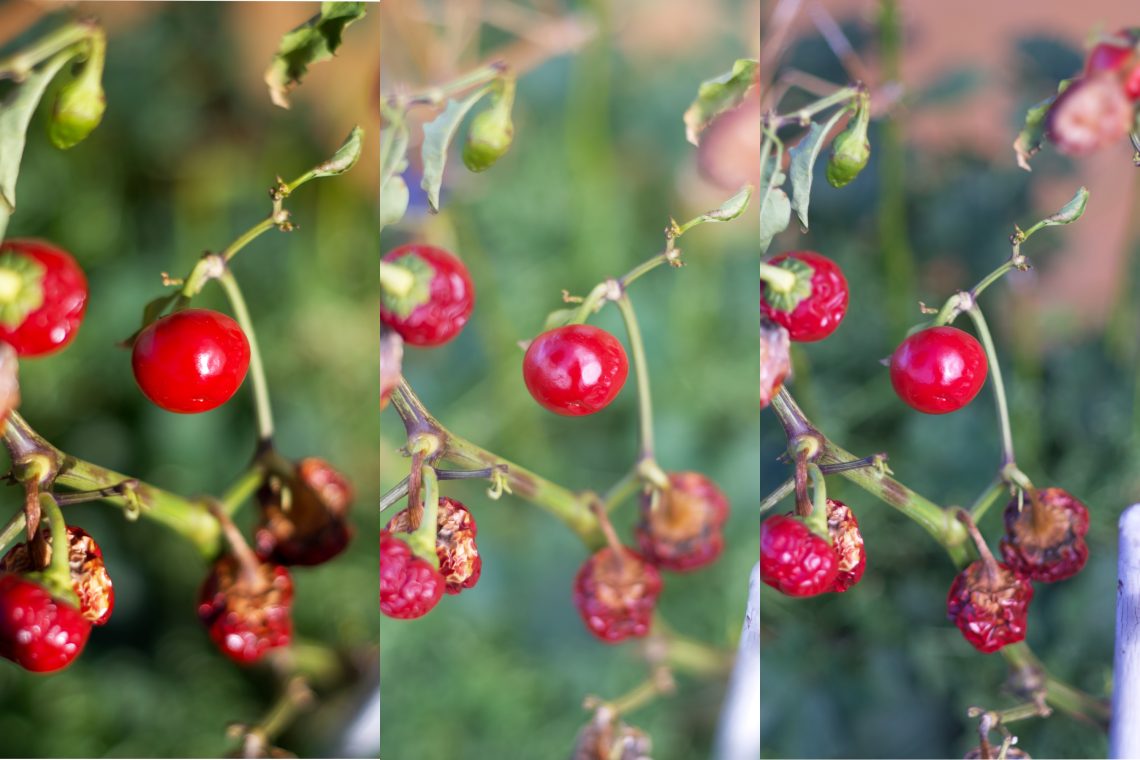
Pentax SMC-A 50/1,7 – Nikkor 50/1,4 – Summicron 50/2
The left slice is taken with a Pentax K-1 and SMC-A 50/1,7, the centre with a Nikon D750 and a Nikkor 50/1,4, the right with a Fujifilm X-T3 and a Summicron 50/2. All the cameras were at their base ISO (100 for the Pentax and Nikon, 160 with the Fujifilm), at F2 and aperture priority. The K-1 and the X-T3 photos were shot in manual focus. Only the K-1 has IBIS stabilization. The jpg is taken in Affinity by slicing each OOC RAW file without post-processing.
-
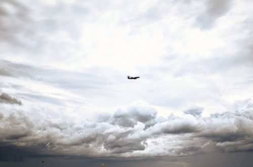
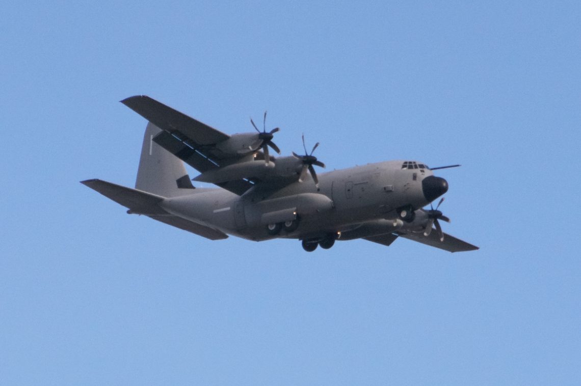
A Lockheed C-130 Hercules
-
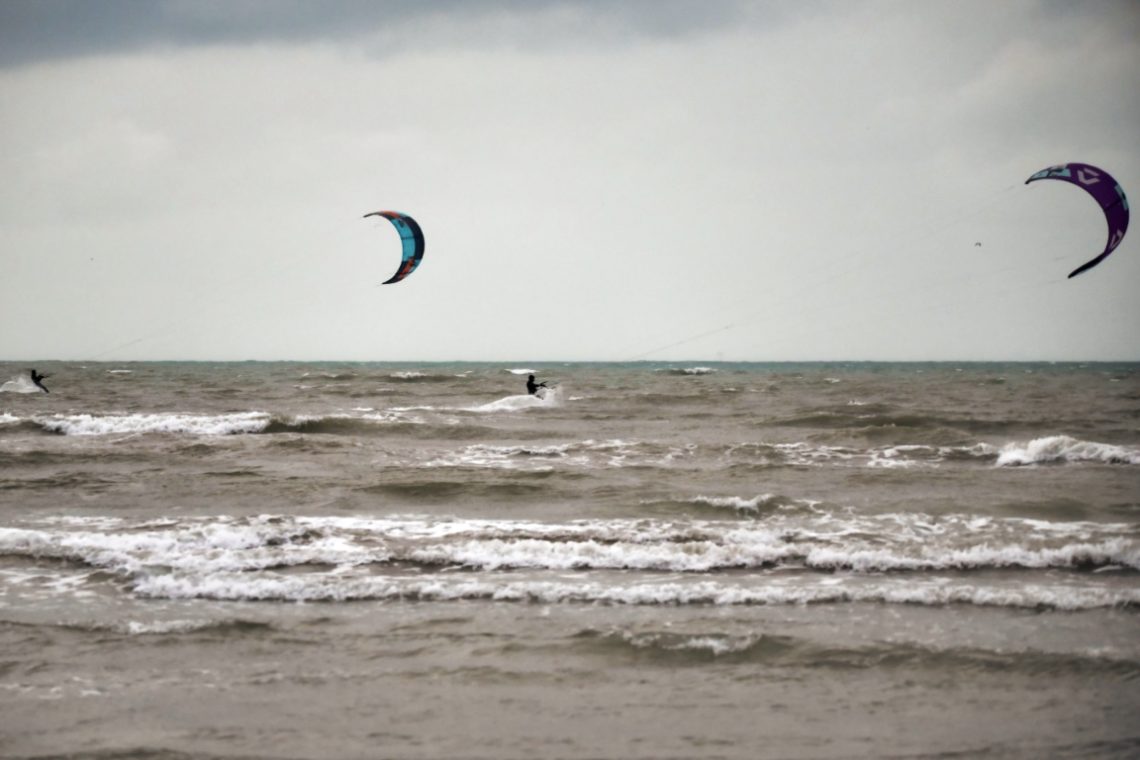
Kite Surfer Under Duress
The wind was already rising when I reached the beach. Grey sky, hard light, the kind of day most people read from behind a window. But the kitesurfers were already out—lines taut, boards skipping through the chop. What always strikes me about this scene isn’t just the colour of the kites against a flat sky, or the sharp angles they carve into the wind—it’s the resolve. They know what they’re getting into. The cold. The salt in their eyes. The bruises. And they do it anyway. Because this is when it’s real. That’s what drew me to raise the camera. The same drive, maybe. You don’t wait for golden hour.…
-
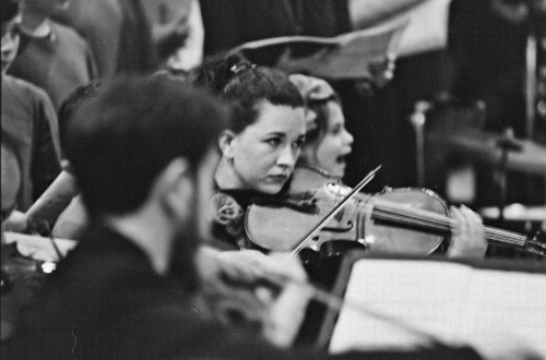
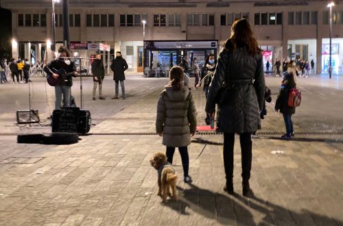
Busker and Covid-19
-
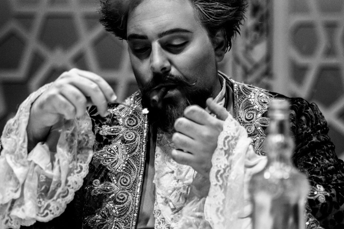
Easy To Shoot?
This picture might look “ordinary” but for the fact that I shot it with a rangefinder film camera (guess which?) during the scene change between to acts of a theatre play. Scene assistants were placing the furnitures, actors were trying to focus on their parts, there was no time (and place) to design a proper composition and set the camera. No autofocus, no real-time exposure and white-balance setting. Maybe I have been lucky capturing the match flame close to the cigar, maybe it was because of “muscle memory”, but I did it nonetheless. Problem is that I could not be sure if I succeeded until, one week later, I saw…
-
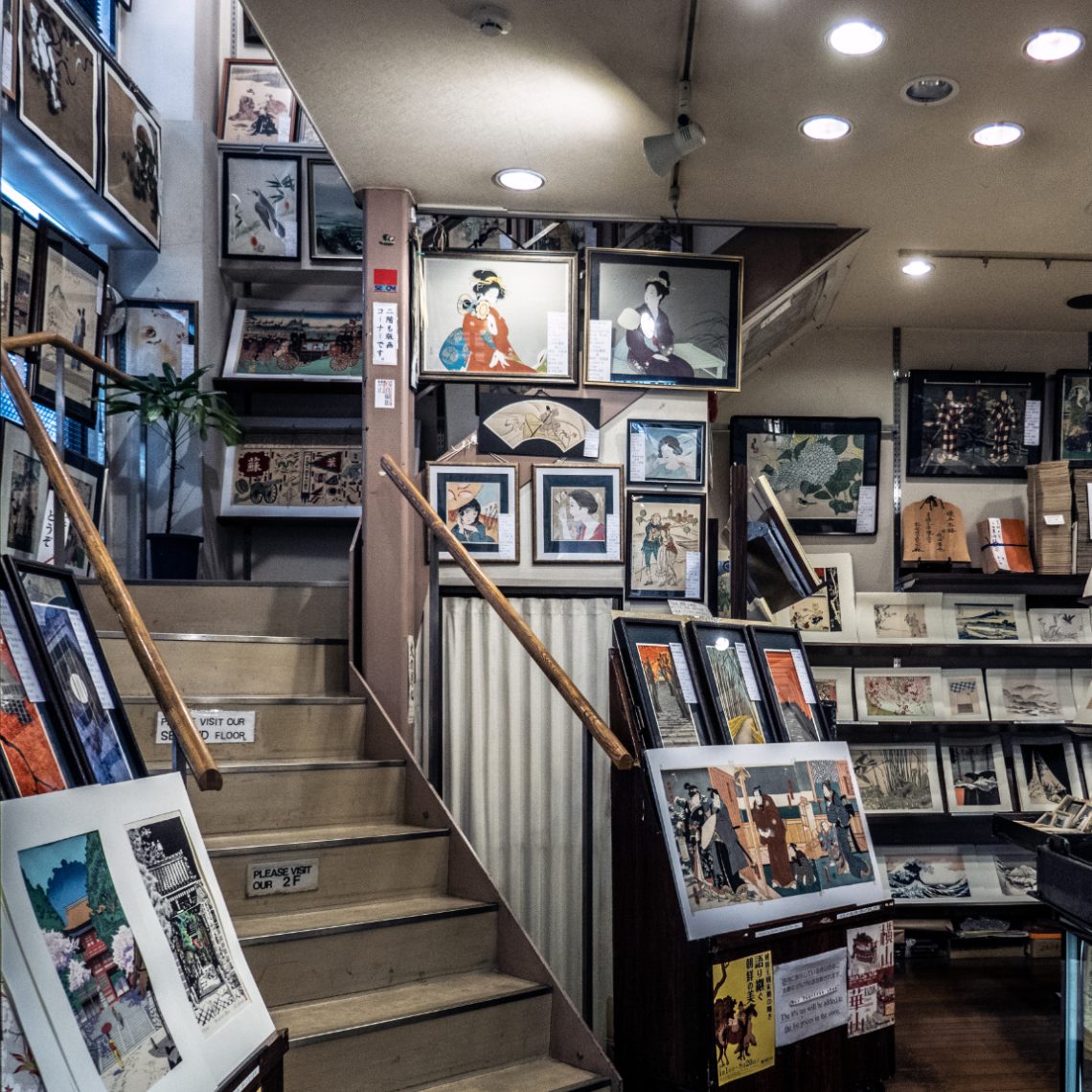
Dai Shodo@Kyoto
Kyoto ‘s Teramachi-dori is full of suprises. Amidst shops of the most different kind and attire, booklovers can find this small gem. This is Dai-Shodo, a quiet print shop tucked into a narrow Kyoto street. I stepped inside on a grey afternoon with no particular plan. The light was soft, filtered through old windows and the hushed presence of paper. Everything in the shop seemed to lean inwards—frames, shelves, stairs—as if holding its breath in reverence. What struck me most wasn’t the prints themselves, but how they were displayed. Ukiyo-e woodblocks and vintage ephemera layered on every surface, propped rather than hung, as if caught mid-conversation. The stairway invited you up…
-
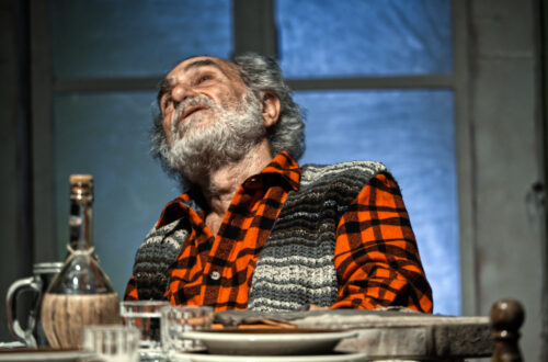
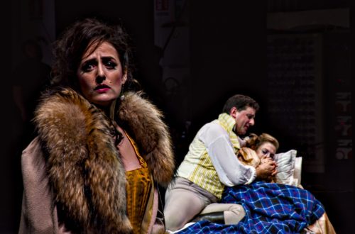
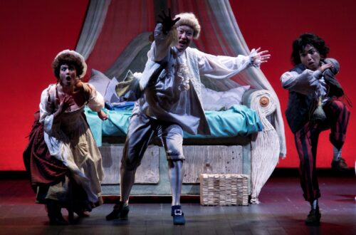
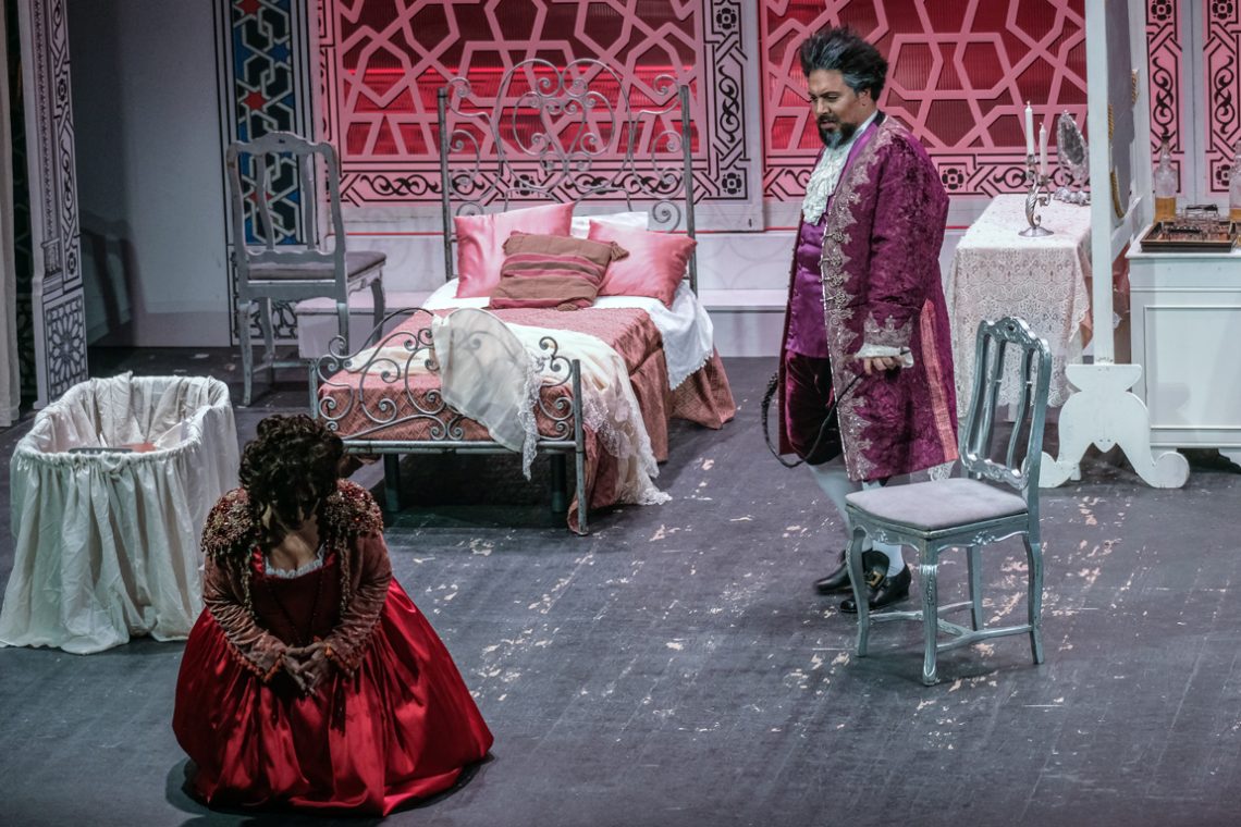
Il barbiere di Siviglia – Don Bartolo mad at Rosina
A shot from the mise en scene of the Il Barbiere di Siviglia I did as a scene-photgrapher for the Teatro Marrucino