-
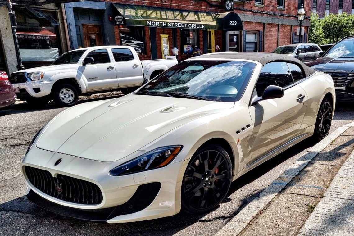
A Maserati GranTurismo
Another piece of Italy in Boston…
-
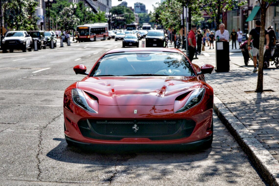
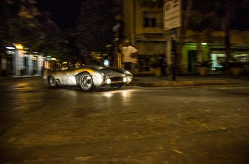
A Ferrari 812 GTS in Boston
Amid the urban thrum of a bustling boulevard in Boston, a Ferrari 812 GTS rests with theatrical poise, like a tenor waiting for the curtain to rise. Its rosso corsa bodywork catches the sun like a blade, slicing through the cluttered backdrop of imitation, of diluted Italian flair printed onto shirts, menus, slogans. But here—here is the real thing. This image captures more than automotive power. It embodies the burden and brilliance of authenticity in a world obsessed with mimicry. The Ferrari’s uncompromising lines, forged in Maranello, don’t shout. They assert. In contrast to the busy street and distracted passers-by, the car is still, composed, sovereign. It doesn’t need motion…
-
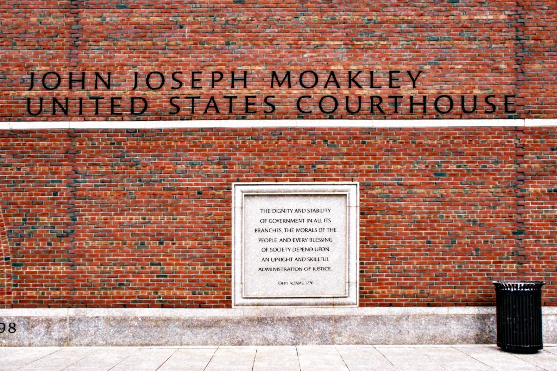
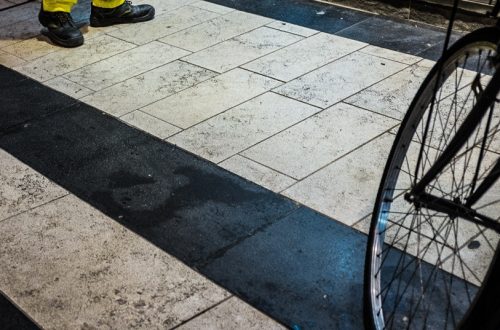
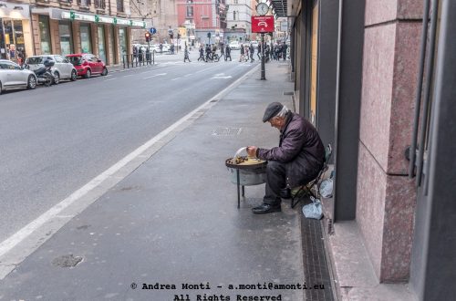
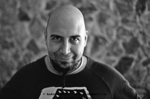
Justice measured as the distance between Words and Facts
This photo, in itself, is nothing special. Bur it carries an implicit message about law and rights: the level of democracy in a country is measured by the distance between bold statements and the daily courtroom’s reality.
-
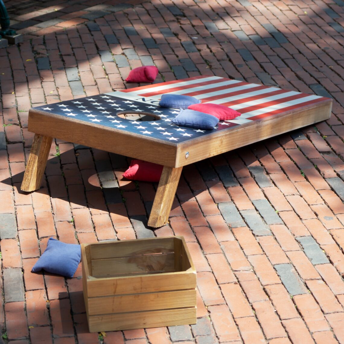
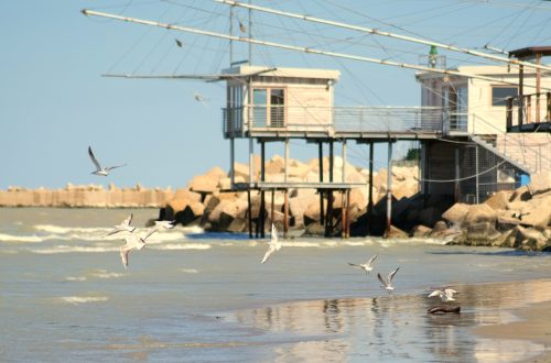
A Cornhole Board – Independence Day Edition
I took this photograph in Boston on July 4th, and for me, it captures a small but telling fragment of the day’s celebrations. No fireworks, no parade—just a simple cornhole board dressed in the American flag, surrounded by scattered red and blue beanbags on a sunlit brick pavement. It’s an image that speaks to the quieter, more tactile traditions that sit alongside the grand spectacle. Compositionally, I let the board occupy the upper right of the frame, its diagonal placement adding a sense of movement and inviting the viewer’s eye from the legs toward the target hole. The wooden box in the foreground balances the frame and anchors the bottom…
-
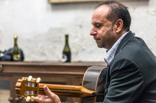
Elishéva live@Faneuil Hall
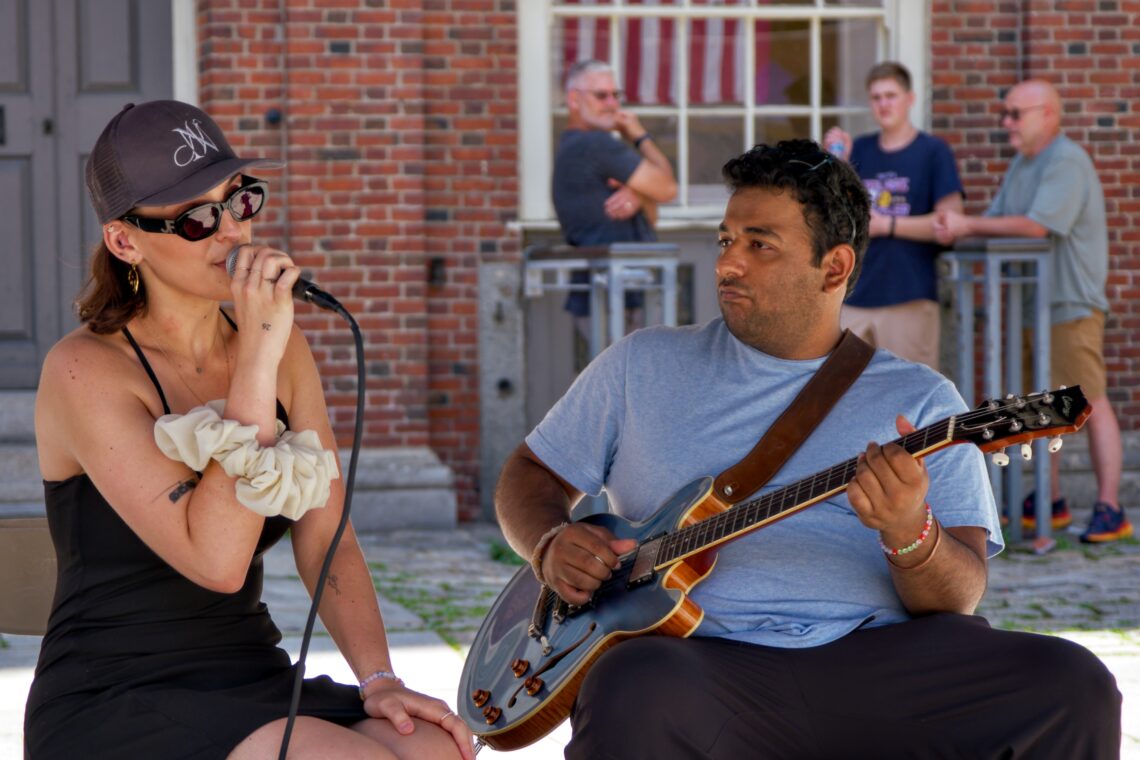
Boston is an incredibly vibrant city and hosts many live events in theatres and outdoor venues. At Boston’s Faneuil Hall, I took some pictures of Elishéva, a soulful jazz singer, while she was rehearsing. Boston in summer has its own rhythm—a blend of footsteps, street chatter, and, if you’re lucky, the pulse of live music spilling into the air. I took this photograph during one of those moments when the city seems to pause and listen. The singer, shaded under her cap and oversized sunglasses, leans into the microphone with an intimacy that draws you in, while her guitarist locks eyes with her, an unspoken conversation carried through chords. From a…
-
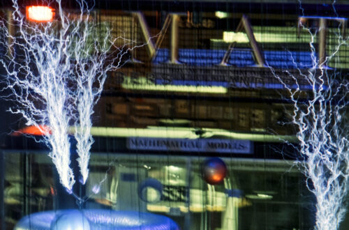
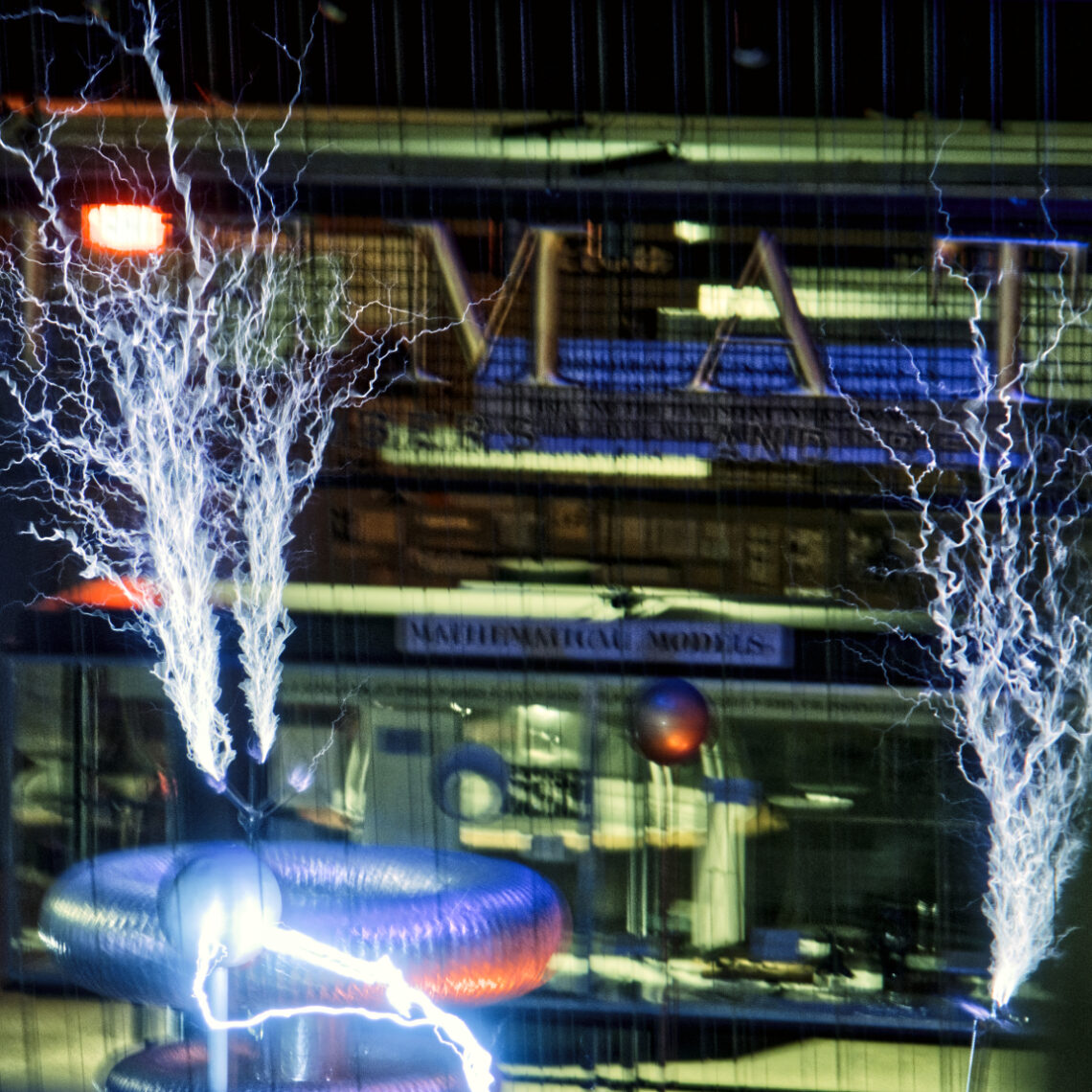
Tesla Coils@Boston Science Museum
Capturing a Tesla coil mid-discharge is less about speed and more about timing. The arcs of electricity, chaotic and brief, demand an intuitive trigger finger and a dose of luck. I didn’t want the image to become a science illustration; I wanted it to hold some tension between spectacle and control, between the purity of mathematics and the danger of raw power. The coils themselves form a natural anchor in the bottom third of the frame, giving structure to what would otherwise be an abstract burst of energy. I shot through a safety mesh, letting it subtly ghost across the image, a reminder of the physical danger involved in what…
-
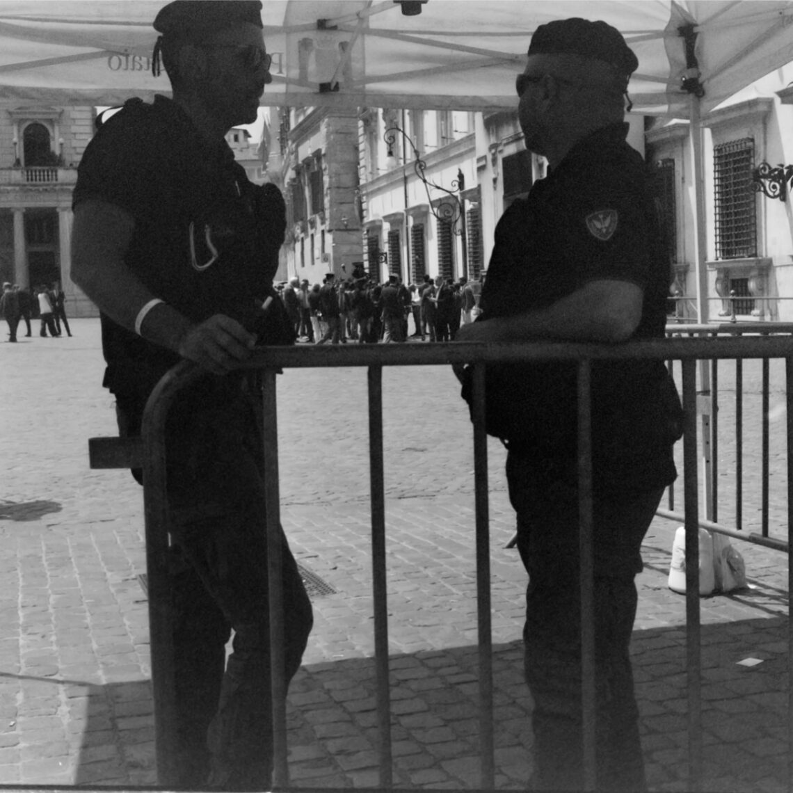
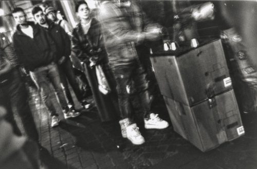
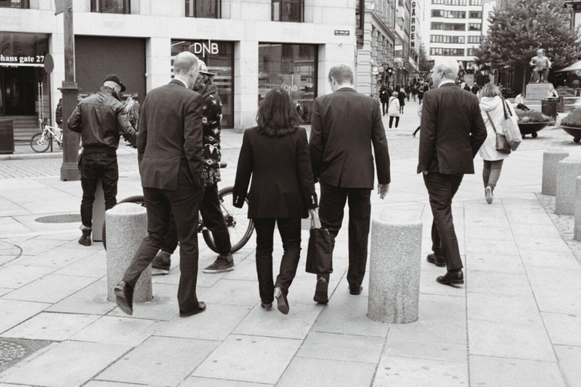
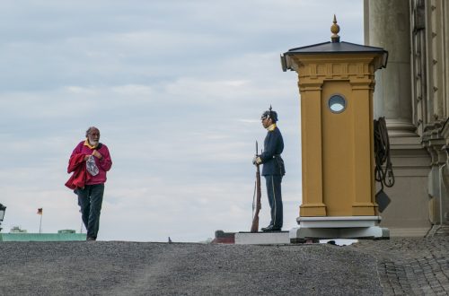
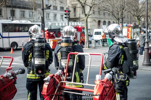
Guarding Democracy
Shot on film, this frame came from a day of walking — not searching, just watching. I didn’t need to look far. Two officers, positioned under a temporary gazebo, leaned into casual conversation, framed by the barricade they were meant to man. Beyond them, a crowd gathered in orderly concentration. The juxtaposition wasn’t loud, but it was clear: authority in the foreground, public in the distance. The separation was both literal and symbolic. The choice to shoot from behind the barrier wasn’t just compositional — it was contextual. I wanted to keep the divide intact. The vertical bars bisecting the two officers are rigid, unforgiving. They draw the eye down,…
-
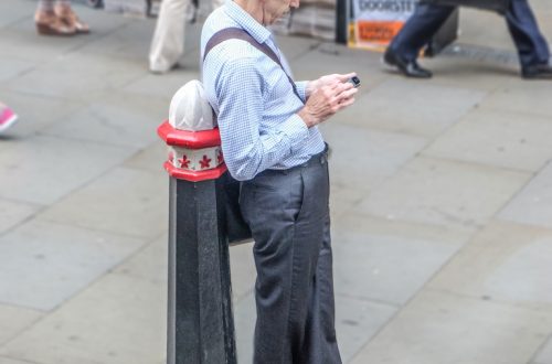
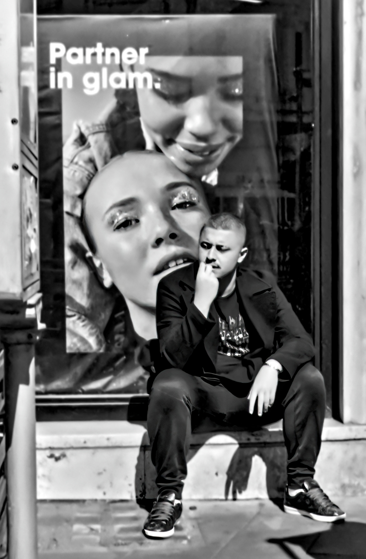
Partner in Glam
I framed this shot fast — the kind of street moment that gives you three seconds to get it or lose it. What pulled me in wasn’t the man alone, nor the advert behind him. It was the convergence. His physical presence, heavy and brooding, intersecting perfectly with the oversized face of the model. Two expressions, one contemplative, one seductive, unintentionally in conversation. The poster reads Partner in glam. A marketing line, forgettable in most contexts. But set against this man, seated in shadow, caught mid-thought, it takes on irony. Or honesty. Depends how you read it. Technically, the photo leans hard into contrast. Shot in direct sunlight, the shadows…
-
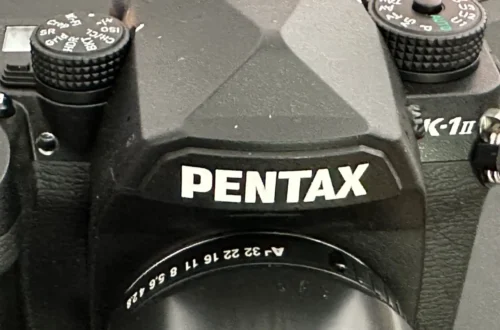
Processing DSLR-digitized film with and without Pentax K-1 Monochrome Custom Image profile
Digital Camera Utility 5.0 is a pain to use on a Mac with Monterey. It is slow and laggy. Its only use is to get the photo as shot, with the custom image profiles embedded in a K-1 (and other recent Pentax DSLRs), and export it as a 16-bit tiff for further processing.One might wonder, however, whether editing a RAW file without going through the DCU —and thus losing the custom image profile— would produce lower quality results. We are about to find out.The test is quite demanding, as it starts with a shot from an Ilford SP2 Super 400 (note: this is not a true B&W film, as it…
-
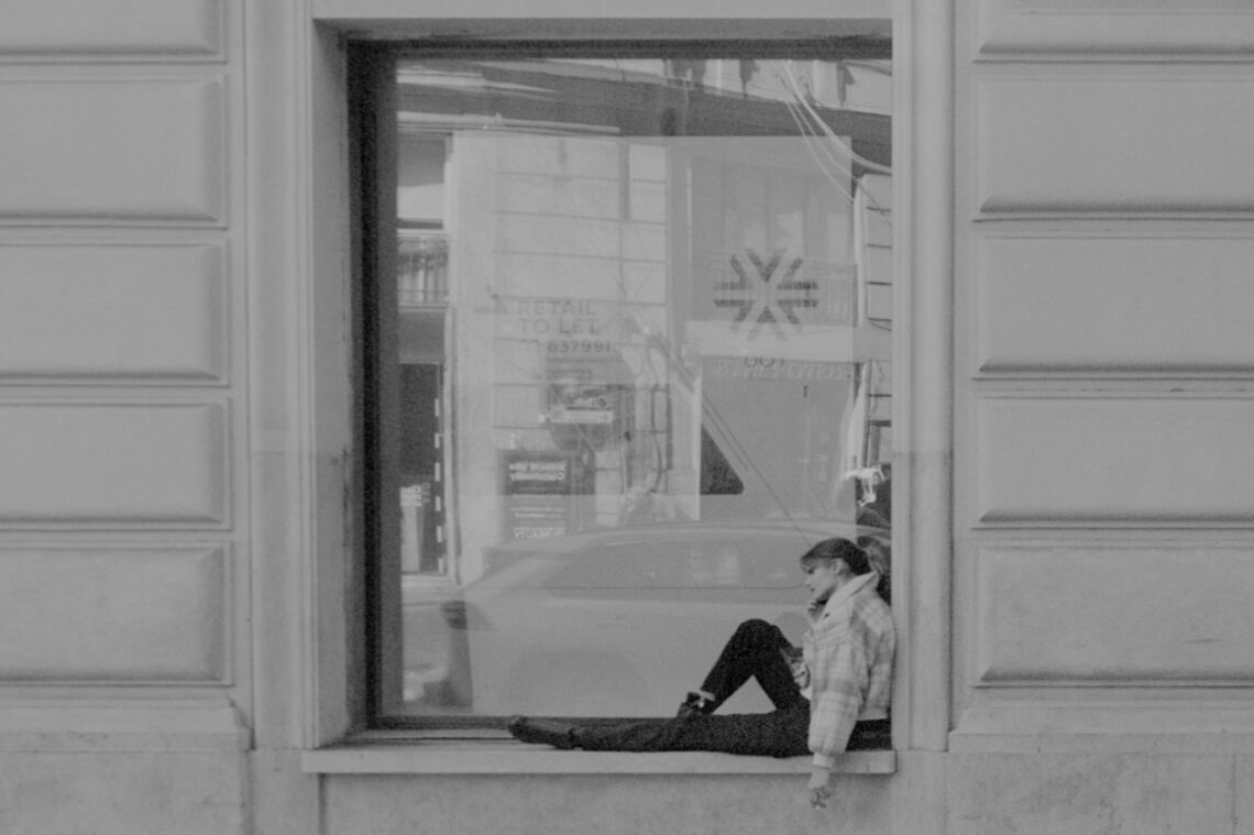
A Frame Within a Frame Within a Frame
The irony didn’t hit me until I developed the roll—an expired Ilford XP2 Super 400 that had been lounging at the bottom of a drawer for years. Shot with a Voigtländer Bessa R2 paired with the Nokton 35mm f/1.4, this image is as much a meditation on layers as it is a commentary on isolation. What initially looked like an ordinary street shot—girl on a call, perched on a windowsill—turned out to be a trifecta of enclosures: her physical pose wrapped in posture and winter clothing, set within the architecture of the window, itself encased in the framing of the building. Beyond, the city reflects itself, ghostlike, on the glass—another…
-
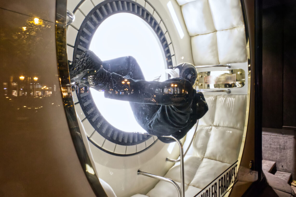
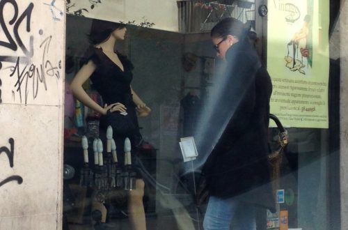
Floating
This image was born out of a fascination with stillness in the midst of implied movement. The mannequin — suspended, curled, caught in an almost foetal position — seems to drift within a capsule that looks as though it could be orbiting somewhere far beyond Earth. The large, circular light behind it could be a porthole, a hatch, or simply a stage light; its blinding white obscures what might be beyond, giving the scene a surreal, detached quality. Technically, the biggest challenge was exposure. The extreme contrast between the brilliant backlight and the darker figure risked losing detail on both ends. I chose to protect the highlights, letting the shadows…
-
DSLR film scanning: episode three
This is, by far, the most pleasing result I have ever had from digitising a film negative with a DSLR.Contrary to many suggestions found on Youtube, I did not invert the negative RAW curve by tweaking the Master RGB option. I did it, instead, channel-bychannel minding each clipping point. This approach allowed for a better reproduction of the grey tones, and in the end a fair result.
-
Another attempt at DLSR film scanning
Still trying.I digitised the negative with a Pentax K-1 and the FA 100 2.8 Macro lens using the JJC clone of Nikon ES-2. Postproduction is done in Pixelmator Pro. I used a Nikon 35TI and a Kodak BW400CN to take the original photo. Strangely enough, the JJC does not allow a 1:1 ratio with the Micro Nikkor 60 2.8.The instructions advise to mount the 62mm to 52mm step-down ring, the #2 52mm barrel-shaped tube and finally the film holder. These instructions are clearly wrong, as it is not possible to get 1:1 magnification with this setup.So I removed the tube and mounted the film carrier directly on the 62mm to…
-
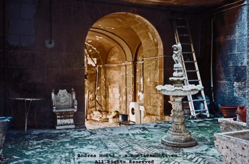
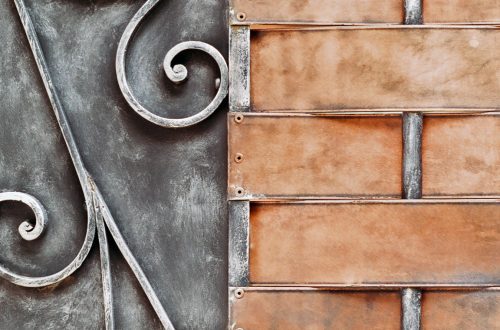
Cleaning the Tabernacle
-
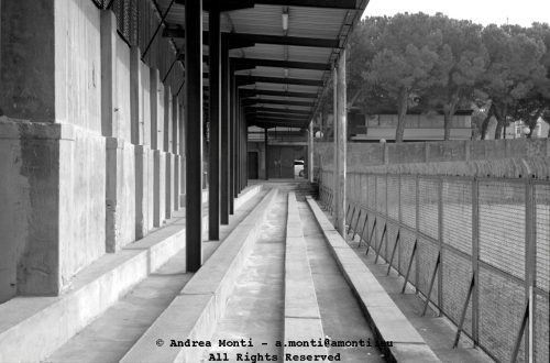
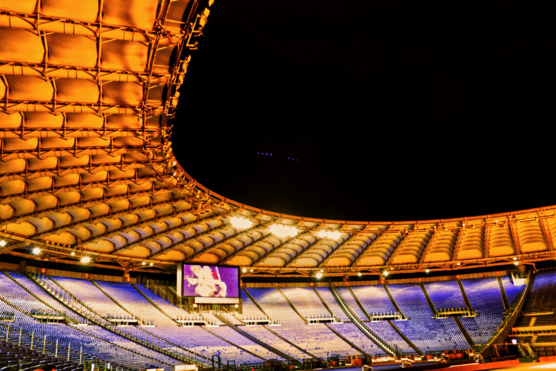
Stadio Olimpico, seen from Tribuna Monte Mario
The Stadio Olimpico is not an easy subject to photograph, especially when seen from the lofty and privileged perch of the Tribuna Monte Mario. The vantage point offers grandeur, but grandeur doesn’t always translate easily into pixels—especially under the kind of merciless lighting that the stadium seems to favour at night. From this spot, the sweeping geometry of the roof dominates the composition. Its repeating, honeycomb-like pattern glows under the sodium vapour lights, casting a heavy golden hue that floods the upper half of the frame. Below, the seating—empty and rendered in cool blues—acts as a counterweight, both in tone and texture. The effect is a split visual dialogue between…
-
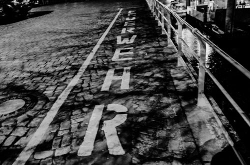
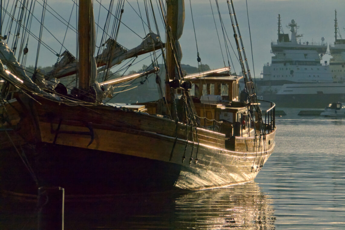
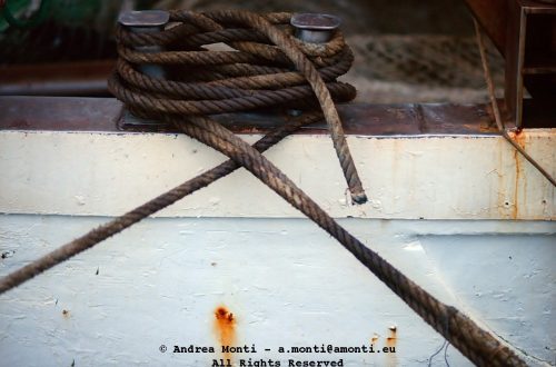
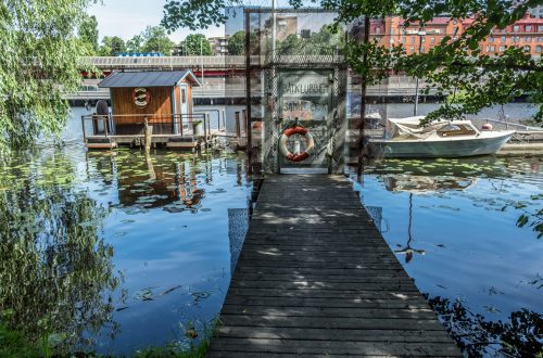
A Vessel Moored on the Pier
-
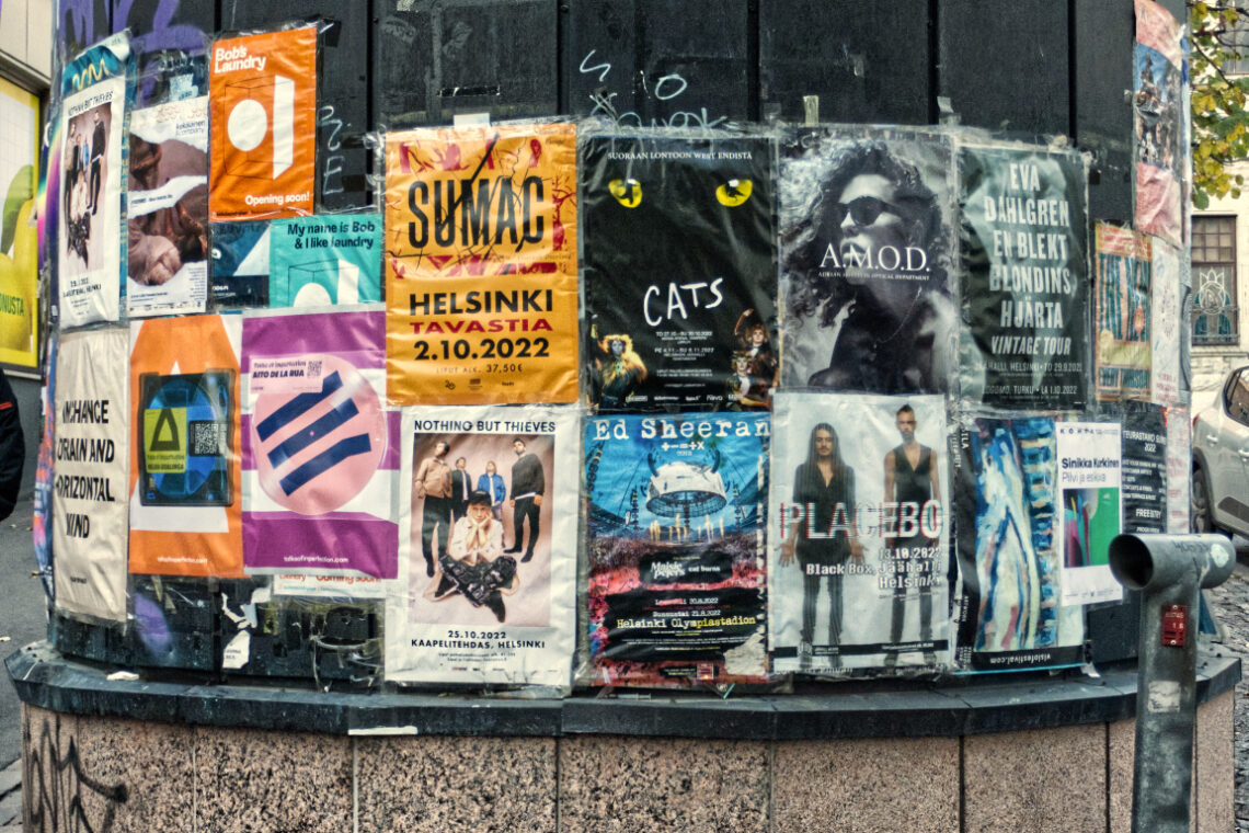
Cultural Variety In Helsinki
Walking through Helsinki, I came across this street corner turned makeshift cultural diary. A column of posters, each one shouting louder than the next, all layered in a beautiful visual chaos. Music, theatre, design, protests — everything stuck side-by-side like a democratic collage of intent. No hierarchy, no curatorship — just pure public messaging. I framed this image straight on, keeping the grid of posters as symmetrical as the structure allowed. What interested me wasn’t just the content, but the juxtaposition — a sleek Ed Sheeran ad beside a hand-designed experimental flyer, a musical next to a political slogan. It’s a visual argument, but a peaceful one. Technically, this shot…
-
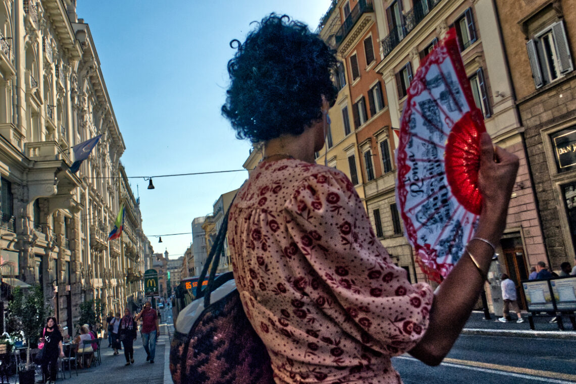
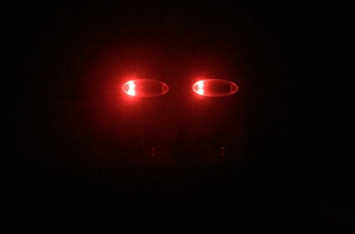
Red Fan
You May Also Like
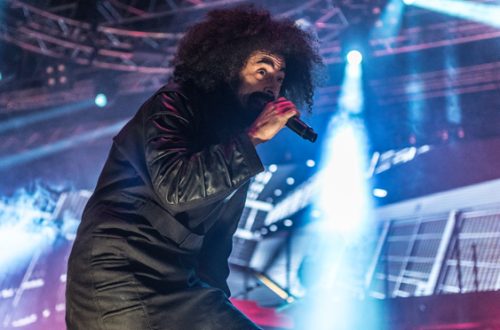
Caparezza – Live@Palamaggetti Roseto degli Abruzzi
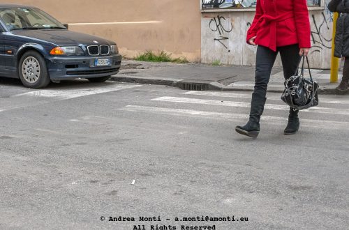
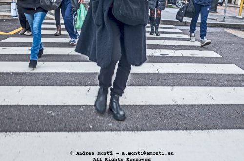
Zebra Crossing
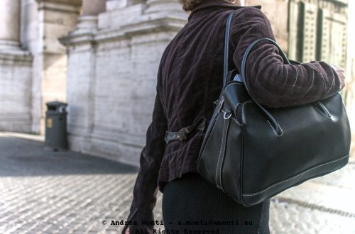
A Mysterious Bag
-
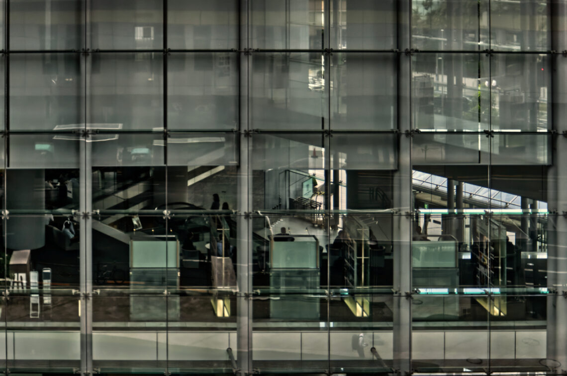
Nittele Tower
This photograph was taken on the move, from the Tokyo Monorail, aimed at the glass façade of Nittele Tower. Shooting through layers — the monorail’s own window and the tower’s reflective panels — created a composition that is equal parts interior, exterior, and abstraction. The grid of the building’s structure acts as both frame and subject, compartmentalising the scene into individual vignettes where people, staircases, and architectural lines intersect. The DA* 16-50 on the K-5 handled the mix of reflections and transparency better than I anticipated. Exposure was tricky: the overcast light outside diffused evenly, while the building’s interior lighting added warm pockets of contrast. I kept the balance slightly…
-
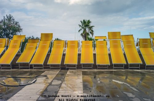
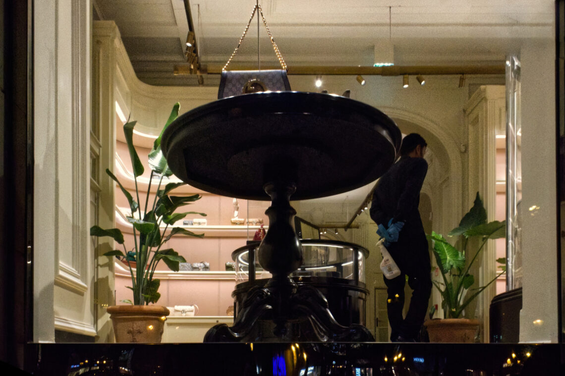
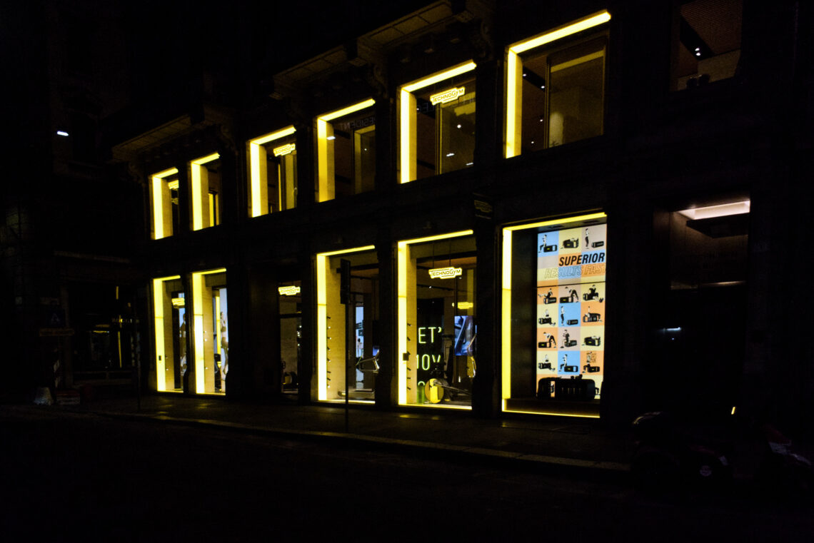
Technogym Milan@Night
I photographed this storefront in Milan after dark, intrigued by the way its illuminated windows cut through the night. The architecture itself is not the subject so much as the grid of glowing rectangles, each acting like a screen against the blackness of the street. The strong yellow framing lines draw the eye, repeating rhythmically across the facade, while the deep shadows surrounding them emphasise their intensity. Compositionally, I chose a wide perspective to capture the full stretch of the facade. This decision places emphasis on repetition and geometry rather than on any single detail. The asymmetry of the right side, where a bright advertisement interrupts the rhythm, creates a…
-
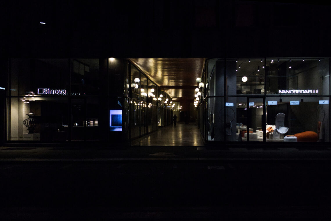
Late Night@Piazza San Babila
Working with a compact camera like the Panasonic TZ-100 at night is a reminder that you don’t always need a full-frame monster to tell a story — but you do need to understand and embrace the camera’s limitations. The TZ-100’s one-inch sensor is not built for clean, clinical low-light work. Push the ISO and it will show noise quickly; underexpose, and shadow recovery will fall apart. But here, those very traits help carry the mood. The composition rests on a central axis — the illuminated corridor pulling the viewer inward, flanked by the Binova and Ivano Redaelli showrooms. Their glowing interiors act like bookends, framing the pathway and setting a…
-
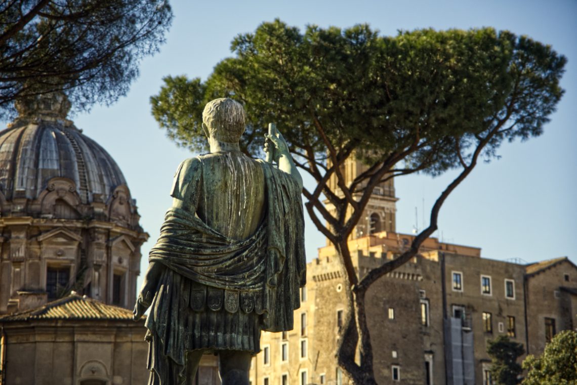
Still Ruling The Empire
The statue in this image has its back turned to the camera, but it commands the frame entirely. Shot in Rome, with the dome of Santi Luca e Martina on the left and the Torre delle Milizie rising in the distance, this bronze figure—likely an emperor or general—stands as if still governing the landscape before him. I didn’t photograph the face on purpose. The power of this moment lies in presence, not identity. The shot is about line, volume, and the compression of history into layers. The trunk of the umbrella pine rises behind him like a sceptre made of wood and air, while the palatial facades blend architectural periods…
-
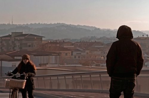
Get Ready, Set, Go
I’ve always enjoyed the way a single moment in the street can hold multiple narratives at once. In this frame, taken in Piazza Venezia with the Vittoriano looming behind, the cyclist seems caught between pause and motion — a split-second where the decision to push forward hasn’t yet been made. The backlighting was a gamble. Shooting into the sun with the Fuji X-T3 and the XF 16-80 meant dealing with inevitable flare, lowered contrast, and the risk of losing detail in the shadows. But I wanted that shaft of light breaking through, almost theatrical in how it picks out the rider against the cobblestones. Exposure was a compromise: holding the…
-
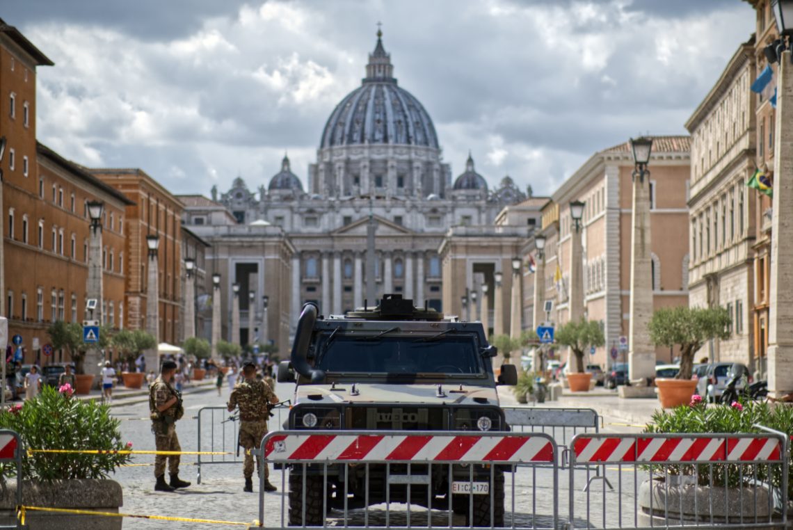
Dark Cloud Over San Pietro
The tension wasn’t subtle. I framed this on a humid Roman afternoon, the kind where the air sticks and light flattens the facades. At the vanishing point: San Pietro, serene and untouchable, a facade that’s absorbed centuries of ceremony and conflict. But in the foreground—armoured steel, automatic rifles, and red-striped barricades—modern anxieties assert themselves. This is what occupation looks like when dressed as precaution. The symmetry of the shot exaggerates the contrast. The axis from the dome to the vehicle is mathematically clean, unnerving in its balance. You can’t not look down the middle, and once your eyes reach the Iveco Lince, you realise you’re not a tourist anymore. You’re…