-
Sun Worshipers
-
Dark Omen
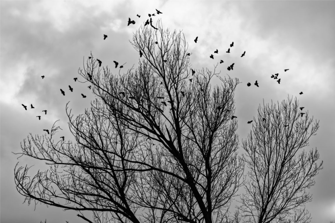
I photographed this scene in late winter, when the bare trees carried no leaves and the sky pressed low with heavy clouds. The flock of birds, startled into flight, scattered across the frame in uneven patterns. Their silhouettes against the pale backdrop gave the scene a sense of unease, as though the moment was charged with something more than simple movement. Compositionally, I placed the trees as anchors, their skeletal branches reaching upward and outward, filling much of the lower frame. They serve as both structure and stage, while the birds provide rhythm and unpredictability. The flock is not evenly distributed—clusters form and break apart, guiding the eye from one…
-
Gliding Away
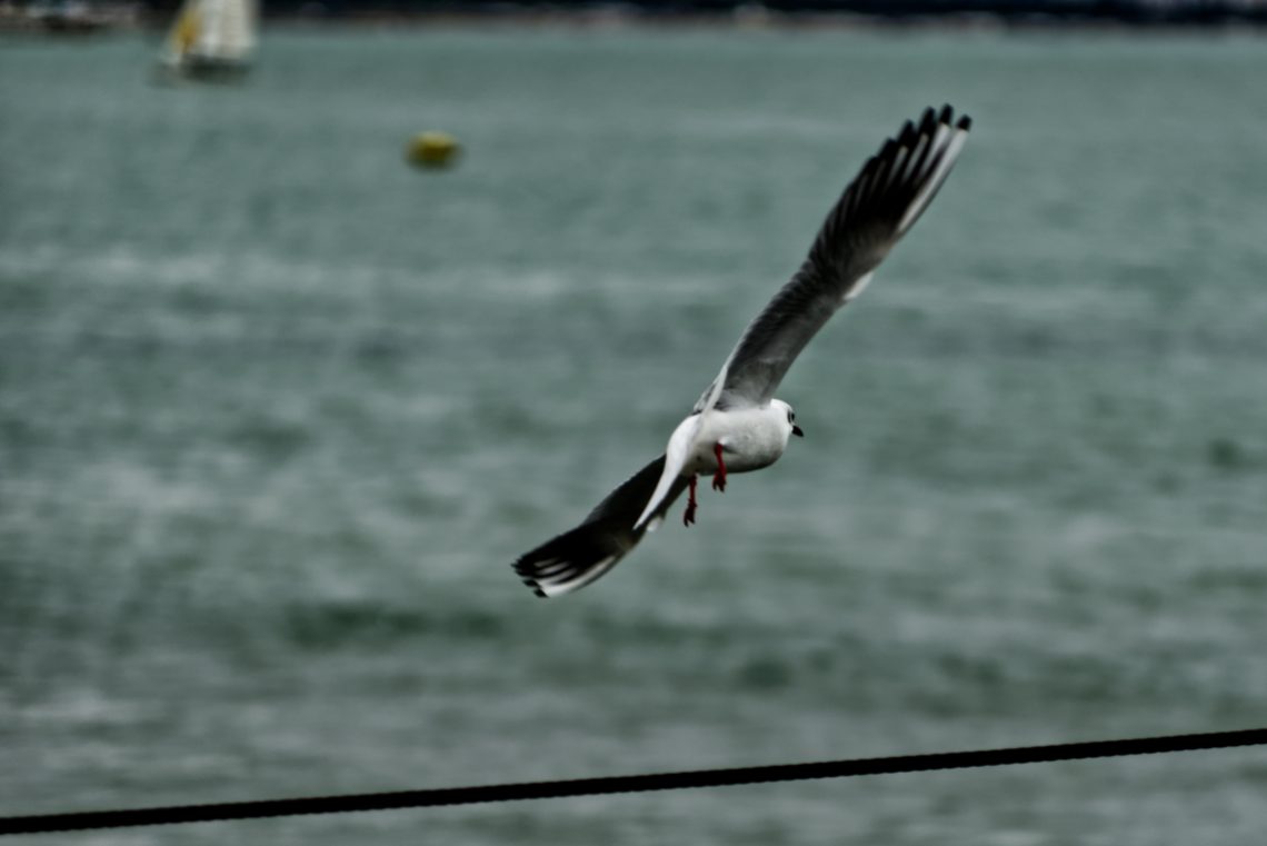
I caught this shot as the gull moved past me, wings stretched in an elegant curve, pulling away from the frame almost as quickly as I brought the camera to my eye. Tracking birds in flight with the DA* 50-135 on the K-3 II is always a test of reflexes and technique, especially when the background is a shifting plane of textured water. The lens handled the contrast well, keeping the bird distinct enough from the muted greens and greys of the sea, though the fine detail in the wingtips fell just short of crisp — a reminder that a fractionally faster shutter speed might have been the better choice.…
-
Waiting for the Fish
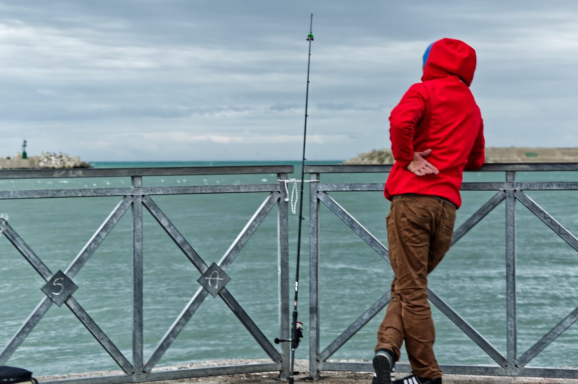
There’s a particular kind of pleasure in using the Pentax K-3 II paired with the DA* 50-135mm f/2.8—a combination that rewards patience much like the fisherman in this frame. The lens’s rendering and microcontrast gave me exactly what I wanted here: a clean separation between subject and background without the look feeling forced. The weather was brooding, the horizon hazy, and the colours naturally muted, so the camera’s sensor, with its well-known dynamic range, had plenty of tonal nuance to work with. The man in the red hoodie became my obvious focal point—a striking colour contrast against the cooler palette of sea and sky. His posture, hands clasped behind his…
-
Should I Seat?
-
Landing
-
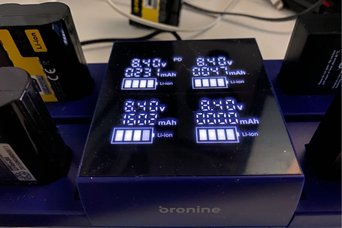
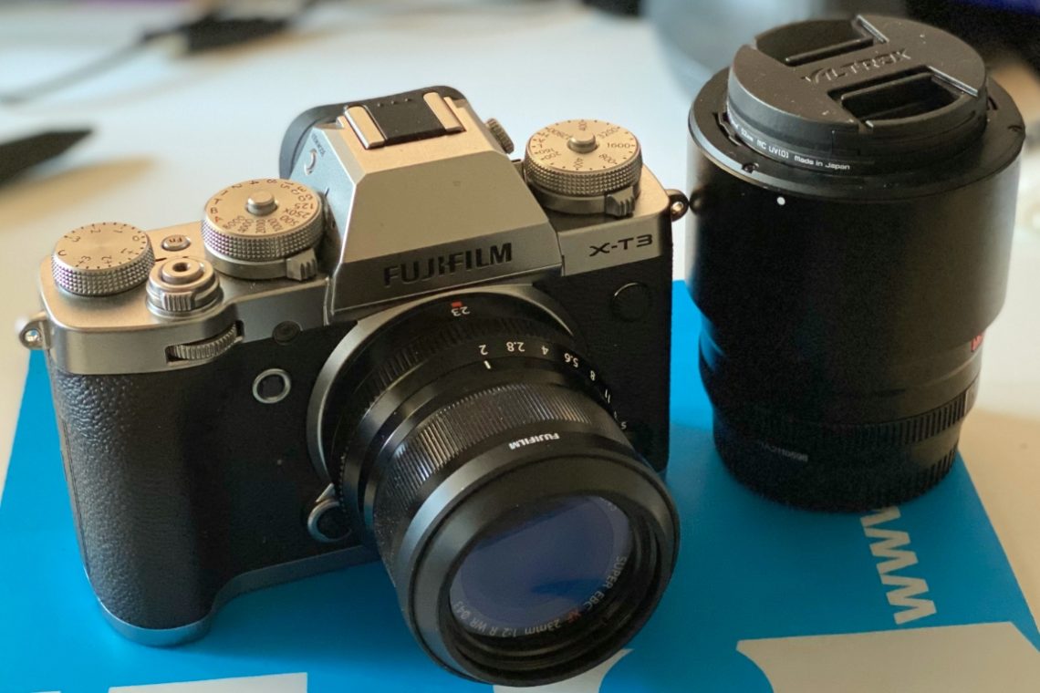
Bronine Volkit Camera Hub. Mixed feelings
The picture is self-eplaining. Patona batteries show odd parameters, while a Nikon original battery is more in line with the declared specs. This is by no way a reliable experiment, as the batteries’ state is not comparable. I will continue experimenting with different models because these results are pretty odd. However I can not blame Patona for the outcomes, for the bromine volkit itself might be defective and a fair comparison should be based upon batteries handled similarly.
-
A Skateboarder
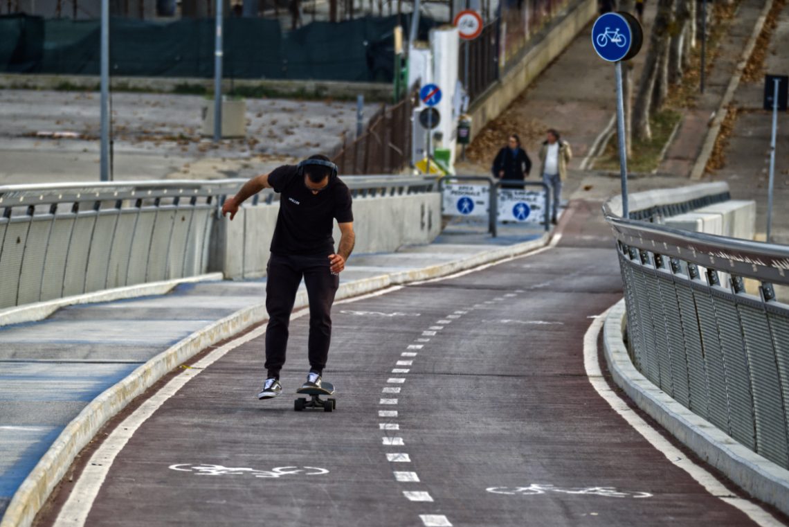
I took this shot with a long lens, standing just far enough back to flatten the scene and compress the zig-zag of the bike lane into a graphic, winding ribbon. What drew me to the moment was the contrast between the physical tension of the skateboarder’s posture and the rigid lines of the urban environment. He’s caught mid-shift — arms out, knees bent, entirely present in his balance. No theatricality, no posing. Just rhythm and gravity. The geometry of the path worked as an unintentional compositional gift. The white lines, curved rails, and signage almost funnel the viewer’s attention into the skater’s hunched figure. A classic leading-lines scenario, but more…
-
Man in Trenchcoat
-
After Heat, Structure
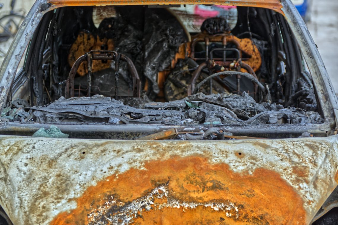
I made this photograph handheld, late afternoon. The car was still warm. Fire had done what fire does: reduced all function to form, all value to surface. What remained was metal, glass, ash—and light. I chose a shallow angle, head-on through the front windscreen, to confront the wreckage as directly as possible. The lens was at roughly 60mm, allowing a slight compression of space. I focused on the mid-depth—the charred dashboard—so the frame reads in layers: foreground (rust and blistered bonnet), middle (molten plastic and exposed seat frames), background (burned upholstery, collapsed interior geometry). Each plane tells a different part of the story. The light was flat, which helped. No…
-
Soldering
-
Fancy a beer?
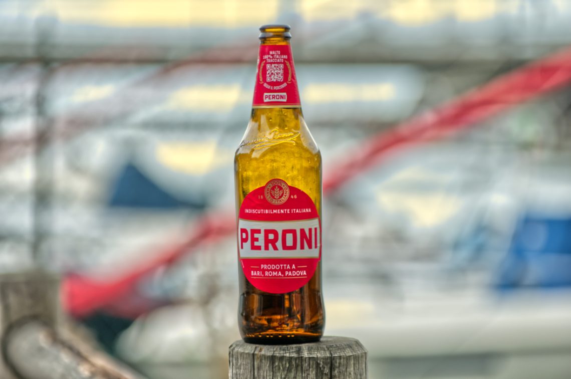
I caught this Peroni bottle resting on a worn wooden post at the marina, the kind of accidental still life you don’t stage — you simply recognise and frame. The Pentax K-5, paired with the DA* 50-135 f/2.8, made the job effortless. That lens has a way of pulling a subject into sharp relief while letting the world behind it dissolve into painterly abstraction. Here, the background of masts, ropes, and blurred hulls becomes more a wash of colour than a setting, yet it still whispers the story of where we are. I shot wide open, wanting the bokeh to take the harsh edges off the busy scene. The glass…
-
Imitation of Banksi
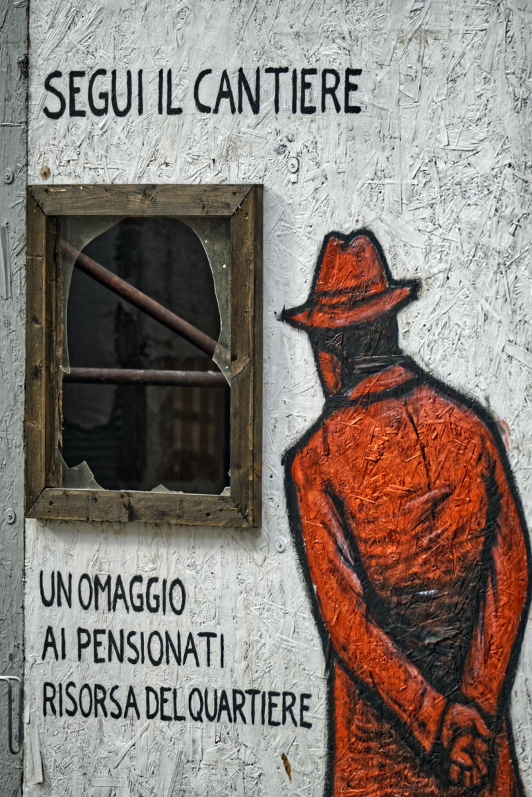
Some photographs happen because you spot them at the right time; others, because the right lens lets you see them from a distance before they disappear. This was the latter. Walking past a construction site, I noticed a splash of red against the pale, textured hoarding — a painted figure in a hat and long coat, back turned, hands behind him, staring through a broken window. The text alongside reads: “Segui il cantiere – Un omaggio ai pensionati, risorsa del quartiere” (“Follow the construction site – A tribute to pensioners, the neighbourhood’s resource”). It’s part humour, part homage, a knowing wink to the archetypal retiree who spends his days watching…
-
Black Cat
-
Fast Roping
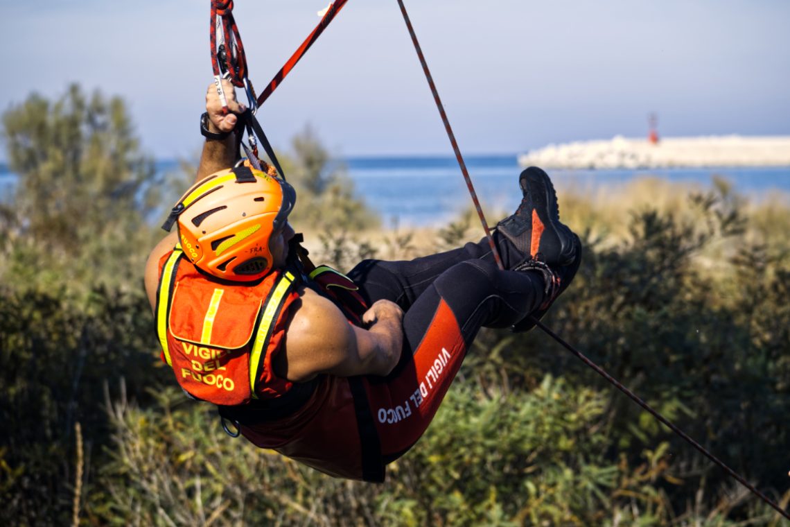
Photographing action is often about timing, but in this case it was also about proximity — or rather, the lack of it. The Fujinon 100-400mm on the Fuji X-T3 gave me the reach I needed to isolate the firefighter mid-descent, suspended against a Mediterranean backdrop. The long lens flattened the perspective just enough to bring the vegetation, the sea, and the distant breakwater into a coherent, layered background, without stealing focus from the main subject. The composition works around the strong diagonal created by the rope, which slices through the frame and guides the viewer’s eye from top left to bottom right. His bright helmet and high-vis vest aren’t just…
-
Kite Surfers
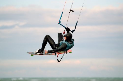
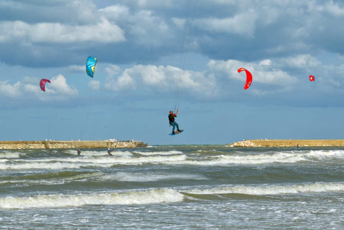
There’s a certain theatricality to kitesurfing that photography loves. The arc of the kite, the tension in the lines, the frozen posture of the rider mid-jump — all these elements play beautifully against a dramatic sky. In this frame, the scene is split into three horizontal bands: the restless sea, the solid breakwaters, and the layered clouds. The kites add the essential vertical accents, their bright reds and blues pulling the eye away from the muted tones of sea and stone. The choice of timing is decisive. The central figure is caught at the peak of his jump, the board still angled upwards, knees bent, hands taut on the bar.…
-
Chasing Rainbows on the Open Road
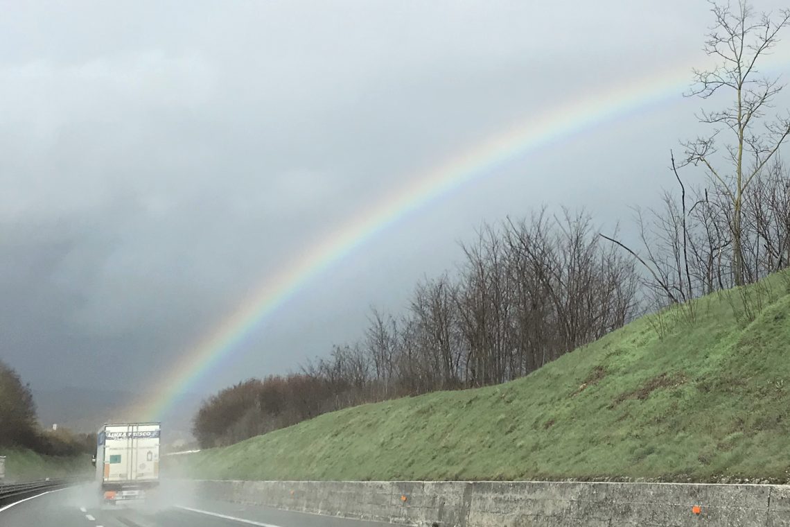
The highway stretches ahead, slick with rain, as a truck hums steadily through the mist. Then, as if drawn by some unseen hand, a rainbow arches across the sky, anchoring itself almost to the truck’s path. In that instant, the mundane transforms: the road becomes a bridge between grey clouds and fragile colour. The scene speaks of quiet journeys and unexpected rewards. The truck, anonymous and workmanlike, seems to carry the weight of routine—deliveries, schedules, miles yet to go. Yet above it, nature paints a fleeting miracle, a reminder that even on a wet and weary road, wonder can appear without warning. The trees along the embankment stand bare, witnesses…
-
The Gate to the Appeal
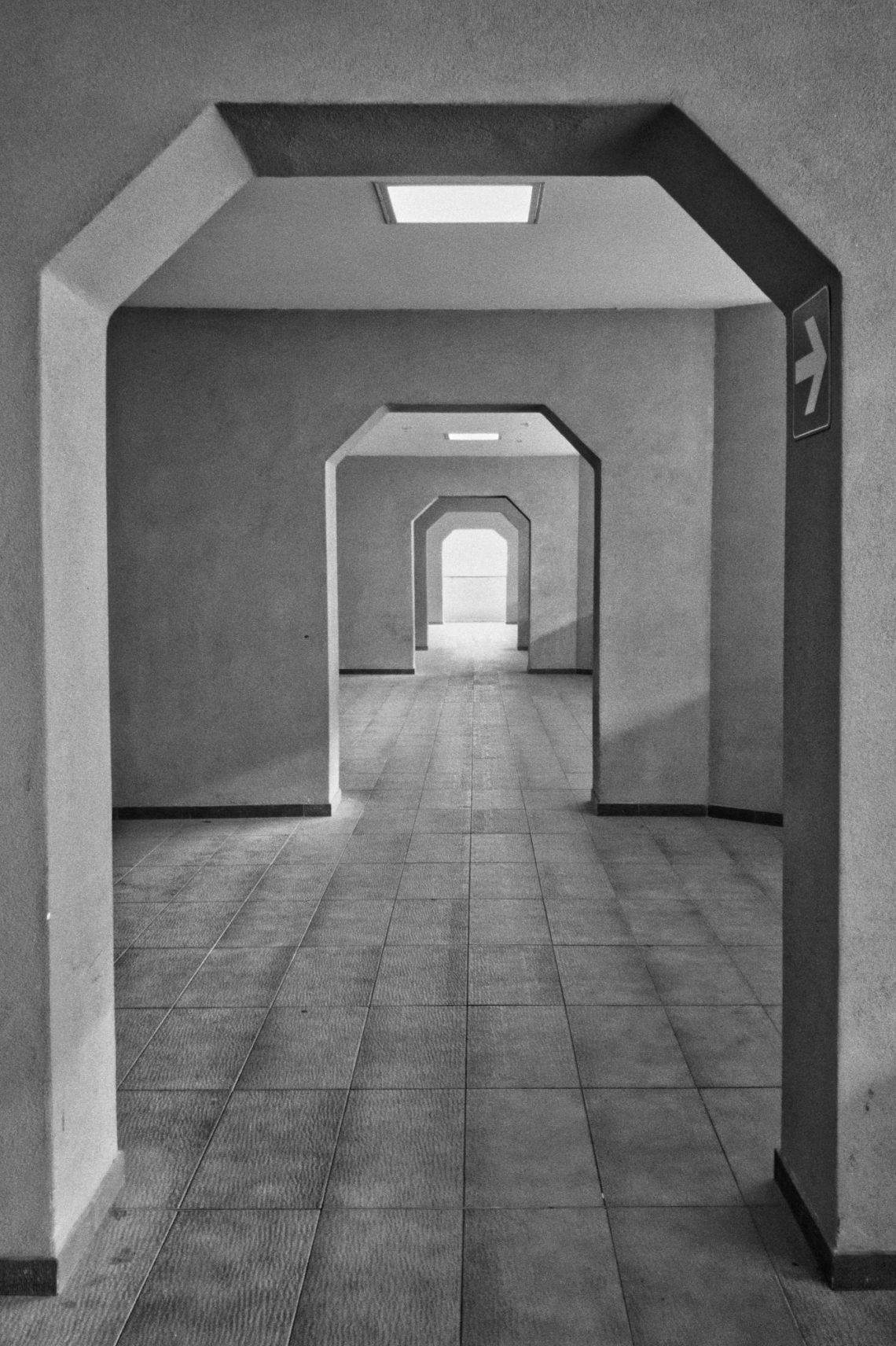
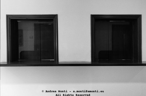
Inside the Court of Appeals, a lobby serves more as a transition than a destination. The architecture is stripped of ornament—pure function, no decorative intent—yet the repeated octagonal frames create an unintended visual rhythm. Each opening leads to another, and then another, until the corridor seems to extend beyond its physical limits. What drew me to the scene was the quiet precision of these shapes. They’re not dramatic, but they impose order. The light at the far end, brighter and slightly softer than the interior illumination, acts as a vanishing point that pulls the viewer forward. It lends the space a faint sense of expectation, as though something awaits at…
-
Boats
-
Sky Patrol
-
Fujifilm X-T3 Video Cheat Sheet
Although the Internet (and Youtube) are full of information about using the Fujifilm X-T3’s video capabilities —kudos to Chris Lee’s Pal2Tech Youtube channel for his incredible work— having a ‘quick ‘n’ dirty’ cheat sheet works better when all you need is information and not entertainment. This cheatsheet is organised according to (my personal) logic rather than to the camera’s menu order. It starts from the outside and goes deep down the intricacies of the various features. It also highlights some techicanilities that, although written in the manual, have not so obvious implications. A final word: this is a work-in-progress. More information will be added as soon as they become available.…
-
Toxic Waste in Open Air
-
Barbarians At the Beach
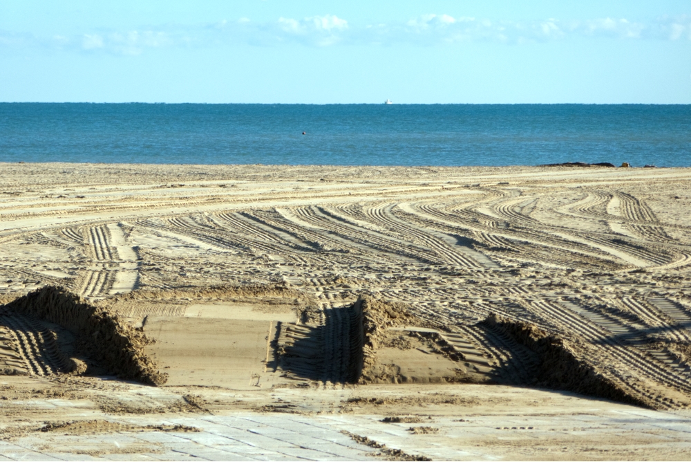
Early in the morning, before the usual hum of the seafront returned, the marks left behind during the night were still untouched. The beach, normally a place defined by wind, tide, and human leisure, had been overwritten by the heavy, mechanical tracks of off-road vehicles. What should be a natural surface shaped by the sea had become a blueprint of careless intrusion. The lines in the sand tell their own story. They are not the soft curves left by a bicycle or the faint imprints of footsteps. These are deep, forceful grooves—parallel, looping, intersecting—carved by weight and speed. They cut through the beach in patterns that have nothing to do…
-
Dark Cloud Over San Pietro
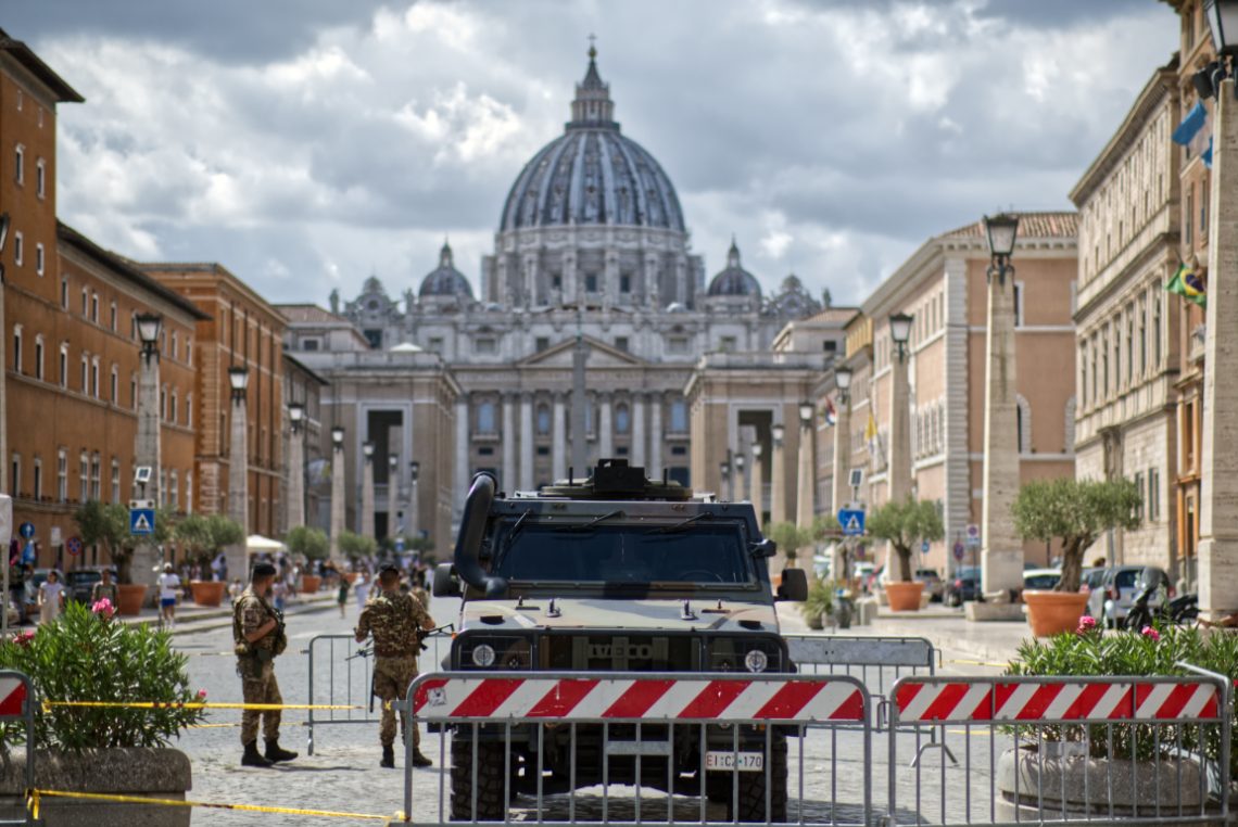
The tension wasn’t subtle. I framed this on a humid Roman afternoon, the kind where the air sticks and light flattens the facades. At the vanishing point: San Pietro, serene and untouchable, a facade that’s absorbed centuries of ceremony and conflict. But in the foreground—armoured steel, automatic rifles, and red-striped barricades—modern anxieties assert themselves. This is what occupation looks like when dressed as precaution. The symmetry of the shot exaggerates the contrast. The axis from the dome to the vehicle is mathematically clean, unnerving in its balance. You can’t not look down the middle, and once your eyes reach the Iveco Lince, you realise you’re not a tourist anymore. You’re…
