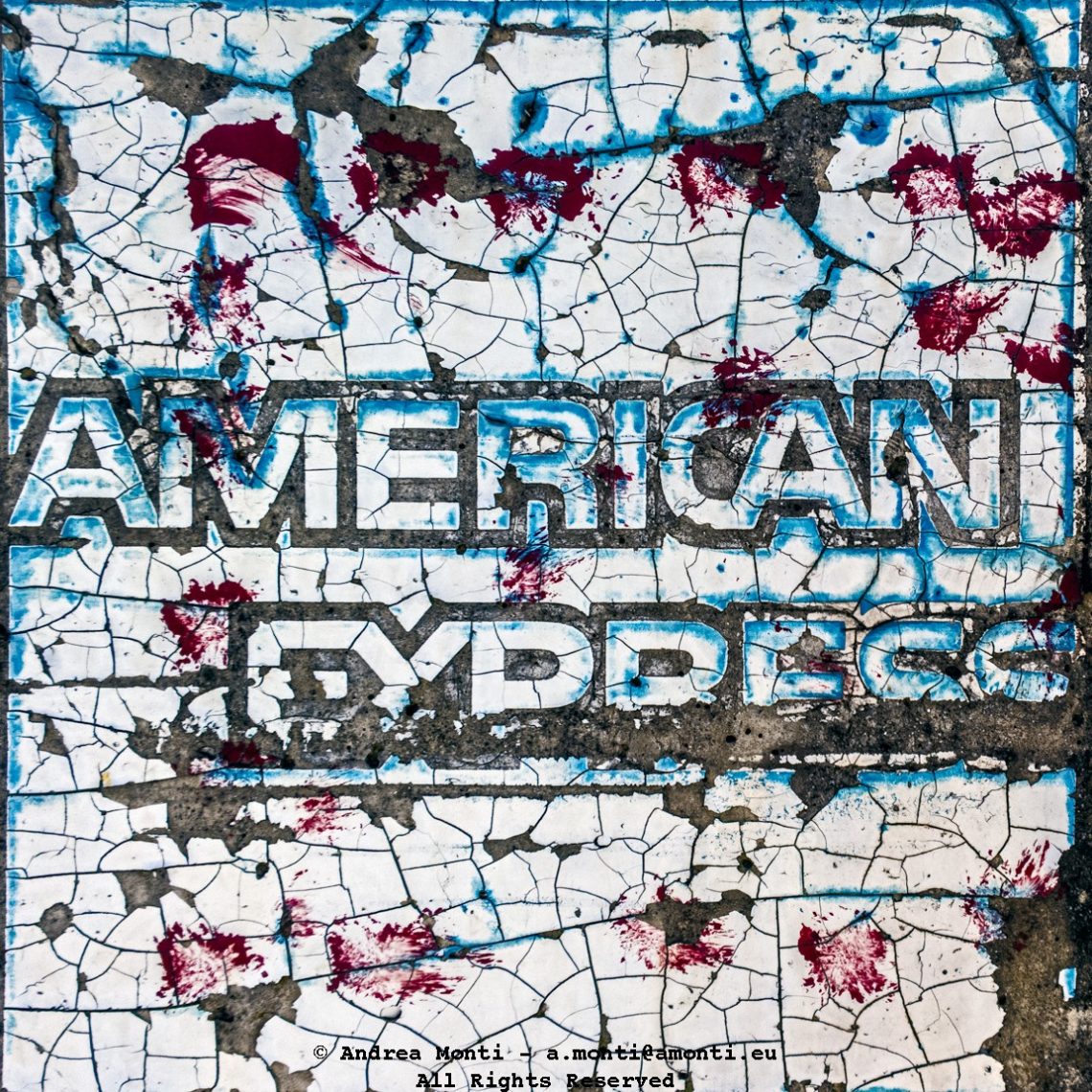
The Brand As a Ruin
This photograph operates like an archaeological find: a surface surviving by accident. The recognisable typography of American Express is still legible, yet it is embedded in a field of fracture—craquelure cracks, flaked paint, and exposed substrate that turn corporate identity into something closer to weathered signage, or a wall fragment lifted from a demolished street.
The frame is tight and declarative. There is no contextual relief, no surrounding scene to soften interpretation. Instead, the image insists on material: a white ground stained with blue seepage, the black outline of letterforms, and scattered red marks that read, at first glance, as violent splatter. Whether those marks are paint, rust bleed, or incidental staining is less important than the way they destabilise the logo. They convert a clean, confident mark into a contested surface—one that has been lived with, walked over, scraped, and repeatedly repaired.
What gives the photograph its charge is the tension between permanence and degradation. Branding is designed for consistency: a logo should reproduce cleanly, remain identical across contexts, and convey reliability by repetition. Here, the opposite happens. The letters buckle under the surface’s entropy. Cracks run through the typography as if time itself were editing the message, forcing the brand to share space with chance.
Colour does the heavy lifting. The palette is not subtle, but it is controlled: icy blues around the edges and in the fissures, a stark white ground, and those red punctures that keep interrupting the field. The effect is painterly, almost abstract, and yet the wordmark anchors it back into the everyday world of transactions and trust. It is precisely this oscillation—between abstraction and recognition—that sustains the image. You read it, then you see it; you see it, then you read it again.