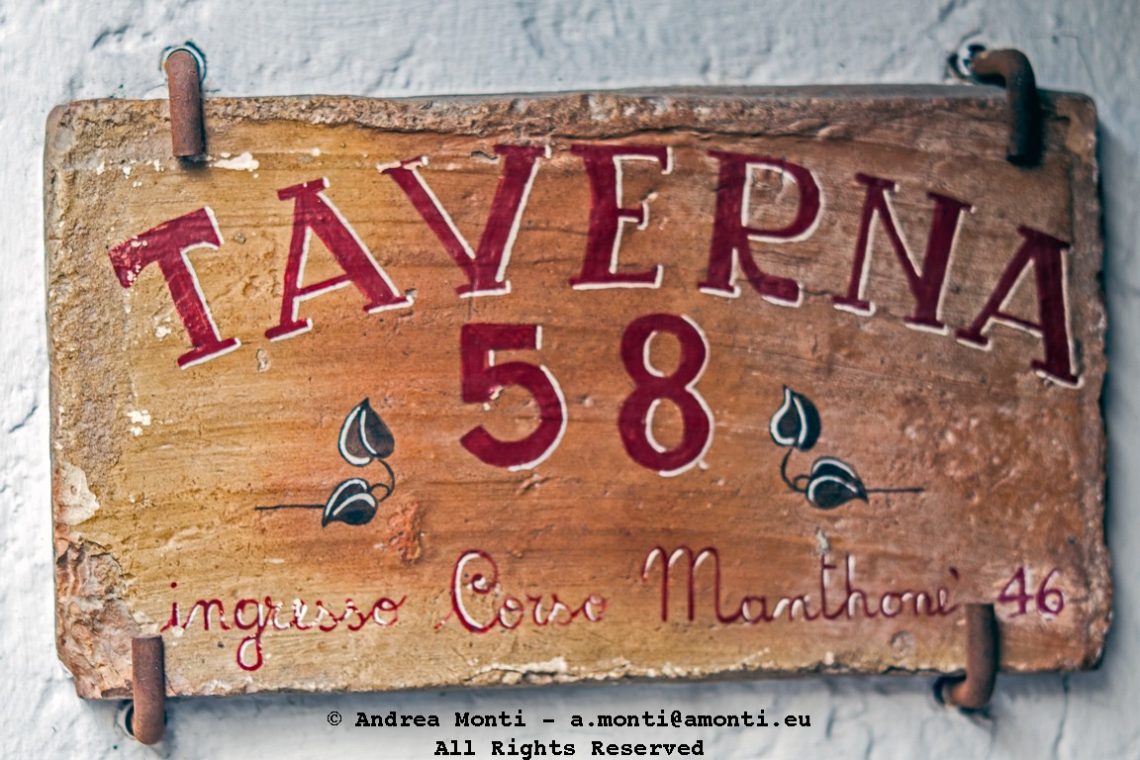
A Banner
I photographed this weathered sign for its layered character. The hand-painted letters, once bold, now bear the marks of time—faded paint, chipped wood, and a patina that speaks of decades of exposure. Its message is straightforward, advertising a taverna and pointing to an address, but as an object it is also a record of vernacular design, where function and personality coexist.
The composition was kept simple: a tight frame, centred to let the text dominate without distraction. By eliminating the surrounding wall almost entirely, the sign becomes the sole subject, demanding attention to its texture and imperfections. The small decorative leaves and the script at the bottom break the rigidity of the block letters, softening the overall effect.
Technically, the challenge was to balance colour and texture. I wanted to preserve the warm hues of the wood and the contrast with the deep red lettering without over-saturating them. Natural light helped, falling evenly across the surface and revealing the cracks, the rusted nails, and the slight unevenness of the paint strokes. The exposure was straightforward but required restraint: too much contrast and the subtleties would be lost; too little and the image would feel flat.
The photograph is not about spectacle. It is about attention—seeing in a simple wooden board the evidence of craft, decay, and persistence. Signs like this are often overlooked, replaced or discarded when no longer pristine. Here, framed carefully, it becomes something more enduring: a portrait of a place through its handmade identity